

Blog
Transparent Button Hover Effect with CSS

Transparent Button Hover Effect with CSS
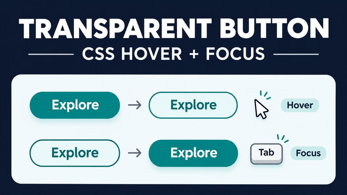
To make a filled button transparent on hover, change its background to transparent while keeping a visible border and changing the text to a contrasting color. Add the same visual treatment for keyboard focus and keep the border width constant so the control does not shift.
This tutorial covers both filled-to-outline and outline-to-filled styles. The live demo includes real navigation links, a disabled button, a touch-preview checkbox and reduced-motion support. It needs no JavaScript.
Try the transparent button live demo
Transparent button playground
Hover with a mouse or Tab to either link. Use the preview checkbox to compare both styles without opening their destinations.
Filled to transparent
The fill disappears while the border and label stay visible.
Transparent to filled
The outline style gains a fill and switches to a white label.
The two active controls are navigation links styled as buttons. The disabled example is a native button with no action. No link is nested inside a button.
Reduced motion removes the color transition. On touchscreens, links navigate normally; the checkbox provides a separate visual preview. Preview requires CSS :has() support.
What is a transparent or ghost button?
A transparent button style leaves its background unfilled so the surrounding surface shows through. A border and readable label still identify the control. The term ghost button often describes this outline appearance.
You can start filled and remove the fill on interaction, or start outlined and fill it. Use the pattern where the surrounding background provides enough contrast in both states. Transparency over a busy photograph needs more care than transparency over a plain white card.
1. Choose a button or link by behavior
Use a button for an action, such as opening a dialog, and a link for navigation. Apply a visual class to the correct element rather than nesting one interactive element inside another.
<!-- An action control; connect it to your application behavior. -->
<button class="ghost-button" type="button">Open details</button>

<!-- Navigation to another page. -->
<a class="ghost-button" href="/simple-gradient-background-for-webpage-using-css3-code/">
  Explore gradients
</a>
The live demo uses links for its two active examples because they navigate to tutorials. It also shows a native disabled button. The original nested anchor/button pattern is replaced with one appropriate interactive element per control. See MDN’s button reference for native button behavior and the type attribute.
2. Style the filled state
Set the border in the default state and keep that width throughout. This avoids adding extra pixels only when the pointer arrives. Use an explicit button type inside forms to avoid unintentionally submitting one.
.ghost-button {
  display: inline-flex;
  align-items: center;
  justify-content: center;
  min-height: 48px;
  padding: 11px 20px;
  border: 2px solid #126747;
  border-radius: 8px;
  background-color: #126747;
  color: white;
  font: 700 16px/1.5 system-ui, sans-serif;
  text-decoration: none;
  cursor: pointer;
  transition: background-color .2s ease, color .2s ease;
}
The transition lists only the properties that change. The label, padding and border remain in place. A minimum height also gives the control comfortable vertical space without forcing a fixed width.
3. Make the background transparent on hover and focus
.ghost-button:focus-visible {
  background-color: transparent;
  color: #126747;
  outline: 3px solid #7346b8;
  outline-offset: 4px;
}
@media (hover: hover) and (pointer: fine) {
  .ghost-button:hover {
    background-color: transparent;
    color: #126747;
  }
}
When the fill disappears, white text would be hard to read on the demo’s white card. The text therefore changes to dark green. Keyboard focus receives the same color change plus a separate outline, so it remains visible independently of the hover styling.
The focus-visible selector follows the browser’s focus-indicator heuristics, commonly showing the indicator for keyboard use. Do not remove focus outlines globally.
4. Reverse it: transparent to filled
For a ghost button that starts outlined, swap the two color states. Keep the same border in both.
.ghost-button--outline {
  background-color: transparent;
  color: #126747;
}
.ghost-button--outline:focus-visible {
  background-color: #126747;
  color: white;
}
@media (hover: hover) and (pointer: fine) {
  .ghost-button--outline:hover {
    background-color: #126747;
    color: white;
  }
}| Variant | At rest | On hover or visible focus |
|---|---|---|
| Filled to transparent | Green fill, white label | Transparent fill, green label |
| Transparent to filled | Transparent fill, green label | Green fill, white label |
| Both | 2px green border | Same 2px border; keyboard outline remains separate |
Background transparency is different from opacity
background-color:transparent affects the background paint. Setting opacity:0 on the entire control would also hide its text and border while potentially leaving an invisible interactive element.
Use a transparent background for this effect and keep the control’s overall opacity intact. The opacity reference explains how element opacity affects its contents. If you need a partially transparent fill, an alpha color is a better fit than fading the whole control.
Touch preview, disabled state and reduced motion
Touchscreen users should be able to activate the control normally rather than needing a first tap just to simulate hover. The playground provides a separate checkbox for previewing the styles. It uses :has(), and is hidden in browsers without selector support; normal links and keyboard behavior still work.
A real disabled button uses the native disabled attribute. It should not look like an active call to action. The demo uses neutral colors and no click behavior. Links do not support the native button disabled attribute, so do not treat a styled anchor as a disabled button.
<button class="ghost-button" type="button" disabled>Unavailable</button>

<style>
.ghost-button:disabled {
  background-color: #edf0f4;
  color: #5b6575;
  border-color: #a8b2bf;
  cursor: not-allowed;
}
@media (prefers-reduced-motion: reduce) {
  .ghost-button { transition: none; }
}
</style>
The complete project scopes its disabled rules so the sample stays neutral. In a generic stylesheet, exclude disabled controls from hover/focus color rules or ensure the disabled rules take precedence. Reduced motion removes the transition; the interactive states still change instantly.
Download and customize the example
- Extract the ZIP and open
index.html. - Tab through the links, then try the preview checkbox.
- Replace the sample destinations with real links or use a button connected to your application action.
- Edit the green color, radius or spacing in
style.css. - Test both states over your actual background and on a narrow screen.
The ZIP contains HTML, CSS and a README. It works offline with local sample destinations. The public links open related tutorials. All demo styling is scoped to avoid changing unrelated WordPress buttons.
Common problems and fixes
- The label disappears on hover: change its color when the background becomes transparent.
- The control jumps in size: keep the same border width in every state.
- The whole control vanishes: change background color, not the element’s opacity.
- Click behavior is inconsistent: remove nested links/buttons and use the correct element once.
- The effect looks wrong on a photo: choose a stable surface or colors that remain readable over every area behind the control.
- A form submits unexpectedly: use
type="button"for an action that is not a submission.
Frequently asked questions
Does a transparent hover button need JavaScript?
No. CSS changes the visual state. A real application action may separately need JavaScript or a form submission.
Can I use rgba with an alpha of zero?
Yes. A fully transparent background color achieves the same visual purpose here. The keyword transparent is concise.
Should I put an anchor inside a button?
No. Use an anchor for navigation or a button for an action and style that element directly.
Does hover work on phones?
Touch interaction does not provide the same reliable hover behavior as a mouse. Keep activation usable without hover and provide another way to preview decorative states when teaching them.
Why keep the border visible?
It preserves the outline when the fill disappears and avoids changing the control’s dimensions during interaction.
More CSS practice
Try the CSS button bounce effect for a short motion treatment, or the gradient underline animation for ordinary text links.
Conclusion
A transparent button effect needs a stable border, coordinated fill and text colors, and a visible focus state. Keep the element’s behavior clear and test the transparent state against the background it will actually reveal.