

Blog
3D Text Effect with CSS Text-Shadow

3D Text Effect with CSS Text-Shadow
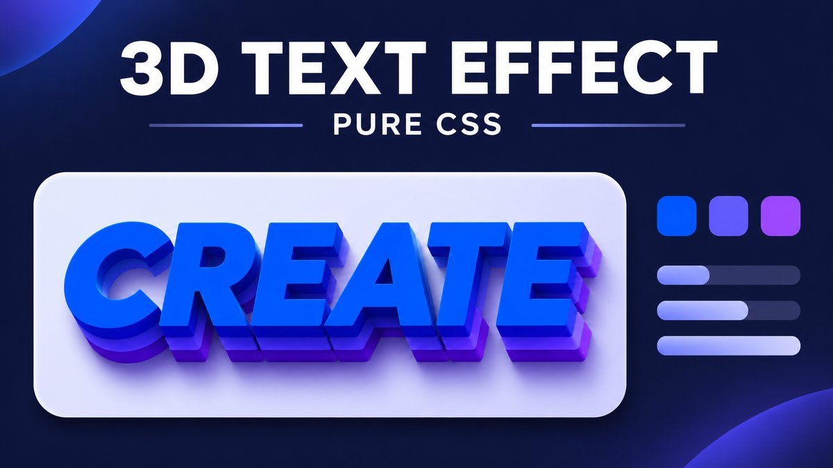
To create a 3D text effect with CSS, apply several zero-blur text-shadow layers with progressively larger offsets, then add a softer shadow behind them. The sharp layers look like an extruded edge while the normal text color forms the front face.
This tutorial creates the effect with ordinary HTML text and CSS. The live demo lets you compare three colors and three depths, including a flat version. It uses no JavaScript, image, external font or 3D library.
Try the CSS 3D text live demo
CSS 3D text playground
Compare the front-face colors and shadow depths. The word below is ordinary selectable text with a layered CSS shadow—not an image or a 3D model.
CREATE
Use arrow keys within each radio group. Flat removes the shadows for comparison. This effect has no animation; all text stays available without JavaScript.
Interactive choices require CSS :has() support. Your browser is showing the default blue text with deep shadows.
How text-shadow creates a 3D-like effect
Each text shadow repeats the shape of the glyphs at an offset. A series of sharp shadows at 1px, 2px and larger distances fills the space behind the letters. A separate blurred shadow suggests that the letters cast a shadow onto the background.
This is a visual depth illusion using two-dimensional shadows. It does not create a 3D mesh, perspective camera or real extruded geometry. It is useful for short display headings, badges and decorative titles, while ordinary body text should remain simple.
1. Add a real text heading
Write the words once in HTML and apply a class. Choose the heading level according to your page structure; the effect does not require an extra heading or a duplicate text layer.
<h2 class="title-3d">CREATE</h2>Because the word stays as text, people can select it, zoom it and read it without downloading a separate graphic. Use a short label while learning the effect, then check your actual heading when you customize it.
2. Stack sharp shadows behind the front face
.title-3d {
  color: #1748a6;
  font: 900 clamp(2rem, 10vw, 5rem)/1.3 system-ui, sans-serif;
  letter-spacing: .035em;
  text-shadow:
    1px 1px 0 #9cb6e4,
    2px 2px 0 #9cb6e4,
    3px 3px 0 #9cb6e4,
    4px 4px 0 #9cb6e4,
    5px 5px 0 #9cb6e4,
    6px 6px 0 #9cb6e4,
    9px 12px 12px rgb(24 49 84 / 20%);
}
A shadow entry contains a horizontal offset, vertical offset, optional blur radius and color. Positive offsets move right and down. The sharp layers use zero blur; the final entry provides the softer cast shadow. In a comma-separated list, earlier shadows are painted above later ones. See MDN’s text-shadow reference for the syntax and painting order.
| Part | Purpose |
|---|---|
color |
Sets the actual text’s front-face color |
| Small offsets with zero blur | Build a continuous-looking extrusion |
| Progressively larger offsets | Increase apparent depth in one direction |
| Final blurred shadow | Add a softer cast shadow behind the edge |
3. Adjust depth and color separately
Changing color changes the front face, but explicit colors in the shadow list stay unchanged. Use separate custom properties when you want to coordinate the face and extrusion colors.
.title-3d {
  --face: #6d28a8;
  --edge: #c4a9e8;
  color: var(--face);
  text-shadow:
    1px 1px 0 var(--edge),
    2px 2px 0 var(--edge),
    3px 3px 0 var(--edge),
    4px 4px 0 var(--edge);
}
.title-3d.is-flat { text-shadow: none; }
Keep offsets close enough that the edge looks connected. Jumping from a 1px layer straight to a 12px layer usually looks like a separate duplicate rather than a solid extrusion. A bold font gives the face more visual weight and leaves room for the depth effect.
The playground’s Deep option uses six sharp layers and one soft layer. Subtle uses two sharp layers with a smaller soft shadow. Flat removes the shadows entirely, making it easy to compare whether the styling actually improves your heading.
4. Keep the text responsive
A large fixed font size can overflow a small card or phone screen. Use a fluid size with a reasonable minimum and maximum, allow wrapping and leave padding for the shadow.
.preview {
  padding: 30px 24px;
  background: white;
}
.title-3d {
  font-size: clamp(2rem, 10vw, 5rem);
  line-height: 1.3;
  max-width: 100%;
  overflow-wrap: anywhere;
}
The clamp() function bounds a preferred size between a minimum and maximum. Here the viewport-based middle value scales the text, while wrapping handles narrow containers. For a sidebar, tune the values to that content width rather than assuming the whole viewport is available.
Text shadows are painted outside the glyphs and do not reserve extra space for their depth. Avoid clipping them with a tight fixed-height box or overflow:hidden. Check the longest word and the deepest shadow after changing the design.
5. Add optional CSS-only controls
The teaching playground uses native radio groups and :has() selectors to change its CSS custom properties. The text effect itself only needs text-shadow.
.swc3t:has(#swc3t-violet:checked) {
  --swc3t-face: #6d28a8;
  --swc3t-edge: #c4a9e8;
}
.swc3t:has(#swc3t-flat:checked) {
  --swc3t-shadow: none;
}
In a browser without :has(), the optional controls are hidden and the default blue/deep example remains visible. Keyboard users can Tab to a radio group and use its arrow keys to choose an option. There is no automatic animation or motion to disable.
Readability, forced colors and printing
Choose the text color for contrast with its background before adding shadows. A dramatic shadow does not make a low-contrast face readable. Use the effect sparingly and avoid applying heavy depth to paragraphs or long navigation labels.
Forced-color modes and print styles can use a simpler presentation. The downloadable example removes the shadow so the text remains straightforward in those environments:
@media (forced-colors: active) {
  .swc3t .swc3t-word {
    color: CanvasText;
    text-shadow: none;
  }
}
@media print {
  .swc3t .swc3t-word { color: #183154; text-shadow: none; }
}
The forced-colors media feature identifies an enforced user-agent color palette. Avoid overriding it just to preserve decorative colors.
Download and customize the project
- Extract the source ZIP and open
index.htmlin a current browser. - Compare Blue, Violet and Coral with Flat, Subtle and Deep.
- Replace CREATE with your own short heading in the HTML.
- Edit face and edge colors and the shadow list in
style.css. - Test the text on a narrow screen and with your actual font and background.
The ZIP contains HTML, CSS and a README. It works offline without build tools. The public example keeps its styles scoped so it does not alter every heading on the WordPress page.
Common CSS 3D text problems
- The letters look blurry: keep blur at zero on the extrusion layers and reserve blur for the cast shadow.
- The shadow looks detached: use small consecutive offsets in the same direction.
- Changing text color leaves the edge unchanged: edit the shadow colors or their shared custom property too.
- The effect gets clipped: leave room for painted shadows and remove overly tight fixed heights.
- The heading is hard to read: reduce depth, simplify the background and check the face color’s contrast.
- Only a box has a shadow: use
text-shadowfor glyphs;box-shadowaffects the element’s box.
Frequently asked questions
Does CSS 3D text need JavaScript?
No. Multiple text shadows can create this static depth effect with CSS alone.
Is this actual 3D text?
It is a 3D-like illusion created by offset two-dimensional shadows. True extruded geometry requires another rendering approach.
Can I use any font?
Yes, but bold faces usually show the layers more clearly. Recheck spacing and readability with your chosen font.
Can the heading still be selected and read?
Yes. The demo uses one real heading and does not replace it with an image or duplicate text for every layer.
Should I add more shadows for more depth?
Add only enough to achieve the intended look. More layers can make small letters muddy; compare against a flat version and test rendering on your target devices.
More CSS practice
Try the gradient underline animation for link styling or the simple gradient background for a color treatment behind a content card.
Conclusion
A convincing CSS text extrusion starts with a readable front face, closely spaced sharp shadows and a restrained soft shadow. Keep the heading responsive and selectable, and use the effect where a short decorative title helps the design.