

Blog
Animated Gradient Underline on Hover and Focus with CSS

Animated Gradient Underline on Hover and Focus with CSS
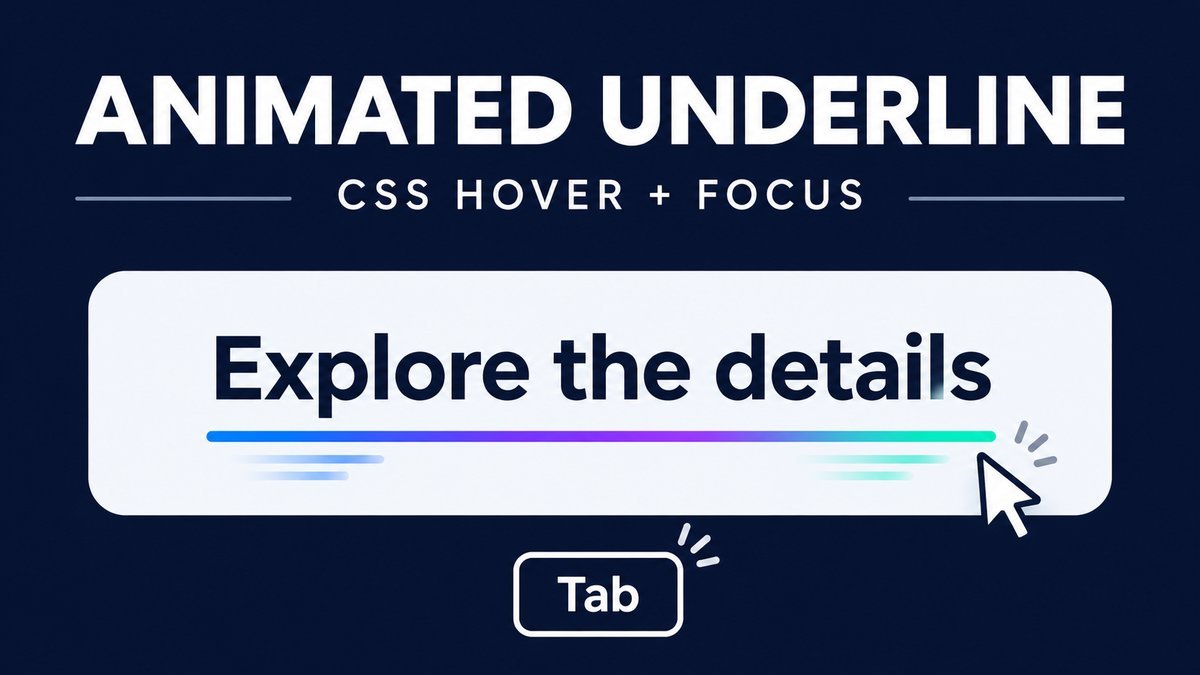
To animate a gradient underline with CSS, draw a thin linear-gradient background beneath an inline link, make the background wider than the link, and animate its horizontal position on hover or keyboard focus. Keep the text opaque and provide a static underline when motion is reduced.
This tutorial includes a short color sweep, a visible keyboard focus outline, support for wrapping link text and a touch-friendly preview control. It needs no JavaScript, custom font or image file.
Try the gradient underline live demo
Gradient underline playground
Hover with a mouse or Tab to a link. Each interaction plays one short color sweep. The links open real examples; use the preview checkbox to try the effect without following a link.
WRAPPING LINK
Build a responsive vertical timeline with HTML and CSS
A longer link wraps naturally and keeps an underline on each text fragment.
KEYBOARD FOCUS
Tab to this link to see the focus outline and the short underline pass.
The checkbox plays one pass when checked. Uncheck and check again to replay. With reduced motion enabled the underline stays static. Link text and focus outlines remain visible.
How does the underline animation work?
A background gradient is drawn as a strip at the bottom of the link. Its height stays at 3px, while its width is 200% of the link’s background positioning area. Changing background-position exposes different colors along the strip. The text remains in normal flow and does not move.
The effect runs once for 1.2 seconds. It does not keep looping while someone reads. A static underline is visible before and after the sweep, so the link remains identifiable without motion.
1. Start with a real link
Use an anchor with a useful destination and meaningful link text. A styling effect should not turn a navigation link into a fake button or an empty href="#" placeholder.
<a class="swcul-link" href="/simple-gradient-background-for-webpage-using-css3-code/">
  Explore CSS gradients
</a>
The live demo links lead to related SanWebCorner tutorials. In the downloadable project they point to local sample sections so navigation still works offline.
2. Add readable text and a basic underline
Begin with a normal text underline as the fallback. Avoid transparent text and text-shadow tricks: the words should remain readable independently of the decorative background.
.swcul .swcul-link {
  display: inline;
  color: #1748a6;
  text-decoration: underline;
  text-underline-offset: .2em;
  font-size: 20px;
  font-weight: 700;
  line-height: 1.85;
  overflow-wrap: anywhere;
}
Keeping the link inline lets a long label wrap inside a paragraph or narrow card. An inline-block link behaves as one rectangular box instead, which may suit a short menu item but is less flexible for text that spans several lines.
3. Replace the underline with a thin gradient strip
@supports (background-image: linear-gradient(to right, blue, teal)) {
  .swcul .swcul-link {
    text-decoration: none;
    background-image: linear-gradient(
      90deg, #2455d9, #7c3aed, #0f766e, #2455d9
    );
    background-size: 200% 3px;
    background-repeat: no-repeat;
    background-position: 0% 100%;
    padding-bottom: 5px;
    -webkit-box-decoration-break: clone;
    box-decoration-break: clone;
  }
}
The background is positioned at the bottom, and padding leaves a little space between the glyphs and the strip. The gradient begins and ends with blue to make its resting colors feel consistent.
box-decoration-break: clone applies the box decoration to individual fragments when inline text wraps. The project includes the prefixed declaration for engines that use it. See MDN’s box-decoration-break reference and check your actual browser targets, especially with several lines of text.
4. Animate on mouse hover and keyboard focus
The keyframes move only the background position. Hover applies on devices whose primary input supports fine-pointer hovering. Keyboard focus receives both the color sweep and a clear outline.
@keyframes swcul-flow {
  from { background-position: 100% 100%; }
  to   { background-position: 0% 100%; }
}
.swcul .swcul-link:focus-visible {
  outline: 3px solid #7346b8;
  outline-offset: 5px;
  animation: swcul-flow 1.2s ease-out 1;
}
@media (hover: hover) and (pointer: fine) {
  .swcul .swcul-link:hover {
    animation: swcul-flow 1.2s ease-out 1;
  }
}
The final 1 means one iteration. After the pass, the link keeps its default background position. Moving away and hovering again starts another pass. If hover and focus overlap, the identical animation may continue instead of restarting; the link still shows the appropriate focus outline.
The focus-visible selector lets the browser determine when a focus indicator should be drawn, commonly during keyboard interaction. Keep a visible indicator rather than removing outlines globally.
5. Provide a preview control for touch users
Touch users should be able to follow a link with a normal tap. The demo therefore keeps native navigation and adds a separate checkbox to preview the visual effect without leaving the page.
<label class="swcul-control">
  <input type="checkbox" class="swcul-preview"> Preview underline animation
</label>

<style>
.swcul-control { display: none; }
@supports selector(:has(*)) {
  .swcul-control { display: flex; }
  .swcul:has(.swcul-preview:checked) .swcul-link {
    animation: swcul-flow 1.2s ease-out 1;
  }
}
</style>
Checking the box plays one pass. Uncheck and check it again to replay. The optional checkbox is hidden in browsers without :has(); ordinary links, hover and keyboard styles still remain. It is a teaching aid rather than a required part of every link on your site.
6. Respect reduced motion and forced colors
Disable the animation when the device requests reduced motion. Keep the static gradient underline and focus outline. In forced-color modes, use a real text underline so the link does not depend on a background image being painted.
@media (prefers-reduced-motion: reduce) {
  .swcul .swcul-link,
  .swcul .swcul-link:hover,
  .swcul .swcul-link:focus-visible,
  .swcul:has(.swcul-preview:checked) .swcul-link {
    animation: none;
  }
}
@media (forced-colors: active) {
  .swcul .swcul-link {
    background-image: none;
    text-decoration: underline;
  }
}
The prefers-reduced-motion media feature exposes the user’s device preference. The effect should remain useful as a static underline rather than relying on movement to signal that text is a link.
Customize and run the source project
- Download and extract the ZIP, then open
index.html. - Tab through the links and preview the animation with the checkbox.
- Change the gradient colors or its 3px height in
style.css. - Adjust the 1.2s duration if needed, keeping the effect brief.
- Test long link text, small screens and the device’s reduced-motion setting.
The ZIP includes HTML, CSS and a README. There are no external assets or dependencies. Keep the styles scoped when embedding the example in WordPress so global anchor rules do not change unrelated links.
Common problems and fixes
- The underline covers letters: increase bottom padding or revise the background position and line height.
- Only one line is decorated: keep the link inline and inspect box-decoration-break support and theme overrides.
- Nothing animates: check the reduced-motion preference and confirm the keyframe name matches the animation declaration.
- The animation loops forever: remove
infiniteand use one iteration. - The focus outline disappears: remove a global outline reset or add a more specific focus-visible rule.
- Text is invisible: use a real text color; do not make the label transparent to build a decorative underline.
Frequently asked questions
Is JavaScript needed for an animated underline?
No. CSS backgrounds, keyframes and interaction selectors provide the visual effect. The optional preview uses native checkbox state.
Does the effect work on a link that wraps?
The example uses inline text and cloned box decorations so each fragment can have an underline. Test this behavior in the browsers you support.
Should the underline be hidden until hover?
For links inside ordinary content, a visible underline helps identify navigation before interaction. This demo keeps an underline visible at rest.
Can I use the same class on a button?
The visual technique can be adapted, but keep the correct element: links navigate and buttons perform actions. Preserve the button’s focus and interaction states.
Why does the preview stop while the box stays checked?
It plays one short pass rather than continuously looping. Uncheck and check again to replay; reduced-motion mode keeps it static.
Continue learning
Review the simple CSS gradient tutorial to understand directions and stops, or try the CSS button bounce effect for another short interaction.
Conclusion
A small gradient strip can add interest to links while their text and behavior remain clear. Keep the effect brief, include keyboard focus, and offer a static result for reduced motion.