
Blog
Animated Gradient Background with CSS

Animated Gradient Background with CSS
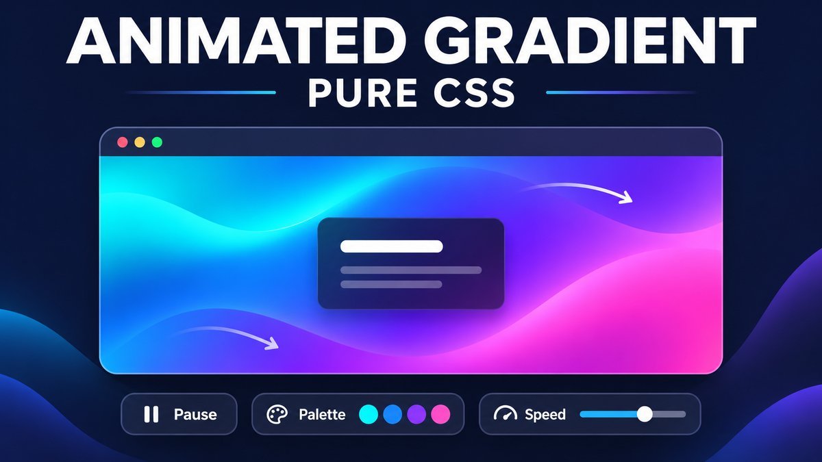
To create an animated gradient background with CSS, apply a linear gradient, make its background larger than the element, and animate background-position between two positions with keyframes. This creates a smooth color drift without JavaScript, video or image files.
This tutorial includes a responsive live demo with three palettes, three loop durations and a pause control. The background becomes static when the device requests reduced motion. Text sits on a solid card so its contrast does not depend on the moving colors.
Try the animated gradient live demo
Animated gradient playground
Try a palette, change the loop duration, or pause the background. The text stays on a solid dark card while the colors move behind it.
Color in motion
A pure CSS gradient. No video, image or JavaScript required.
Animation is running. Check Pause animation to freeze the current frame.Animation is paused. Uncheck Pause animation to resume.
Your browser is showing a static gradient preview. Interactive controls require CSS :has() support.
Reduced motion is enabled on your device. A static gradient is shown and motion controls are hidden.
This demo is entirely HTML and CSS. Choices apply only while this page is open.
How the CSS gradient animation works
The gradient image remains the same throughout the loop. Increasing background-size to 400% 400% gives the element a larger color field to display. Animating its position then exposes different parts of that field. This technique moves an existing gradient; it does not interpolate one set of color stops into another.
The demo travels from the starting position to the opposite side and back in one complete loop. Its default duration is 18 seconds. A longer duration slows the movement; a shorter one speeds it up.
1. Create the HTML preview and controls
Use an ordinary section for the component and a separate preview element for the animated background. The pause checkbox and palette radios stay outside the moving region. Native inputs already support keyboard interaction and expose their checked state.
<section class="swcag">
  <div class="swcag-preview">
    <div class="swcag-card">
      <h4>Color in motion</h4>
      <p>A pure CSS gradient.</p>
    </div>
  </div>
  <label><input type="checkbox" id="swcag-pause"> Pause animation</label>
</section>
This small markup example shows the main structure. The complete project adds grouped palette and duration choices, visible status text and responsive styles.
2. Add the oversized linear gradient
Define a fallback color, a gradient angle and a list of color stops. The custom property keeps palette colors separate from the animation rules.
.swcag {
  --swcag-colors: #0f766e, #2563eb, #7c3aed, #0891b2;
  --swcag-duration: 18s;
}
.swcag-preview {
  min-height: 300px;
  background-color: #183154;
  background-image: linear-gradient(-45deg, var(--swcag-colors));
  background-size: 400% 400%;
  background-position: 0% 50%;
}
A gradient displayed at exactly the element’s size leaves no extra space for this position change to reveal. Oversizing creates that extra range. Percentage positions align a percentage point of the background image with the same percentage point of its positioning area; see MDN’s background-position reference for the positioning model.
3. Animate background-position with keyframes
@keyframes swcag-drift {
  0%, 100% { background-position: 0% 50%; }
  50% { background-position: 100% 50%; }
}
@supports selector(:has(*)) {
  .swcag-preview {
    animation: swcag-drift var(--swcag-duration) ease-in-out infinite;
  }
}
The middle keyframe reaches the far side, and the last keyframe returns to the exact starting position. ease-in-out slows the turn at each end. The demo enables its loop inside a feature query because its pause control uses :has(). Browsers without that selector keep a static background instead of starting motion with a nonfunctional control.
4. Add a persistent pause control
The checked pause input changes animation-play-state. It freezes the current frame, and unchecking resumes from that phase rather than restarting the animation.
.swcag:has(#swcag-pause:checked) .swcag-preview {
  animation-play-state: paused;
}
See MDN’s animation-play-state documentation for pause and resume behavior. A persistent checkbox works on touchscreens and through the keyboard; a hover-only pause would stop working when someone moves the pointer away.
Motion can distract people while they read. The W3C guidance on Pause, Stop, Hide explains when automatically moving information needs a user control. This demo provides one alongside a separate reduced-motion alternative; assess the accessibility of your complete page when adapting it.
5. Change the palette and loop duration with CSS
The radio groups select named options. Each selector changes a variable on the component, so the preview can reuse the same gradient and animation declarations.
.swcag:has(#swcag-sunset:checked) {
  --swcag-colors: #b45309, #db2777, #7c3aed, #f97316;
}
.swcag:has(#swcag-aurora:checked) {
  --swcag-colors: #065f46, #0891b2, #4f46e5, #0d9488;
}
.swcag:has(#swcag-slow:checked) { --swcag-duration: 30s; }
.swcag:has(#swcag-fast:checked) { --swcag-duration: 10s; }| Control | Result |
|---|---|
| Ocean | Default teal, blue, violet and cyan |
| Sunset | Amber, pink, violet and orange |
| Aurora | Green, cyan, indigo and teal |
| Slow / Standard / Fast | 30 / 18 / 10 seconds for a complete out-and-back loop |
| Pause animation | Hold the current animation phase until unchecked |
Palette changes are immediate. Changing an animation duration may move the displayed phase; it is a teaching control, not a seamless speed ramp. Choices are not saved by application code across reloads.
6. Respect reduced motion and keep text readable
Reduced motion takes priority over the demo controls. The preview becomes static, and controls that no longer apply are hidden. The color and content remain available.
@media (prefers-reduced-motion: reduce) {
  .swcag .swcag-preview {
    animation: none;
    background-position: 50% 50%;
  }
  .swcag .swcag-controls,
  .swcag .swcag-state,
  .swcag .swcag-fallback { display: none; }
  .swcag .swcag-reduced { display: block; }
}
.swcag-card { background: #101d36; color: #fff; }
.swcag-card p { color: #e2eaff; }
The device preference is exposed by the prefers-reduced-motion media feature. The foreground card uses a solid background rather than a translucent overlay, so the gradient’s brightest frame cannot change the card’s text contrast. If you place text directly on your gradient, check contrast across its full animation.
Run and adapt the source project
- Download and extract the ZIP, then open
index.html. - Edit the colors and timing in
style.css. - Try Pause with Space, and use arrow keys to move through each radio group.
- Test the smallest content width you support and your device’s reduced-motion setting.
- Keep IDs and radio group names unique if you add multiple copies to a page.
The ZIP contains HTML, CSS and a README. It has no remote assets, dependencies or build step. The styles target this component rather than the entire document, so they are easier to adapt to an existing site.
Performance and troubleshooting
Animating background-position can cause repainting. CSS alone does not guarantee a compositor-only animation. Keep the animated area modest, avoid many full-screen instances and profile the actual page on the devices you support. For more demanding designs, consider a carefully sized decorative layer animated with transforms, then measure its rendering and memory costs.
- The gradient looks static: check the background size, keyframe name, pause checkbox and reduced-motion setting. Browsers without
:has()intentionally show the static fallback. - The color jumps at the loop boundary: make the first and last keyframes identical.
- The page scrolls horizontally: use
width:100%inside a content column; avoid100vwplus extra padding. The old100whvalue is not a valid width unit. - The inputs do not affect the preview: confirm their IDs match the CSS selectors and remain inside the component.
- The text becomes difficult to read: place it on a solid, contrasting panel instead of relying on the changing gradient colors.
Frequently asked questions
Does an animated gradient need JavaScript?
No. Keyframes can animate the background position, and native inputs with :has() can control this demo in current browsers.
Why use background-size:400% 400%?
It makes the gradient larger than the visible element, allowing position changes to reveal different colors. Other oversized values can work; adjust the colors and movement together.
Can I use this for a full-page background?
Yes, but profile rendering on mobile devices, retain a persistent pause control and provide a static reduced-motion version. Keep foreground content readable throughout the loop.
Why does Pause hold the same color frame?
The checkbox pauses the existing animation instead of removing it. Resuming continues from the held phase.
What happens in an older browser?
A browser that cannot match the feature query sees a static gradient with hidden interactive controls. The content stays readable.
More CSS practice
Try the multi-layered image hover effect for a short, user-triggered transition, or the horizontal news ticker for another CSS loop with a pause control.
Conclusion
An oversized gradient and a small keyframe animation create the color drift. Make the result practical with a pause control, a static reduced-motion state, readable foreground content and a layout that fits the surrounding page.