
Blog
Multi-Layered Image Hover Effect with CSS

Multi-Layered Image Hover Effect with CSS
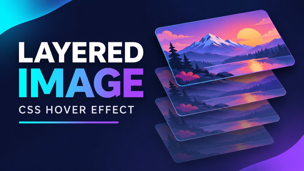
To create a multi-layered image hover effect with CSS, place four copies of the same image inside a positioned container, give each copy a different opacity, and translate them by increasing offsets when the container is hovered. A small rotation of the parent stack adds a 3D-like angle without JavaScript.
This tutorial builds a responsive version of that effect with a native Show layers checkbox. Mouse users can hover; keyboard and touch users can keep the layers open with the checkbox. The transition respects the device’s reduced-motion preference.
What is a layered image hover effect?
A layered image effect separates overlapping copies of an image so they look like a small stack of translucent cards. The top copy stays fully opaque while the copies behind it use lower opacity. Each copy receives a different translation distance, which makes the separation visible.
This is a decorative 2D transform effect with a 3D-like appearance. It does not track pointer position, split a photo into foreground and background, or create true perspective geometry. It is useful for portfolio previews and visual demonstrations when the content remains understandable without the animation.
Try the live CSS image effect
Layered image playground
Hover over the image area with a mouse, or check Show layers to keep the stack open. On a keyboard, focus the checkbox and press Space.

Four copies of one original illustration create the depth effect. Only the top image has descriptive alt text. Reduced motion removes the transition; the checked state still reveals the layers instantly.
1. Add one image and three decorative copies
All four images share the same source, dimensions and crop. The first three copies are decorative and use empty alt text; the final copy describes the illustration once. The checkbox is a real HTML input, so it supports touch and keyboard interaction without a custom button script.
<section class="swcml">
  <label class="swcml-control">
    <input class="swcml-toggle" type="checkbox"> Show layers
  </label>
  <div class="swcml-stage">
    <div class="swcml-stack">
      <img class="swcml-layer" src="assets/mountain-landscape.png" width="900" height="600" alt="" aria-hidden="true">
      <img class="swcml-layer" src="assets/mountain-landscape.png" width="900" height="600" alt="" aria-hidden="true">
      <img class="swcml-layer" src="assets/mountain-landscape.png" width="900" height="600" alt="" aria-hidden="true">
      <img class="swcml-layer" src="assets/mountain-landscape.png" width="900" height="600" alt="Illustrated mountain landscape with a sunset and winding river">
    </div>
  </div>
</section>
The downloaded project includes the original mountain illustration, so the example runs offline. If you replace it with a photograph, update all four source paths and write alt text that matches your new image. Use an image you own or have permission to reuse.
2. Reserve space for the transformed stack
Absolute positioning lets the copies overlap precisely. The outer stage reserves space for the full effect; the stack has its own 3:2 aspect ratio. Percentage widths keep the design inside a narrow content column instead of relying on a fixed 300px image plus large pixel offsets.
.swcml-stage {
  position: relative;
  width: 100%;
  max-width: 680px;
  aspect-ratio: 1.55;
  margin: 20px auto;
  overflow: hidden;
  border-radius: 16px;
  background: #0c1933;
}
.swcml-stack {
  position: absolute;
  width: 54%;
  aspect-ratio: 3 / 2;
  left: 20%;
  top: 33%;
  transform: rotate(-12deg) skewY(4deg);
  --swcml-open: 0;
}
.swcml .swcml-layer {
  position: absolute;
  inset: 0;
  width: 100%;
  height: 100%;
  object-fit: cover;
  border-radius: 9px;
  pointer-events: none;
  opacity: var(--swcml-opacity);
  transform: translate(
    calc(var(--swcml-i) * 8% * var(--swcml-open)),
    calc(var(--swcml-i) * -12% * var(--swcml-open))
  );
  transition: transform .4s ease, opacity .4s ease;
}
The parent rotates the entire stack, while each image translates within it. Transforms change the visual position without reserving more space in normal layout; the stage must therefore allow room for the spread. See MDN’s transform reference for transform functions and coordinate behavior.
3. Assign layer indexes, opacity and order
Use :nth-of-type() to assign each image its own index, opacity and stacking order. Index zero stays in place; indexes one through three move progressively farther. The last image stays fully opaque so the illustration remains crisp.
.swcml-layer:nth-of-type(1) { --swcml-i: 0; --swcml-opacity: .35; z-index: 1; }
.swcml-layer:nth-of-type(2) { --swcml-i: 1; --swcml-opacity: .55; z-index: 2; }
.swcml-layer:nth-of-type(3) { --swcml-i: 2; --swcml-opacity: .75; z-index: 3; }
.swcml-layer:nth-of-type(4) { --swcml-i: 3; --swcml-opacity: 1; z-index: 4; }| Layer | Horizontal offset when open | Vertical offset when open | Opacity |
|---|---|---|---|
| 1 | 0% | 0% | 0.35 |
| 2 | 8% | -12% | 0.55 |
| 3 | 16% | -24% | 0.75 |
| 4 | 24% | -36% | 1 |
These translation percentages are relative to each image’s transform reference box, not the outer stage. Increasing them makes the stack spread farther. Test the largest offset after changing the card size or angle.
4. Support mouse hover, keyboard and touch
The demo uses :has() to connect the checked checkbox to its sibling stage. A separate hover rule applies only when the primary input can hover and has a fine pointer. The checkbox remains available for everyone.
.swcml:has(.swcml-toggle:checked) .swcml-stack {
  --swcml-open: 1;
}
@media (hover: hover) and (pointer: fine) {
  .swcml-stage:hover .swcml-stack { --swcml-open: 1; }
}
.swcml-toggle:focus-visible {
  outline: 3px solid #7346b8;
  outline-offset: 4px;
}
Check Show layers to keep the effect open, or focus the checkbox and press Space. To close it, uncheck the box and move the pointer outside the stage. Hover can still hold it open while the pointer remains inside. The hover media feature describes the primary input’s hovering capability; it does not identify every device attached to a computer.
This version targets current browsers with :has() support. In an older browser without it, the image remains visible and mouse hover can still work, but the checkbox will not change the spread. If those browsers are part of your audience, add a small change handler that toggles a class and use that class alongside the CSS selector.
5. Remove the transition for reduced motion
The user should still be able to inspect both states without the animated movement. Remove the transition when the device requests reduced motion:
@media (prefers-reduced-motion: reduce) {
  .swcml .swcml-layer { transition: none; }
}
The stack then opens instantly. This uses the device preference exposed by prefers-reduced-motion. There is no autoplay or repeating animation in the example.
Download, run and customize the project
- Extract the ZIP and open
index.htmlin a current browser. - Use the checkbox, test Space on the keyboard, and try mouse hover.
- Replace
assets/mountain-landscape.pngwith your own image, keeping all four source paths consistent. - Edit the opacity values, angle and percentage offsets in
style.css. - Test your new crop at a narrow viewport and with reduced motion enabled.
The project includes HTML, CSS, a local illustration and a README. No JavaScript library, server or build step is needed. When adding it to WordPress, keep the styles scoped to the component and check your theme’s image and paragraph rules.
Common problems and fixes
- The copies do not line up: give every image the same source, dimensions, aspect ratio and object-fit setting.
- The stack is clipped: reduce the translation distances or reserve more stage space before removing overflow protection.
- The checkbox appears to do nothing: check browser support for
:has()and confirm the input remains inside the component. - Layers stay open after unchecking: move the mouse away; the hover rule can also open them.
- The effect does not animate: inspect the reduced-motion preference and check for theme rules overriding transitions.
- Screen readers repeat the same description: keep empty alt text on the three decorative copies and a useful description on the top copy only.
Frequently asked questions
Is JavaScript required for the layered image hover effect?
No. CSS controls the transforms, opacity and transition. A native checkbox and :has() add the persistent state in current browsers.
Is this a real 3D effect?
It creates a 3D-like impression with two-dimensional rotation, skew and translation. It does not use perspective or depth-axis positioning.
Can I use different images in each layer?
Yes, but the result becomes a stack of separate cards. This tutorial repeats one image to create a coherent layered silhouette. If each image conveys different information, revise the alternative text and interaction design accordingly.
Why use a checkbox when hover already works?
A checkbox makes the state available on touchscreens and through the keyboard. It also lets a mouse user keep the stack open after moving away.
Can the effect resize on mobile?
Yes. The stage and stack use percentage sizing and aspect ratios, while the translations scale with the images. Check the real image crop and surrounding page at the smallest width you support.
Related CSS tutorials
Continue with the text-to-image hover effect or the CSS button bounce effect for other small interactions.
Conclusion
A multi-layered image effect needs only overlapping copies, clear stacking order and controlled transforms. Keep the source image readable, reserve room for the spread, and provide a keyboard and touch control so the visual treatment is easy to explore.