

Blog
Responsive Sliding Tabs with CSS and jQuery

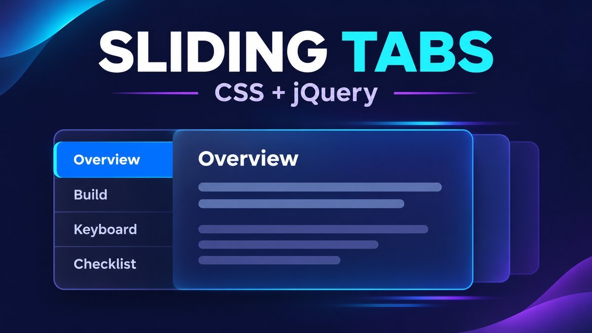
Responsive Sliding Tabs with CSS and jQuery
To create sliding tabs with CSS and jQuery, connect a set of tab links to matching content sections, use jQuery to update the selected tab and hide inactive panels, then animate the newly selected panel with CSS. Keep keyboard focus and panel visibility in sync so the interface works beyond mouse clicks.
This tutorial rebuilds a vertical sliding tab layout as a responsive component. On small screens the navigation becomes a horizontal tab strip. The example includes manual keyboard activation, reduced-motion support and a readable fallback when JavaScript is unavailable.
What are sliding tabs?
Sliding tabs show one of several related content panels within the current page. The slide is a visual entrance effect; the tab state decides which content is available. Use this pattern for related product details, settings categories or tutorial topics. Use ordinary page links when each destination needs its own URL and navigation history.
This example uses a short 240ms transform and opacity animation. It does not move the entire page, auto-rotate topics or wait for an animation timer before accepting another selection.
Try the sliding tabs live demo
Sliding tabs playground
Choose a topic to slide in its panel. Try the keyboard too: arrow keys move focus; Enter or Space opens the focused tab.
01 / THE PATTERN
One topic at a time
Tabs organize related sections inside the same page. This demo reveals one panel with a short slide and keeps your focus on the chosen tab.
- Vertical navigation on wide screens
- Horizontal scrolling tabs on small screens
- All content stays readable without JavaScript
02 / BUILD IT
Start with readable HTML
- Link each tab to a unique section ID.
- Use CSS for layout, focus and motion.
- Enhance the links with jQuery events and ARIA states.
- Test with a mouse, keyboard and a narrow screen.
The ZIP includes local jQuery, CSS and source code. No build step is needed.
03 / TRY THE KEYS
Focus first, activate second
On a wide screen use Up and Down. On a narrow screen use Left and Right. Home and End jump to the first and last tab.
Press Enter or Space to display the focused topic. Press Tab to move into the selected panel. There is no automatic cycling.
04 / PRACTICE
Check your implementation
These practice checkboxes stay checked when you switch away and return.
Practice state is kept only while this page is open; it is not saved to a server.
Motion follows your device’s reduced-motion setting. If JavaScript or jQuery is unavailable, the links jump to the four readable sections below them.
1. Start with linked HTML sections
The unenhanced document is ordinary anchor navigation followed by four visible sections. Do not add hidden in the initial HTML: if a script fails, that would leave the content inaccessible. Each tab needs a unique ID and a destination that matches its panel ID.
<div class="swcst-nav" aria-label="Tutorial topics">
  <a class="swcst-tab" id="swcst-tab-overview" href="#swcst-overview">Overview</a>
  <a class="swcst-tab" id="swcst-tab-build" href="#swcst-build">Build steps</a>
</div>
<div class="swcst-panels">
  <section class="swcst-panel" id="swcst-overview">Overview content</section>
  <section class="swcst-panel" id="swcst-build">Build steps content</section>
</div>
The snippet illustrates two pairs. The complete downloadable project supplies the surrounding component and all four pairs. Keep the tab order and panel order identical; the script uses their indexes to associate them.
2. Style the responsive layout and entrance effect
A two-column grid leaves room for the vertical navigation. The panel column uses minmax(0,1fr) so content can shrink inside the page. At 640px the layout becomes a single column and the tab strip can scroll horizontally without widening the document.
.swcst-shell { display:grid; grid-template-columns:190px minmax(0,1fr); gap:22px; }
.swcst-nav { display:flex; flex-direction:column; gap:8px; min-width:0; }
.swcst [hidden] { display:none !important; }
.swcst-enter { animation:swcst-slide .24s ease-out both; }
@keyframes swcst-slide {
  from { opacity:.45; transform:translateX(var(--swcst-offset,18px)); }
  to { opacity:1; transform:translateX(0); }
}
@media(max-width:640px) {
  .swcst-shell { grid-template-columns:minmax(0,1fr); }
  .swcst-nav { flex-direction:row; overflow-x:auto; }
  .swcst-tab { flex:0 0 auto; white-space:nowrap; }
}
@media(prefers-reduced-motion:reduce) { .swcst-enter { animation:none; } }
The full stylesheet also includes focus indicators, selected-tab colors, panel spacing and rules scoped to this component. Hidden panels are removed from layout rather than simply made transparent. Different panel heights can change the page height; allow the content to grow rather than clipping long text.
3. Enhance the tabs with jQuery
The project uses a locally bundled jQuery 3.7.1 for reproducible offline use. Load that file before script.js in the standalone page. On WordPress, enqueue your script with the existing jquery dependency instead of loading another copy. The initializer checks that jQuery exists before changing the fallback document.
The selection function clears the previous state, reveals one panel and applies a directional entrance class. Here is the core function from the complete script:
        function activate(index, animate) {
          var previous = active;
          active = index;
          $tabs.attr({'aria-selected':'false', tabindex:'-1'});
          $tabs.eq(index).attr({'aria-selected':'true', tabindex:'0'});
          $panels.prop('hidden', true).removeClass('swcst-enter swcst-back swcst-forward');
          var $panel = $panels.eq(index).prop('hidden', false);
          if (animate) {
            $panel.addClass(index < previous ? 'swcst-back' : 'swcst-forward');
            void $panel[0].offsetWidth;
            $panel.addClass('swcst-enter');
          }
        }
$tabs and $panels are scoped to the same component; active begins at zero. The full source also assigns tab roles and label relationships, sets the initial panel, handles keyboard events and keeps the orientation synchronized with the responsive layout. Download the ZIP for the runnable implementation rather than pasting this function alone.
Events are attached through jQuery’s .on() method; see the official jQuery event-handler documentation for direct and delegated binding. No animation-completion timer blocks input, so rapid tab selections remain responsive.
Keyboard behavior and ARIA state
The interface follows the manual activation approach described in the WAI-ARIA tabs pattern. Moving focus and selecting a topic are separate actions. This keeps a user’s current content in place while they explore the tab names.
| Key | Behavior in this demo |
|---|---|
| Tab | Enter the tab list on the selected tab, then move to the visible panel |
| Up / Down | Move among vertical tabs on wide screens, wrapping at the ends |
| Left / Right | Move among horizontal tabs on small screens, wrapping at the ends |
| Home / End | Focus the first or last tab |
| Enter / Space | Activate the focused tab |
After enhancement the navigation has role="tablist", each link has role="tab" and each section has role="tabpanel". The script updates aria-selected, aria-controls and aria-labelledby. Only one tab is in the normal tab sequence. Inactive sections use hidden, which also prevents their checkboxes from receiving keyboard focus.
How to run and customize the download
- Download and extract the source ZIP, then open
index.html. - Edit the text in the four sections. Keep IDs unique and preserve matching tab/panel order.
- Change the colors, spacing and animation duration in
style.css. - If you change the 640px breakpoint, update both the CSS media query and
matchMediainscript.js. - Open
no-script.htmlto inspect the readable fallback.
The ZIP includes HTML, CSS, the complete script, local jQuery with its license and a README. The demo needs no build tools, remote API or server-side storage.
Troubleshooting sliding tabs
- Every section is visible: check that jQuery and the component script loaded in the right order. A script failure intentionally leaves the readable fallback.
- The wrong content opens: verify the tab and panel counts, order, IDs and anchor destinations.
- Keyboard arrows feel wrong after resizing: keep the CSS and JavaScript breakpoints identical.
- Content is clipped: remove fixed heights from your custom panels and check your theme’s overflow rules.
- The slide does not play: check the device’s reduced-motion preference; the demo deliberately disables its entrance effect in that mode.
Frequently asked questions
Can I create sliding tabs without jQuery?
Yes. Plain JavaScript can handle the same state changes and keyboard events. jQuery is used here to match this tutorial’s original topic. CSS supplies the visual transition; JavaScript manages the interactive tab state.
Does the demo work without JavaScript?
All four sections remain visible, and the navigation links jump to their matching section IDs. The enhanced one-panel interface requires JavaScript and jQuery.
Can I add more tabs?
Add one new link and one corresponding section in matching order. Give both unique IDs. The script derives the number of tabs from the component, so the wraparound behavior adapts.
Does changing a tab save form values?
Switching tabs does not recreate the panels, so the sample checkbox state remains while the page stays open. Reloading resets that state. Persisting real form data requires a separate storage design.
Are the tabs automatically changing?
No. A click, Enter or Space selects a topic. Arrow keys only move focus. There is no autoplay.
Continue practicing
For another small interface effect, try the CSS button bounce tutorial. To build a moving headline strip with a pause control, see the horizontal news ticker tutorial.
Conclusion
A useful sliding tab component starts with readable content, adds clear selection state and preserves predictable keyboard navigation. Use the demo and source project as a starting point, then test your actual content, theme styles and assistive-technology requirements.