
Blog
CSS Button Bounce Effect on Hover, Focus and Tap

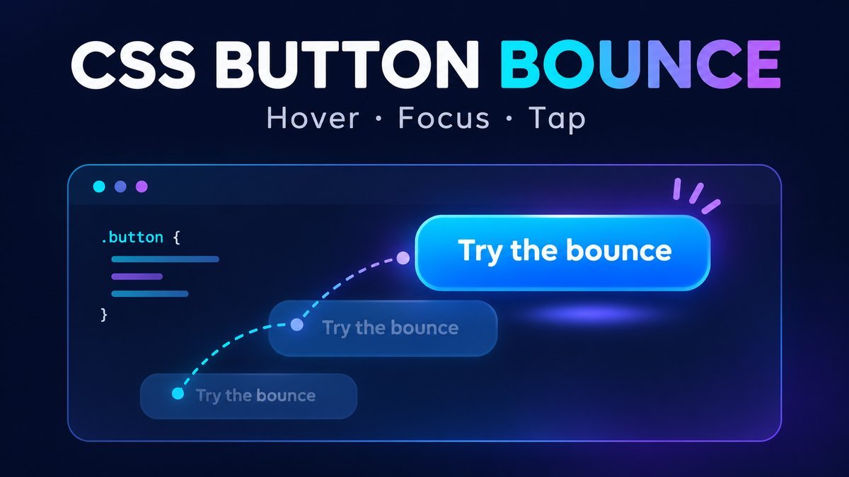
To create a CSS button bounce on hover, define vertical movement with @keyframes and apply a short animation to the button’s inner span when the button is hovered. Add :focus-visible for keyboard users and a prefers-reduced-motion rule that removes the movement when requested.
This tutorial uses a real HTML button, a stable clickable area and a single 650ms bounce. The downloadable project includes two strengths, keyboard focus, an optional tap/click replay and a motion-off control. The bounce itself uses CSS; JavaScript only adds replay and practice status messages.
Live demo: hover, focus or tap a bouncing button
CSS button bounce playground
Hover with a mouse, Tab to a button, or tap/click to replay. Each interaction plays a short bounce; it does not loop continuously.
Classic bounce
14px lift · two small hops
Gentle bounce
6px lift · subtle feedback
Ready. Try either practice button.
These are practice buttons with no purchase, navigation or submission. Your device’s reduced-motion preference also disables the bounce. Keyboard focus remains visible.
1. Use a real button with an inner label
<button type="button" class="bounce"><span>Try the bounce</span></button>A button gives the control native keyboard activation. Use type=”button” for a practice or interface action so it does not accidentally submit a surrounding form. If the real purpose is navigation, use an anchor with a valid href instead.
Animate the inner span rather than the button’s hit area. Keeping the target still helps avoid hover repeatedly ending when a moving button slips out from under the pointer. Extra vertical padding leaves room for the bounce; avoid clipping it inside an overflow:hidden ancestor.
2. Define the bounce with CSS keyframes
/* Keep the button hit area stable; animate its inner label. */
.bounce { padding: 14px 12px; border: 0; background: transparent; cursor: pointer; }
.bounce span { display: block; padding: 14px 24px; border-radius: 12px;
  background: #2455db; color: white; pointer-events: none; }
.bounce:focus-visible { outline: 3px solid #183888; outline-offset: 4px; }
@keyframes button-bounce {
  0%, 100% { transform: translateY(0); }
  35% { transform: translateY(-14px); }
  60% { transform: translateY(0); }
  78% { transform: translateY(-6px); }
}
.bounce:focus-visible span { animation: button-bounce 650ms ease-out 1; }
@media (hover: hover) and (pointer: fine) {
  .bounce:hover span { animation: button-bounce 650ms ease-out 1; }
}
@media (prefers-reduced-motion: reduce) {
  .bounce span { animation: none !important; transform: none !important; }
}
The animation starts at rest, lifts 14 pixels, lands, makes a smaller 6-pixel hop, and returns to rest. The final 1 in the animation shorthand means one iteration. Moving the pointer away removes the hover animation immediately; leaving and re-entering starts it again. Keyboard focus triggers the same effect when it first matches :focus-visible.
CSS keyframes describe intermediate animation states, while the animation property sets duration, easing and iteration behavior. See MDN’s guide to CSS animations and @keyframes reference for the underlying model.
3. Choose an appropriate bounce strength
| Setting | Classic demo | Gentle demo |
|---|---|---|
| First lift | 14px upward | 6px upward |
| Second lift | 6px upward | 3px upward |
| Duration | 650ms | 650ms |
| Iterations | One | One |
The project uses custom properties for the two lift distances. Choose a smaller lift for dense interfaces and leave enough room around the control. Prefer transform over changing layout positions such as top or margins for this effect. See the web.dev discussion of animating transform and opacity; actual rendering performance still depends on the page and device.
4. Support touch and reduced motion
Touch devices do not provide a dependable desktop-style hover interaction. The demo therefore uses a small optional click handler to restart the CSS animation and update an activation count. The same click event also supports native keyboard activation with Enter or Space. The buttons perform no real purchase, navigation or form submission.
The basic CSS example above requires no JavaScript and supports hover and keyboard-focus entry. For repeated tap replay and the counter, use index.html, style.css and script.js from the ZIP. The visual animation remains defined in CSS.
When the device requests reduced motion, the media query disables the bounce. The demo’s “Disable motion” checkbox provides an additional local preview using :has(); it never overrides an operating-system request to reduce motion. Color, text and the focus outline keep the controls understandable without movement. MDN documents how prefers-reduced-motion reflects that user preference.
Download and run the complete example
- Download and extract the source ZIP.
- Open index.html in a current browser. No server, package install, framework or API key is required.
- Hover each button, use Tab to focus it, and activate it with Enter, Space or a tap.
- Check Disable motion and confirm the buttons still activate without bouncing.
Why is my CSS button bounce not working?
- No hover on a phone: use the optional activation replay or make the action work without animation.
- No movement despite activation: check the local motion checkbox and device reduced-motion setting.
- Animation only plays once: one iteration is intentional. Leave and re-enter hover, change keyboard focus, or use the replay handler.
- Bounce gets cut off: inspect parent overflow rules and leave space above the animated label.
- Hover flickers: animate an inner span and keep the button target stationary.
- Theme CSS overrides the example: scope selectors to the component and check computed animation-name, transform and animation-duration.
Frequently asked questions
Can I make a bouncing button with only HTML and CSS?
Yes. The HTML button and CSS example above animate on mouse hover and keyboard-focus entry. JavaScript is optional for replaying on every activation or reporting a click count.
Should the bounce run forever?
Usually a brief response is easier to use. This example plays once per trigger rather than drawing continuous attention. Keep any important action understandable when motion is disabled.
Does animation mean the action succeeded?
No. Motion is decorative feedback. A real interface must report the actual result of its action separately. Here the status only confirms a practice button activation.
Do I need jQuery or vendor-prefixed keyframes?
This project uses native buttons, standard CSS animations and optional plain JavaScript. It has no jQuery dependency or build step. Check your target browser requirements before adding compatibility workarounds.
Conclusion
A useful CSS button bounce combines clear keyframes, a stable hit target, visible keyboard focus and a reduced-motion alternative. Start with the small CSS example, then use the full project when you need repeatable tap feedback and a motion preview.