

Blog
Simple Gradient Background with CSS

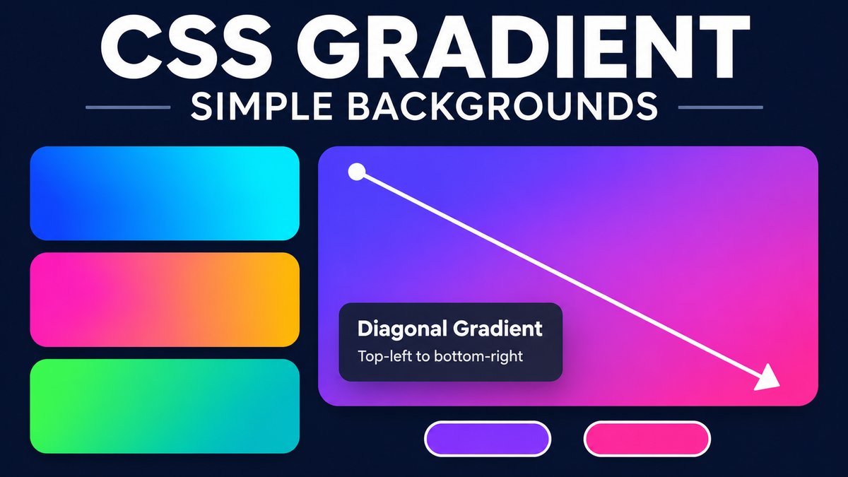
Simple Gradient Background with CSS
To add a simple gradient background to a webpage, use background-image: linear-gradient(direction, first-color, second-color). For example, linear-gradient(to bottom right, #2563eb, #06b6d4) blends blue into cyan diagonally from the top-left toward the bottom-right.
This tutorial explains gradient direction, color stops, a solid fallback and a responsive page example. The live playground lets you compare three color pairs and three directions, then copy the matching CSS. No JavaScript or background image file is needed.
Try the simple CSS gradient live demo
Simple gradient playground
Choose a color pair and direction. The preview and visible CSS update together—no JavaScript required.
A little color, simply
A static CSS background with readable content on a solid card.
background-color: #183154;
background-image: linear-gradient(to bottom rightto rightto bottom, #2563eb, #06b6d4#be185d, #f97316#065f46, #14b8a6);
Select and copy the visible CSS manually. Keyboard users can Tab to a radio group and use arrow keys to change its choice. This demo does not animate or save your choices.
Your browser is showing the default static gradient and its CSS. Interactive choices require CSS :has() support.
What is a CSS linear gradient?
A linear gradient is a CSS-generated image that blends colors along a straight direction. Apply it to an element’s background to style a page, hero section, card or button. It scales with the element, so there is no separate raster asset to download for the gradient.
linear-gradient() is a function that produces an image, not a color value. Use it with background-image or a suitable background shorthand, rather than background-color. See MDN’s linear-gradient reference for the function syntax and direction model.
1. Add two colors and a fallback
Start with a solid background color, then add the gradient as the image layer above it. Keeping the properties separate makes the fallback easy to understand.
.hero {
  background-color: #183154;
  background-image: linear-gradient(to bottom right, #2563eb, #06b6d4);
  padding: 4rem 1.5rem;
  border-radius: 1rem;
}
The first color begins at the start of the gradient and the last color ends it. With no explicit color-stop positions, these two colors span the gradient from start to end. Change the hex values to match your design.
The background-color property supplies the solid layer. A later background shorthand can reset background settings, so check the cascade if the fallback or gradient disappears after adding another rule.
2. Choose the direction
The keyword after to describes where the gradient heads. For example, to right starts the first color on the left and ends the second color on the right.
| Direction | Color flow |
|---|---|
to right |
Left to right |
to left |
Right to left |
to bottom |
Top to bottom; the default when direction is omitted |
to top |
Bottom to top |
to bottom right |
From the top-left toward the bottom-right |
You can also use angles: 0deg points upward, 90deg points right, and 180deg points downward. A corner keyword such as to bottom right adapts to the element’s proportions; it is not always identical to a fixed 135deg direction in a non-square element.
/* Horizontal blue-to-cyan blend */
background-image: linear-gradient(to right, #2563eb, #06b6d4);

/* Vertical pink-to-orange blend */
background-image: linear-gradient(to bottom, #be185d, #f97316);

/* Fixed-angle blend */
background-image: linear-gradient(135deg, #065f46, #14b8a6);
3. Add more colors or explicit stops
A gradient can contain more than two colors. Place a percentage after a color to control where that stop appears. Use stops deliberately: adding many colors close together can create abrupt visual bands.
.hero {
  background-image: linear-gradient(
    to right,
    #2563eb 0%,
    #7c3aed 50%,
    #db2777 100%
  );
}
This example places blue at the start, violet halfway through and pink at the end. A stop marks a color’s position along the gradient line; it is not necessarily the same as an element’s horizontal position when the line is diagonal.
4. Create a complete responsive page
Use normal document flow and a minimum viewport height so the page can grow when its text grows. A gradient does not require a fixed 780px height, external font or vendor-prefixed declarations for this basic current-browser example.
<!doctype html>
<html lang="en">
<head>
  <meta charset="utf-8">
  <meta name="viewport" content="width=device-width, initial-scale=1">
  <title>Simple gradient background</title>
  <style>
    * { box-sizing: border-box; }
    body {
      margin: 0;
      min-height: 100vh;
      background-color: #183154;
      background-image: linear-gradient(to bottom right, #2563eb, #06b6d4);
      font: 1rem/1.7 system-ui, sans-serif;
    }
    main {
      max-width: 44rem;
      margin: 0 auto;
      padding: clamp(2rem, 8vw, 6rem) 1.25rem;
    }
    .content-card {
      padding: 2rem;
      border-radius: 1rem;
      background: #101d36;
      color: #fff;
    }
    h1 { line-height: 1.2; }
  </style>
</head>
<body>
  <main>
    <section class="content-card">
      <h1>A simple CSS gradient</h1>
      <p>Readable content over a blue-to-cyan background.</p>
    </section>
  </main>
</body>
</html>
For a component inside an existing site, apply the background to that component instead of changing the global body rule. The downloadable playground follows this approach by keeping its styling inside a dedicated wrapper.
Keep text readable over gradient backgrounds
A white heading can be readable over a dark endpoint and difficult to read over a pale one. Check every area behind the actual text, not just the two color values. This demo places text on an opaque dark card, so its background stays consistent as the gradient choice changes.
If you prefer text directly over the gradient, choose a suitable text color and verify the complete design’s contrast. A decorative gradient should not be the only way to communicate a state or distinguish an important action.
How the playground controls work
The playground uses native radio groups and CSS :has() selectors. A selected color pair changes one custom property, and a selected direction changes another. The visible CSS output shows the matching values.
.swcsg {
  --swcsg-direction: to bottom right;
  --swcsg-colors: #2563eb, #06b6d4;
}
.swcsg-preview {
  background-image: linear-gradient(var(--swcsg-direction), var(--swcsg-colors));
}
.swcsg:has(#swcsg-sunset:checked) {
  --swcsg-colors: #be185d, #f97316;
}
.swcsg:has(#swcsg-right:checked) {
  --swcsg-direction: to right;
}
The standard gradient does not depend on :has(). Only the interactive teaching controls use it. Browsers without that selector see the default static gradient and its code, with the controls hidden. The demo contains no animation or automatic motion.
Download and customize the example
- Extract the source ZIP and open
index.htmlin a current browser. - Try the color pairs and directions. Select and copy the visible CSS manually.
- Edit
style.cssto change the component’s layout or presets. - When adding a preset, update both its CSS variables and its visible code values.
- Test the result with your real text at a narrow screen width.
The ZIP includes HTML, CSS and a README and works offline. For arbitrary colors, angles and custom stop positions, use the site’s CSS Gradient Generator after checking its controls. The small playground here focuses on the basic two-color syntax.
Common gradient problems
- No gradient appears: use
background-image, check the function syntax, and confirm the element has visible height. - The page cuts off long content: use a minimum height and let the document grow rather than forcing a fixed height.
- The direction is unexpected: read
to rightas heading toward the right. Swap the colors if you want the opposite color order. - Another rule removes the gradient: inspect later
backgroundshorthand rules and more specific theme selectors. - Text is hard to read: use a stable contrasting content panel or revise the text and background colors.
Frequently asked questions
Do CSS gradients need an image file?
No. The browser generates the gradient from the CSS function.
What is the difference between background and background-image?
background-image sets the image layer. background is a shorthand that can set and reset several background properties at once.
Can I use a gradient on a button or card?
Yes. Apply the same image function to that element and check its text contrast, focus indicator and interaction states.
Does a simple gradient animate automatically?
No. A linear gradient is static unless you add a separate animation or other state change. For motion, see the animated gradient background tutorial.
Can I use radial or conic gradients instead?
Yes. They create different shapes: radial gradients spread from a center, while conic gradients rotate around one. This tutorial focuses on straight-line color blends.
Conclusion
A simple CSS gradient needs a direction and two colors. Add a solid fallback, let the layout grow with its content, and make foreground text readable. Use the live example to compare the basic choices before adapting the CSS to your page.