

Blog
Customize a File Upload Button with Pure CSS

Customize a File Upload Button with Pure CSS
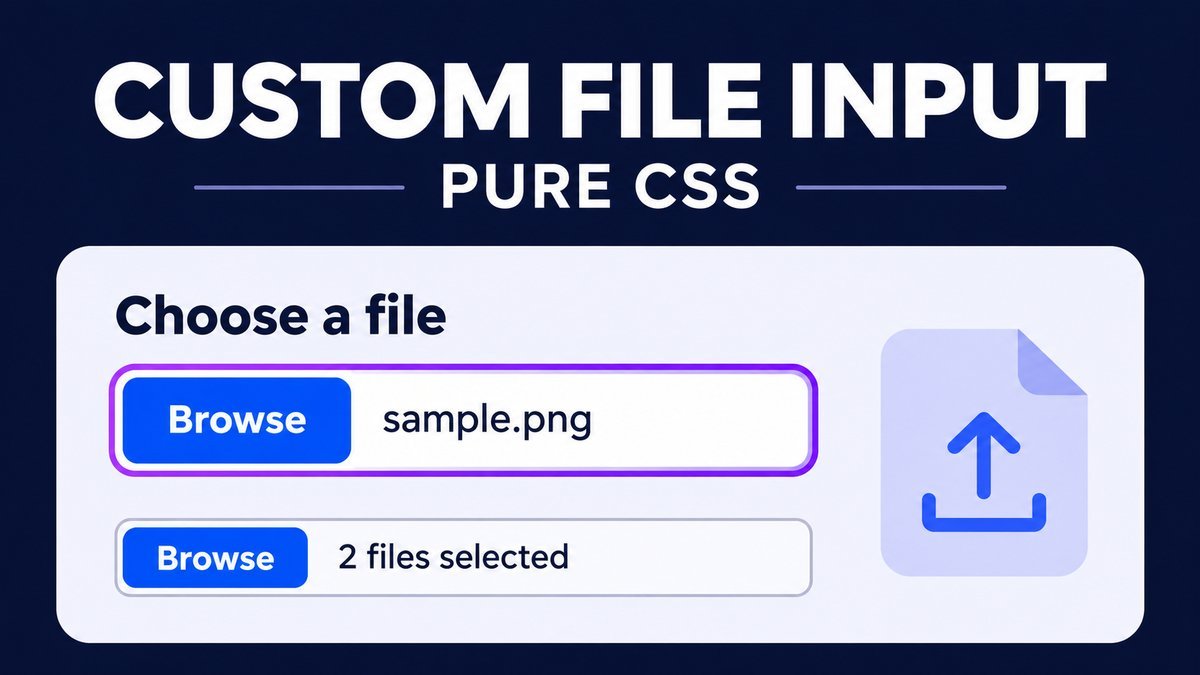
To customize a file upload button with pure CSS, keep the native <input type="file"> and style its ::file-selector-button pseudo-element. You can change the button’s colors, padding, border and hover state while preserving the browser’s file picker and selected-file display.
This tutorial includes labeled single-file, multiple-file and disabled examples, with keyboard focus and responsive sizing. The live demo only selects files locally. Sending them to a server requires separate application behavior.
Try the custom file input live demo
Custom file input playground
Open a native file picker and inspect the styled button and filename display. This demo selects files locally; it has no upload request or submit action.
One image. The image filter is a chooser hint, not file validation.
PDF or text files; multiple selection is enabled. The browser controls how names or a file count are displayed.
A native disabled example. It cannot open the picker and is skipped in keyboard navigation.
Tab to either enabled input, then use your browser’s activation key to open the picker. Reload the page to start a fresh selection. No JavaScript, custom filename script or hidden overlay button is used.
Why use the native file input?
The browser already provides the picker, selected-file status and keyboard behavior. Styling the selector button lets you keep those features instead of covering an invisible input with a separate fake button. It also avoids needing a script just to show the selected filename.
The file-selector-button reference describes the pseudo-element that targets this native button. Browsers without that styling support still have a functional file input, though its appearance may differ.
1. Add a visible label and helper text
Associate the label with the input’s ID. Use aria-describedby to connect a short explanation of the expected selection.
<label for="profile-image">Choose an image</label>
<input
  class="file-input"
  id="profile-image"
  type="file"
  accept="image/*"
  aria-describedby="profile-image-help"
>
<p id="profile-image-help">Choose one image.</p>
The input stays visible and focusable. There is no nested button, transparent overlay or replacement textbox. Change the IDs if you place more than one copy of the example on a page.
2. Style the input and its selector button
.file-input {
  display: block;
  width: 100%;
  max-width: 100%;
  min-width: 0;
  box-sizing: border-box;
  padding: 8px;
  border: 1px solid #a8bddf;
  border-radius: 9px;
  background: white;
  color: #183154;
  font: 15px/1.5 system-ui, sans-serif;
}
.file-input::file-selector-button {
  font: 700 15px/1.5 system-ui, sans-serif;
  padding: 10px 16px;
  margin-right: 14px;
  border: 2px solid #2455d9;
  border-radius: 6px;
  background: #2455d9;
  color: white;
  cursor: pointer;
  transition: background-color .2s ease, border-color .2s ease;
}
The input rule styles the surrounding field and filename area. The pseudo-element styles only the picker button. Its text and the file-selection wording remain under the browser and operating system’s control, so they can vary by language and platform.
Set the button’s font explicitly rather than assuming every style inherits from the input. A smaller right margin or button padding can help keep space for filenames on a phone.
3. Add hover and a visible focus indicator
Keep a clear outline around the input for keyboard users. The hover rule is limited to a primary fine pointer that supports hovering, so touch users can simply activate the native picker.
.file-input:focus-visible {
  outline: 3px solid #7346b8;
  outline-offset: 4px;
}
.file-input:not(:disabled):focus-visible::file-selector-button {
  background: #173d9e;
  border-color: #173d9e;
}
@media (hover: hover) and (pointer: fine) {
  .file-input:not(:disabled):hover::file-selector-button {
    background: #173d9e;
    border-color: #173d9e;
  }
}
@media (prefers-reduced-motion: reduce) {
  .file-input::file-selector-button { transition: none; }
}
The picker remains native. Keyboard users can reach the input with Tab and use the browser’s activation key. Reduced motion removes the color transition without removing any selection behavior.
4. Enable multiple files or suggest file types
Add multiple when the user may choose several files. Use accept to suggest file categories or extensions in the picker.
<label for="documents">Choose documents</label>
<input
  class="file-input"
  id="documents"
  type="file"
  accept=".pdf,.txt"
  multiple
>
The file input reference explains these selection attributes and the native filename display. A multiple input may show a count instead of every filename. Do not assume every browser presents the selected list identically.
The accept attribute is a selection hint, not validation. A real upload application must independently validate file content, allowed types, size and count on the server. CSS cannot enforce those rules, and a filename extension alone is not trustworthy validation.
5. Style a disabled file input
Use the native disabled attribute when selection is unavailable. It prevents activation and removes the control from normal keyboard navigation.
<label for="unavailable">Unavailable file input</label>
<input class="file-input" id="unavailable" type="file" disabled>

<style>
.file-input:disabled {
  background: #f2f4f7;
  color: #667085;
  border-color: #c7d0df;
}
.file-input:disabled::file-selector-button {
  background: #e4e9f1;
  color: #667085;
  border-color: #c7d0df;
  cursor: not-allowed;
}
</style>
A disabled appearance should not be created only with opacity or a gray color while leaving selection active. Use the real attribute and explain why a control is unavailable where that matters to the user.
Selecting a file is different from uploading it
A file input records a user selection in the browser. This page has no upload form submission, network upload handler or image-preview script. Choosing a file here does not send it to SanWebCorner.
In a real application, uploads need a form or script and a receiving endpoint. An HTML form sending files normally uses POST with enctype="multipart/form-data". Add the appropriate server handling and validation separately; the downloadable styling demo does not implement an upload service.
Browsers also protect local filesystem details. Do not attempt to preset an arbitrary local file through an input value or rely on a visible path string as a real full filesystem path.
Download and adapt the source
- Extract the ZIP and open
index.html. - Choose a harmless sample file and inspect the browser’s selected-file display.
- Try multiple selection in the document input and Tab through the enabled controls.
- Edit colors, padding and borders in
style.css. - Test long filenames and narrow layouts with your browser and operating system.
The project contains HTML, CSS and a README. It works offline with no dependencies. Keep the component styles scoped when adding them to WordPress, and connect an upload backend only when your application actually needs one.
Common problems and fixes
- The fake button opens nothing: use the real visible file input and style its selector button directly.
- The filename disappears: avoid covering or hiding the entire input with a custom overlay.
- The field overflows: use border-box sizing, a maximum width and
min-width:0inside flexible layouts. - The browser shows a different button label: native wording is browser and language dependent; CSS does not replace it with arbitrary text.
- An unwanted file can still be chosen: accept is a hint. Validate real uploads at the receiving endpoint.
- The name is truncated: a narrow native widget may shorten its display. That alone does not mean the file was rejected.
Frequently asked questions
Can I customize an upload button without JavaScript?
Yes. Use ::file-selector-button for its appearance. JavaScript is only needed for extra application behavior such as custom previews or asynchronous transfer.
Can CSS change the native button text?
This approach preserves the browser’s text. Arbitrary replacement wording requires a different control design and additional care to retain native accessibility and selected-file feedback.
Does multiple automatically upload several files?
No. It permits multiple selection. Sending the chosen files still requires form submission or a script.
Why keep the input visible?
It preserves the native selector, file status and keyboard behavior without an invisible overlay or a separate filename script.
Will the style look identical everywhere?
No. The CSS controls many visual properties, but native labels, picker dialogs and selected-file text can differ between browsers and systems.
More CSS practice
Explore the transparent button hover effect for coordinated background and text states, or the gradient underline tutorial for keyboard-aware link styling.
Conclusion
Style the native file selector rather than replacing its behavior. Keep labels, focus and file status visible, let the control fit small screens, and treat real upload processing as a separate application feature.