

Blog
CSS Toggle Switch: Activate and Deactivate with Pure CSS

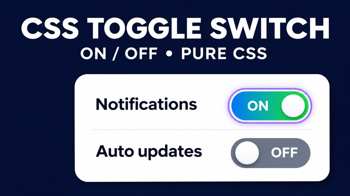
CSS Toggle Switch: Activate and Deactivate with Pure CSS
To create an on/off toggle switch with pure CSS, style a native checkbox and use :checked to change its track and thumb position. Keep the input focusable, give it a stable visible label, and use role="switch" when the control represents a setting that is on or off.
This tutorial rebuilds a simple activate/deactivate switch with keyboard support, visible On/Off text, a disabled example and responsive styling. The embedded controls change only their local checked state. They do not activate an account, save preferences or call a server.
Try the CSS toggle switch live demo
CSS toggle switch playground
Click a setting or focus its switch and press Space. These are local demo controls; they do not change your account or save preferences.
Managed setting is disabled for this example. Its On state is visible, but it cannot be changed.
No JavaScript or dependencies. Thumb position and visible On/Off text show the state alongside color. Your browser may restore form state when reloading.
How the on/off switch works
The checkbox handles interaction. CSS reads its checked state and paints a pill-shaped track and circular thumb. The same input remains in the keyboard order, so no script is needed to add basic toggling. A surrounding label makes the setting name clickable as well.
The WAI-ARIA switch pattern describes a two-state on/off control and requires a stable label. Space changes the focused switch. When a switch uses an HTML checkbox, its native checked state supplies the state rather than a separate manually maintained aria-checked value.
1. Write a labeled native checkbox
Use a setting name that stays the same in both states. The visible status can change from Off to On, but it should not become part of a changing accessible name.
<label class="toggle-row" for="notifications">
  <span id="notifications-label">Notifications</span>
  <input class="toggle" id="notifications" type="checkbox"
         role="switch" aria-labelledby="notifications-label">
  <span class="status" aria-hidden="true">
    <span class="off">Off</span><span class="on">On</span>
  </span>
</label>
The input is still a real checkbox. The switch role describes its on/off meaning to assistive technology; the native input provides focus and keyboard behavior. The status is hidden only from the accessibility tree because the checked state already communicates on/off. The setting name remains visible and explicitly connected to the input.
2. Draw the track and thumb with CSS
Remove the default checkbox appearance from the actual input, give it a fixed track size and draw a decorative thumb with ::before. Do not remove the input with display:none, which also removes it from normal keyboard interaction.
.toggle-row {
  display: grid;
  grid-template-columns: minmax(0, 1fr) 64px 36px;
  align-items: center;
  gap: 16px;
  min-height: 84px;
  padding: 18px;
  cursor: pointer;
}
.toggle {
  appearance: none;
  position: relative;
  width: 64px;
  height: 34px;
  margin: 0;
  padding: 0;
  border: 2px solid #526079;
  border-radius: 999px;
  background: #526079;
  cursor: pointer;
  transition: background-color .2s, border-color .2s;
}
.toggle::before {
  content: "";
  position: absolute;
  top: 3px;
  left: 3px;
  width: 24px;
  height: 24px;
  border-radius: 50%;
  background: white;
  transform: translateX(0);
  transition: transform .2s;
}
The input has a 64-pixel outer width with a 2-pixel border on each side. The 24-pixel thumb has a 3-pixel inset; moving it 30 pixels places it at the opposite end. Use box-sizing:border-box on the component so these dimensions stay consistent. If you change the track width, update the translation too.
3. Use :checked for the active state
.toggle { box-sizing: border-box; }
.toggle:checked { background: #087a59; border-color: #087a59; }
.toggle:checked::before { transform: translateX(30px); }
.status .on { display: none; }
.toggle:checked ~ .status .off { display: none; }
.toggle:checked ~ .status .on { display: inline; }
The input and status must be siblings in this order for the ~ selector to match. Color is accompanied by thumb position and visible words, so a user does not have to distinguish gray from green to interpret the state. The state words are real HTML text rather than generated CSS content.
4. Keep keyboard focus and respect reduced motion
.toggle:focus-visible {
  outline: 3px solid #7346b8;
  outline-offset: 4px;
}
@media (prefers-reduced-motion: reduce) {
  .toggle, .toggle::before { transition: none; }
}
Tab reaches each enabled input. Space toggles the focused switch and its native checked state. Keep room around the track so the outline is not clipped by a parent with hidden overflow. Reduced motion removes the brief slide without removing the control’s functionality.
The downloadable stylesheet also includes a forced-colors fallback that restores the native input appearance and hides its decorative thumb. Check this behavior on the browsers, operating systems and assistive technologies your audience uses.
5. Set the initial state or disable a switch
<!-- Initially on -->
<input class="toggle" type="checkbox" role="switch"
       aria-label="Automatic updates" checked>
<!-- On, but unavailable for interaction -->
<input class="toggle" type="checkbox" role="switch"
       aria-label="Managed setting" checked disabled>
These short attribute examples use accessible names for clarity; use the visible-label structure from step 1 in your interface. checked sets the initial state. disabled prevents changes and skips the control during normal Tab navigation. Explain why a setting is unavailable instead of relying on a gray track alone.
The MDN checkbox reference explains form behavior: an unchecked checkbox does not contribute a name/value pair on submission. A real settings form must handle the absent value explicitly. The checked attribute describes the default; application code reads the current checked property when it needs the live state.
What CSS does and what your application must do
CSS can show an on/off state. It cannot save a preference, change a user’s permissions or confirm that a remote setting was updated. Those actions require application logic and, where needed, a server endpoint. This demo deliberately has no saving or account behavior.
For production, decide whether a switch applies immediately or belongs to a form with a Save button. Show pending and failure feedback when saving remotely. Do not claim that a setting was saved just because the thumb moved. Use checkboxes for inclusion choices and switches for settings whose meaning is naturally on/off.
Download and customize the example
The source ZIP contains index.html, style.css and a README. Extract it and open the HTML file directly. There are no libraries, fonts, JavaScript files or build commands. Change the scoped colors and labels, keep unique IDs for repeated instances, and test the control after placing it inside your own theme.
Common toggle switch problems
- Tab cannot reach the switch: keep the native input in the document and avoid hiding it with display:none.
- The thumb moves outside the track: calculate the translation from the track width, border, thumb size and inset.
- Both status words appear: keep the input before the status element and check for conflicting theme styles.
- The label changes when toggled: use a fixed setting name and expose state through the native input.
- The state resets or is restored unexpectedly: browser form restoration is different from an application’s persistent preference storage.
Frequently asked questions
Can I create a toggle switch without JavaScript?
Yes. A native checkbox changes its checked state, while CSS styles the track, thumb and status text. JavaScript is needed only for additional application behavior such as saving preferences or controlling another component.
Should I add aria-checked to a checkbox switch?
Use the native checked state for an input of type checkbox with role switch. Avoid a hard-coded aria-checked value that can disagree with the actual input after interaction.
Is an on/off switch the same as activating an account?
No. A visual switch records a local state. Real activation needs an authorized application action and confirmation of its result. The example does not change any account.
Can I use this on mobile?
The label is a larger clickable row and the grid lets its text shrink or wrap beside the fixed track. Test narrow screens, long setting names, zoom and your target mobile browsers.
Related CSS tutorials
Continue with a custom file upload button or a transparent button hover effect to practice native controls and visible focus styles.