
Blog
CSS Button Hover Animations: Halftone and Blinds Effects

CSS Button Hover Animations: Halftone and Blinds Effects
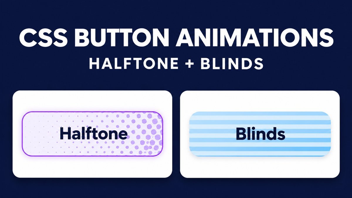
Create animated CSS button backgrounds with gradients, @keyframes and a decorative pseudo-element. This tutorial builds two effects: halftone dots that close into a fill, and horizontal blinds that tighten into a solid background. Both work on keyboard focus as well as mouse hover.
The examples use native buttons, readable dark text, fixed borders and a reduced-motion fallback. A CSS-only preview checkbox lets touch users inspect the effect without depending on hover. No JavaScript or animation library is required.
Try the animated button live demo
CSS button animation playground
Hover with a mouse or Tab to a button. On touch screens, use the preview checkbox to keep both effects visible. These buttons demonstrate styling only and perform no action.
Lavender dots tighten into a solid fill.
Blue horizontal bands close into a solid fill.
Each effect runs once for 1.2 seconds and holds its final fill while its trigger remains active. Turn preview off and leave focus/hover before replaying. Reduced motion shows a static fill.
How the two hover effects work
A decorative ::before layer covers the button’s background while the text stays above it. Halftone uses a repeating radial gradient; blinds uses a repeating linear gradient. Keyframes reduce the size of the pattern tiles and finish with a matching solid background color.
The MDN keyframes reference explains how named keyframes define intermediate animation styles. Here, the animation runs once for 1.2 seconds and retains its last frame while the triggering selector still matches. It does not run continuously.
1. Use semantic button markup
Use a button for an action and an anchor with an actual destination for navigation. This styling playground uses buttons with no action; it does not submit a form or open another page.
<button class="effect-button halftone" type="button">
  <span>Halftone effect</span>
</button>
<button class="effect-button blinds" type="button">
  <span>Blinds effect</span>
</button>
The text span is a separate layer above the background. Keep meaningful labels when adapting the effect to real actions. Explicit type="button" prevents a sample button from accidentally submitting a surrounding form.
2. Add a stable base and decorative layer
.effect-button {
  position: relative;
  isolation: isolate;
  overflow: hidden;
  min-height: 62px;
  padding: 16px 22px;
  border: 2px solid #5a4b8a;
  border-radius: 10px;
  background: white;
  color: #182347;
  font: 750 17px/1.4 system-ui, sans-serif;
  cursor: pointer;
}
.effect-button span { position: relative; z-index: 1; }
.effect-button::before {
  content: "";
  position: absolute;
  inset: 0;
  z-index: 0;
  opacity: 0;
  pointer-events: none;
}
The pseudo-element cannot intercept clicks because it ignores pointer events. The border has the same width before, during and after animation, so the effect does not push nearby content around. The text color stays dark against the white and pale colored backgrounds.
3. Animate a halftone pattern
.halftone::before {
  background-image: radial-gradient(
    circle, #ddd3ff 42%, transparent 44%
  );
  background-size: 20px 20px;
}
@keyframes dots-fill {
  0% { background-size: 20px 20px; background-color: transparent; }
  90% { background-size: 3px 3px; background-color: transparent; }
  100% { background-size: 3px 3px; background-color: #ddd3ff; }
}
.halftone:focus-visible::before {
  opacity: 1;
  animation: dots-fill 1.2s ease-out forwards;
}
The gradient repeats across the layer. Its tiles become smaller until a solid lavender background closes the gaps at the end. The color change belongs to the decorative layer, so the button label is not animated or hidden.
4. Animate horizontal blinds
.blinds::before {
  background-image: linear-gradient(#b7e4ff 50%, transparent 50%);
  background-size: 100% 20px;
}
@keyframes blinds-fill {
  0% { background-size: 100% 20px; background-color: transparent; }
  90% { background-size: 100% 2px; background-color: transparent; }
  100% { background-size: 100% 2px; background-color: #b7e4ff; }
}
.blinds:focus-visible::before {
  opacity: 1;
  animation: blinds-fill 1.2s ease-out forwards;
}
A linear gradient makes horizontal colored bands with transparent gaps. Reducing the tile height makes the bands finer, then a solid blue fill finishes the effect. Keep decorative animation small and brief; a busy moving pattern is usually unsuitable for large reading areas.
5. Add mouse hover without losing keyboard focus
.effect-button:focus-visible {
  outline: 3px solid #7346b8;
  outline-offset: 4px;
}
@media (hover: hover) and (pointer: fine) {
  .halftone:hover::before {
    opacity: 1;
    animation: dots-fill 1.2s ease-out forwards;
  }
  .blinds:hover::before {
    opacity: 1;
    animation: blinds-fill 1.2s ease-out forwards;
  }
}
The hover effect is limited to a primary fine pointer that supports hovering. Keyboard users get the same decorative fill through :focus-visible, plus a separate outline. Keep that outline even when the background is filled; color animation is not a substitute for a focus indicator.
Multiple triggers can overlap. If a button remains focused or the preview checkbox is checked, moving the pointer away will not necessarily clear the effect. Remove all active triggers before replaying it.
6. Provide a touch-friendly preview
The complete demo includes a native checkbox labeled Preview both effects. A scoped :has() selector applies each animation while that checkbox is checked. This is a demonstration control, not part of a production button’s action.
/* The checkbox and buttons are inside .playground. */
.playground:has(.preview:checked) .halftone::before {
  opacity: 1;
  animation: dots-fill 1.2s ease-out forwards;
}
.playground:has(.preview:checked) .blinds::before {
  opacity: 1;
  animation: blinds-fill 1.2s ease-out forwards;
}
Browsers that do not support this selector can still use the hover and focus rules. The downloadable stylesheet uses unique component classes and keyframe names to avoid collisions with a site’s theme. The checkbox stays visible and works with a label click or the Space key.
7. Respect reduced motion and forced colors
@media (prefers-reduced-motion: reduce) {
  .effect-button::before {
    animation: none !important;
    background-image: none;
  }
  .halftone::before { background-color: #ddd3ff; }
  .blinds::before { background-color: #b7e4ff; }
}
The reduced-motion version shows the final color immediately when a trigger is active. There is no pattern animation. The MDN reduced-motion reference describes how this media feature detects a user preference to minimize nonessential motion.
The source also hides the decorative layer in forced-colors mode and uses system button colors. Test these modes on your target platforms. Avoid making a successful action depend on the user seeing an animation.
Download and adapt the source
Extract the ZIP and open index.html directly. The package contains the page, style.css and a README, with no external dependencies. Change the pale pattern colors, duration or border radius, then test keyboard use, long labels, narrow screens and your site’s surrounding styles.
Animating background size can cause repainting. This example limits the area to two small buttons and runs only on interaction. For a page with many animated controls, measure actual performance on your target devices instead of assuming every effect is cheap.
Common problems and fixes
- The pattern covers the label: place the text span above the pseudo-element with a higher stacking level.
- The effect does not restart: uncheck preview and remove both focus and hover before triggering it again.
- The button jumps: keep border width and padding consistent across states.
- Touch users cannot inspect it: keep the native preview checkbox in the demo and make real actions work without hover.
- The theme changes the colors: scope the component styles and inspect the final computed styles after embedding.
Frequently asked questions
Do CSS button animations need JavaScript?
No. These effects use gradients, keyframes and CSS interaction selectors. JavaScript is only needed if your actual button action or application state requires it.
What is the difference between halftone and blinds?
The halftone pattern repeats circles in both directions. The blinds pattern repeats horizontal bands. Both reduce their tile size and finish with a solid pale fill.
Why does the effect remain filled after it finishes?
The animation uses forwards fill mode, which retains the final keyframe while the animation remains applied. Clearing every triggering state removes it and restores the base appearance.
Can I replace a link with a button just for this style?
Choose the element by its purpose. Use a real link for navigation and a button for an action. Adapt the visual classes while preserving the element’s normal keyboard behavior.
Related CSS tutorials
Try a transparent button hover effect or a CSS on/off toggle switch for more interaction styling examples.