
Blog
CSS Vertical Menu: Expand on Hover and Keyboard Focus

CSS Vertical Menu: Expand on Hover and Keyboard Focus
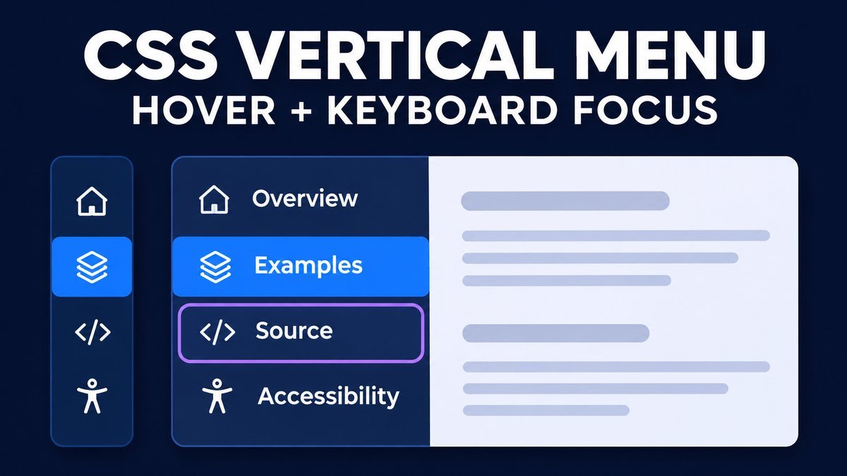
To build a vertical menu that expands on hover, give the navigation rail a compact width and expand it with :hover and :focus-within. Keep real links and their accessible names in the HTML. Show the labels automatically on small or touch screens so users can navigate without a mouse.
This tutorial creates a CSS-only rail with four links, a persistent expanded-view checkbox, visible keyboard focus and a reduced-motion fallback. The menu reserves its expanded width on wide layouts instead of covering the content beside it.
Try the expanding vertical menu live demo
Expanding vertical menu playground
Hover the rail or Tab to a navigation link. Use the checkbox for a persistent expanded view. Links jump to the example sections shown beside or below the menu.
Overview
A compact rail expands to reveal labels. The wide layout reserves room, so the menu does not cover this content.
Examples
Hover the rail with a mouse, Tab through its links, or keep labels visible with the checkbox above.
Source
The downloadable project is plain HTML and CSS. Its four links navigate to these example sections.
Accessibility
Real links retain their names when labels are visually clipped. Small and touch screens show all labels by default.
At narrow widths and on touch-oriented devices, labels remain visible automatically. Unchecking the box cannot collapse that layout. No JavaScript, external icons or fonts are required.
Use navigation links, not an application menu role
A sidebar that links to pages or sections is ordinary navigation. Use a named nav, a list and anchors with real destinations. It does not need a custom keyboard model or an ARIA menu role.
The WAI-ARIA navigation example explains why typical site navigation uses normal link semantics rather than the menu widget role. Our example expands a rail’s visual labels; it does not hide a submenu or implement that example’s disclosure controls.
1. Write a semantic vertical link list
<nav class="rail" aria-label="Demo section navigation">
  <ul>
    <li><a href="#overview">
      <span class="marker" aria-hidden="true">01</span>
      <span class="link-text">Overview</span>
    </a></li>
    <li><a href="#examples">
      <span class="marker" aria-hidden="true">02</span>
      <span class="link-text">Examples</span>
    </a></li>
  </ul>
</nav>
The numbered markers are decorative and do not replace a link’s name. In a production sidebar you can use suitable icons, but the text must still identify each destination. Do not assign every item the same placeholder URL. The demo’s four links point to four actual sections within its content panel.
2. Reserve room for the expanded rail
.stage {
  display: grid;
  grid-template-columns: 232px minmax(0, 1fr);
  gap: 22px;
  align-items: start;
}
.rail {
  width: 64px;
  max-width: 100%;
  overflow: hidden;
  background: #142b50;
  border-radius: 12px;
  transition: width .25s ease;
}
.rail ul { list-style: none; margin: 0; padding: 0; }
.rail a {
  display: flex;
  align-items: center;
  min-height: 56px;
  width: 100%;
  color: white;
  text-decoration: none;
}
.marker { flex: 0 0 64px; text-align: center; }
.link-text { flex: 0 0 152px; opacity: 0; }
The wide layout keeps a 232-pixel slot even when the rail is only 64 pixels wide. This uses more horizontal space, but expanding the rail does not move the adjacent content or cover any controls. The downloadable component adds padding and scoped styles so theme rules are less likely to interfere.
The label is visually clipped by the rail and made transparent; it stays in the accessibility tree. Avoid display:none, visibility:hidden or aria-hidden="true" on the destination text when that text provides the link’s name.
3. Expand on mouse hover and keyboard focus
.rail:focus-within { width: 232px; }
.rail:focus-within .link-text { opacity: 1; }
.rail a:focus-visible {
  outline: 3px solid #bda4ff;
  outline-offset: -4px;
  background: #274b80;
}
@media (hover: hover) and (pointer: fine) {
  .rail:hover { width: 232px; }
  .rail:hover .link-text { opacity: 1; }
  .rail a:hover { background: #274b80; }
}
The MDN focus-within reference explains that the selector matches an element when it or a descendant has focus. That keeps the rail expanded as Tab moves between its links.
The focus outline sits inside the link because the rail clips overflow. Mouse hover is enabled only for a primary fine pointer that supports hover. Enter follows the focused link; Tab and Shift+Tab use the browser’s normal order. This component does not implement arrow-key menu navigation.
4. Offer a persistent expanded view
A native checkbox can keep labels visible without JavaScript. The complete demo uses :has() so extra paragraph wrappers added by a CMS do not break this relationship. Keep it inside the component so a parent :has() selector can read its checked state. Its visible label describes a preference, rather than pretending to be a scripted disclosure button.
<input id="pin-labels" class="pin" type="checkbox">
<label for="pin-labels">Keep labels visible</label>
<div class="stage">
  <!-- rail and content panel; all inside .playground -->
</div>
<style>
.playground:has(.pin:checked) .rail { width: 232px; }
.playground:has(.pin:checked) .link-text { opacity: 1; }
</style>
Click the label or focus the checkbox and press Space. The browser exposes its checked state automatically. Do not hard-code aria-expanded on a CSS-only control and let it become inconsistent with hover, focus or responsive rules. If you instead need a disclosure that hides destinations, implement a complete disclosure pattern with accurate state management.
5. Keep labels visible on small and touch screens
@media (max-width: 700px) {
  .stage { grid-template-columns: minmax(0, 1fr); }
}
@media (max-width: 700px), (hover: none), (pointer: coarse) {
  .rail,
  .rail:focus-within,
  .playground:has(.pin:checked) .rail { width: 100%; }
  .link-text { opacity: 1; flex: 1 1 auto; }
}
The comma-separated conditions are alternatives: any one of them enables full labels. A narrow layout stacks navigation above the content. On a wide touch device, the rail fills its reserved slot. This avoids requiring a first tap merely to discover what an icon means.
Because these rules intentionally keep navigation readable, unchecking Keep labels visible cannot collapse the small-screen or touch layout. Test hybrid devices too: media queries describe the available primary interaction characteristics, not every possible way a person may interact.
6. Respect motion and high-contrast preferences
@media (prefers-reduced-motion: reduce) {
  .rail, .link-text { transition: none; }
}
Removing the transition makes label changes immediate while preserving navigation. The source also uses system colors for links and focus in forced-colors mode. Test your target operating systems and assistive technologies before using the pattern in a production application.
This demo is not a popover: it does not overlay other content or hide destinations behind a modal surface. If you change it into an overlay or a dismissible submenu, review the additional focus, dismissal and state requirements of that component instead of relying on these visual rules alone.
Download and adapt the source
The ZIP contains index.html, style.css and a README. Extract it and open the HTML file directly. There are no external fonts, icon libraries, JavaScript files or build commands.
Replace the example fragments with actual destinations, update the labels and use unique checkbox and section IDs when adding more than one instance. Change the expanded rail width and grid slot together. Allow extra room for long translated names, increased text size and zoom. Keep a full-label version available when icons would be ambiguous.
Common problems and fixes
- The menu closes while tabbing: apply focus-within to the navigation parent, not only focus to a single label.
- The focus outline disappears: use an inset outline or avoid clipping the indicator.
- Screen readers announce unnamed links: keep real link text available and hide only decorative markers.
- Expansion covers the page: reserve the expanded width or redesign the layout deliberately as a disclosure.
- The mobile checkbox appears ineffective: full labels are already enabled by the responsive rules.
Frequently asked questions
Can a vertical menu expand without JavaScript?
Yes. CSS hover, focus-within and a checkbox’s checked state can control the visual rail width. The actual navigation still comes from ordinary anchors.
Why should keyboard focus expand the menu?
A keyboard user needs the same destination labels a mouse user sees. Focus-within keeps them visible while any link inside the rail is focused.
Should this navigation use role menu?
No. This example is a list of site or section links, so native navigation and link semantics are appropriate. An ARIA menu widget has a different interaction model.
Are the links hidden when the rail collapses?
No. Their decorative labels are visually clipped, but the links remain focusable and retain their accessible names. Focusing a link expands the rail.
Related CSS tutorials
Continue with a CSS toggle switch or CSS button hover animations for more examples of focus-aware styling.