

Blog
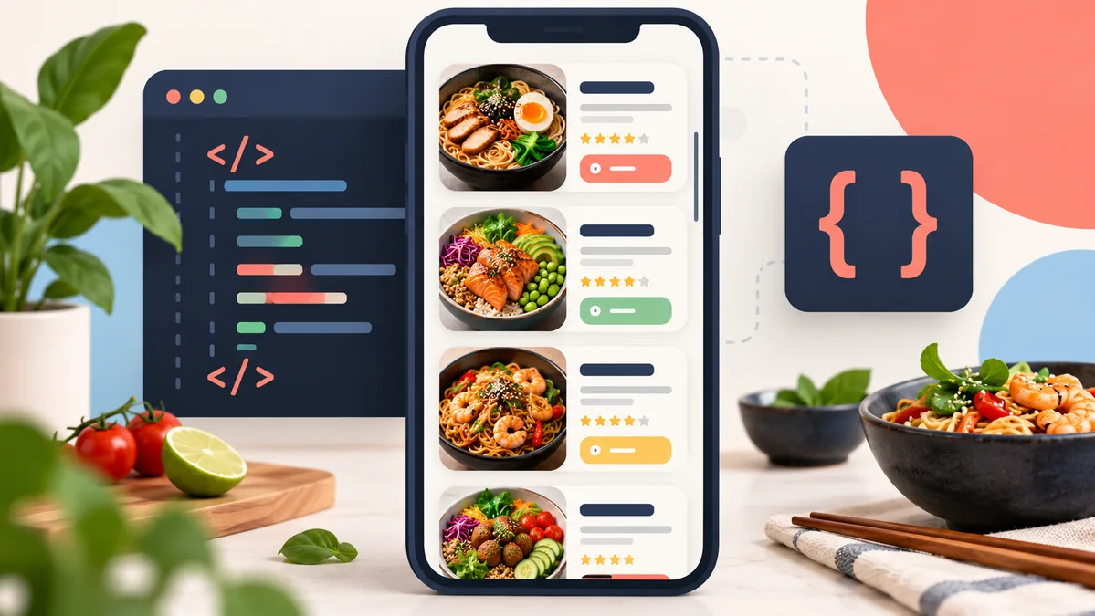

Build a Scrollable Food Menu Card with HTML and CSS
Learn how to turn a stack of food cards into a compact, scrollable menu using semantic HTML and modern CSS. This responsive example uses overflow-y: auto for the scrolling area and optional CSS scroll snapping to make each dish easier to browse. It needs no JavaScript or external libraries.
Quick answer: Give a menu wrapper a constrained block size and overflow-y: auto. Put the cards inside it, then add scroll-snap-type: y proximity to the wrapper and scroll-snap-align: start to each card. The scroll snap is an enhancement; normal scrolling still works without it.
Live Demo: Scroll the Food Menu
Use the keyboard Tab key to focus the menu, then scroll with the wheel, touch, or arrow keys. The “Add” controls are visual only; this front-end demo does not connect to a cart or payment system.
How the CSS scrolling works
The menu list has a maximum height, so its contents can overflow vertically without stretching the whole page. overscroll-behavior: contain helps prevent a wheel gesture at the list edge from unexpectedly scrolling an outer panel. Scroll snapping gently aligns a card after scrolling; the proximity value keeps the browser in control instead of forcing every movement to a stop.
Each card uses a two-column grid: a decorative food illustration and a flexible details area. At narrow widths, a media query reduces the illustration column and page padding. Text remains in the document flow, so longer dish names can wrap without overlapping the price.
HTML structure
Keep each dish in its own <article> and give the scroll area a useful accessible name. A tabindex="0" makes the region keyboard-focusable in browsers where a scrollable region is not focusable by default. The complete runnable markup, including all four cards, is in the download package.
Key CSS
Apply vertical overflow to the menu list rather than each card. Add a visible focus style and do not rely on a custom scrollbar as the only hint that more content is available.
Make the component your own
- Change
max-heighton.menu__listto show more or fewer cards before scrolling. - Use
scroll-snap-type: y mandatoryonly when every scroll step should align; it can feel restrictive for variable-height cards. - Replace the demo’s decorative emoji art with optimized food images. Give informative images descriptive alt text; use empty alt text for purely decorative images.
- Connect each button to real cart behavior only after adding the appropriate form, state handling, and accessible feedback.
Accessibility and responsive behavior
The menu is labelled as a region and can receive keyboard focus. The decorative artwork is hidden from screen readers, while each button has a dish-specific accessible name. The layout uses flexible columns and a small-screen breakpoint. Test with keyboard navigation and at your own content lengths; avoid clipping card text with a fixed height.
Troubleshooting
The list does not scroll
Confirm that the scroll container has a constrained height or max-height, and that its children are taller than the available space. overflow-y: auto has no visible effect when everything fits.
Scroll snapping feels too strong
Switch from mandatory to proximity, or remove scroll-snap-type. Snapping is optional and should not make the list difficult to browse.
The menu is wider than a phone screen
Use minmax(0, 1fr) for flexible grid columns, allow text to wrap, and reduce horizontal padding at a small breakpoint.
Frequently asked questions
Can I make a scrollable food menu with CSS only?
Yes. CSS can create the scroll area, card layout, scrollbar styling, hover and focus states, and scroll snapping. JavaScript is only needed for application behavior such as adding an item to a cart.
Should I use mandatory scroll snap?
Usually, start with proximity for a list of cards. It helps users settle near card boundaries without taking full control of scrolling.
Do the demo buttons place an order?
No. They illustrate the appearance of menu actions only. A real ordering flow needs application logic and a secure backend.
Download the source
The ZIP contains a complete index.html, styles.css, and a short README. Extract the files and open index.html in a modern browser. No build step or dependencies are required.
TODAY'S MENU
Fresh picks
Scroll the list to explore the menu.
Garden fried rice
$12Ginger rice, crisp vegetables, and toasted sesame.
Sesame noodle bowl
$14Chilled noodles, cucumber, herbs, and sesame sauce.
Market garden salad
$11Seasonal greens, avocado, tomato, and lemon dressing.
Roasted veggie tacos
$13Charred peppers, corn salsa, and bright lime crema.
Demo only: the Add buttons are visual and do not place an order.
<div class="menu__list" role="region" aria-label="Scrollable food menu" tabindex="0">
  <article class="food-card">
    <div class="food-card__art" aria-hidden="true">🍛</div>
    <div class="food-card__info">
      <div class="food-card__top">
        <h2>Garden fried rice</h2>
        <span class="food-card__price">$12</span>
      </div>
      <p>Ginger rice, crisp vegetables, and toasted sesame.</p>
      <button type="button" aria-label="Add Garden fried rice to your order">Add +</button>
    </div>
  </article>
</div>.menu__list {
max-height: 26rem;
overflow-y: auto;
overscroll-behavior: contain;
scroll-snap-type: y proximity;
scrollbar-color: #a7b8df #f0f3f9;
scrollbar-width: thin;
}
.food-card {
display: grid;
grid-template-columns: 6.5rem minmax(0, 1fr);
scroll-snap-align: start;
}
.menu__list:focus-visible {
outline: 3px solid #89aaf8;
outline-offset: -4px;
}
@media (max-width: 390px) {
.food-card {
grid-template-columns: 5rem minmax(0, 1fr);
}
}
@media (prefers-reduced-motion: reduce) {
.menu__list {
scroll-behavior: auto;
}
}