

Blog
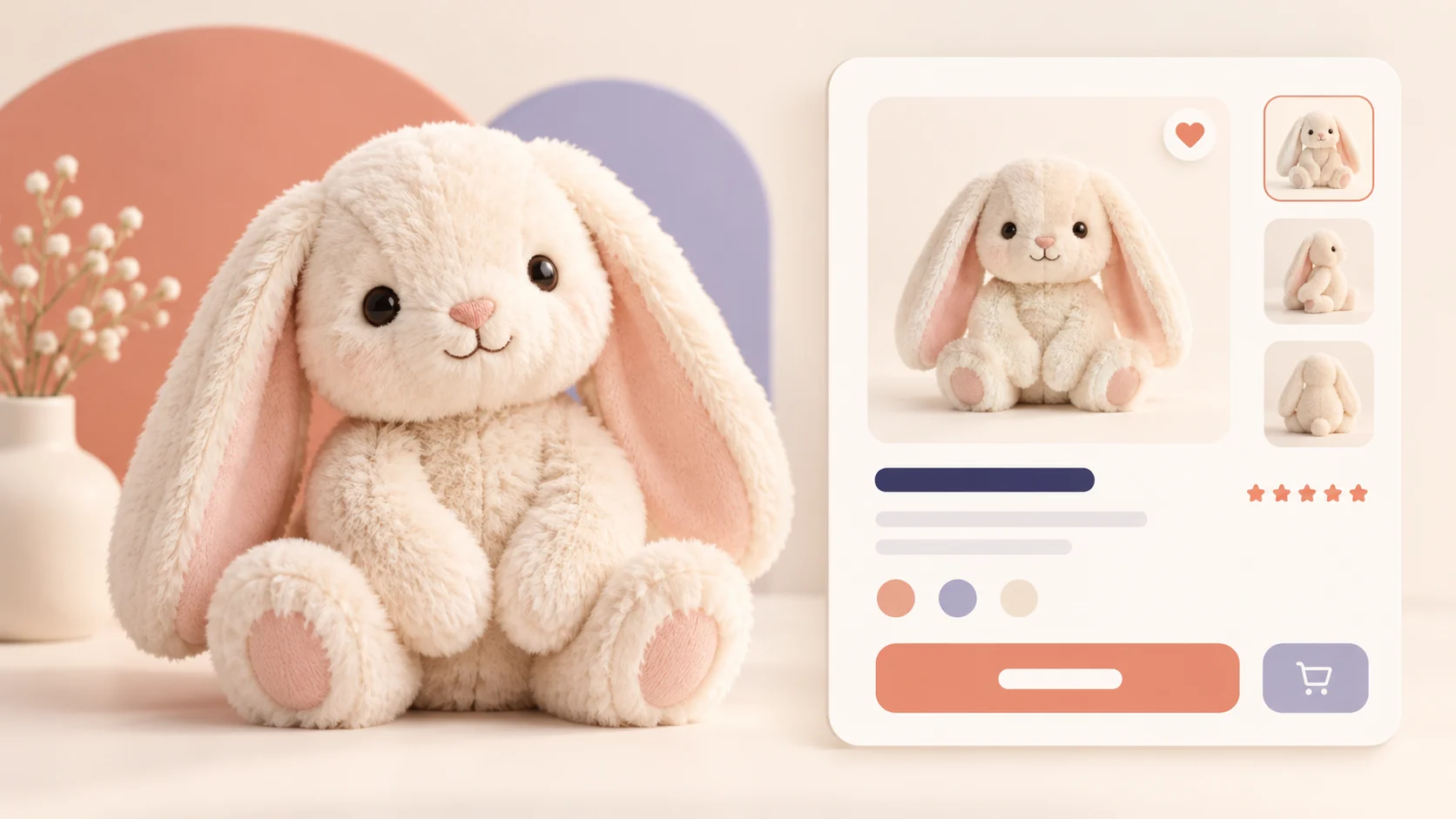

Build a Responsive Product Card with HTML, CSS and JavaScript
A product card brings the details shoppers need—an image, price, options, and a clear action—into one compact component. In this tutorial, you will build a responsive e-commerce product card with color swatches, quantity controls, a wishlist toggle, and an accessible add-to-cart message using plain HTML, CSS, and JavaScript.
Quick answer: Use semantic HTML for product details and buttons, CSS Grid for a responsive card layout, and small JavaScript event handlers to keep each option and status message in sync.
Try the interactive product card
Select a color, adjust the quantity, save the item to your wishlist, or add it to the demo cart. These controls run in your browser and are for learning; the example is not connected to an online store.
PLAYTIME · 3+ YEARS
Soft Bunny Plush
A cuddly, cloud-soft companion made for stories, naps, and big adventures.
♡ Free delivery on orders over $50
What makes a useful product card?
A product card gives shoppers a quick, scannable summary of one item. Include a clear product name, useful image, price, availability, selectable options, and an obvious action. In this example, the card also demonstrates quantity, wishlist, and color controls.
1. Structure the card with semantic HTML
Use an article or section for the card, a heading for the product name, and real buttons for actions. Add accessible names to controls and use a polite live region for cart feedback so assistive technology can announce updates.
2. Create a responsive layout with CSS
CSS Grid can place the product image beside the details on wider screens and stack them on narrow screens. Keep styles scoped to the card class so they do not affect the rest of your WordPress theme. Add visible keyboard focus, readable color contrast, and flexible image sizing.
3. Add small interactions with JavaScript
Use event listeners to update quantity, selected color, and wishlist state. Keep quantity at one or higher. The demo’s cart button shows a confirmation message only; it does not connect to a store, process payments, or save orders.
Build the product card step by step
- Choose the product details and an optimized image.
- Write semantic markup for the image, name, price, options, and buttons.
- Style the card with a responsive grid and clear focus states.
- Add JavaScript for the controls and announce status changes.
- Test the layout at mobile and desktop sizes, with a keyboard and screen reader.
Accessibility and performance tips
Provide descriptive alternative text for meaningful product images, label every control, and do not rely on color alone to show a selection. Use compressed WebP or AVIF images with explicit dimensions to reduce layout shifts. Respect reduced-motion preferences if you add animation.
Common issues
The card overflows on mobile
Allow the grid to become one column at a narrow breakpoint, set images to max-width: 100%, and avoid fixed widths that exceed the viewport.
The quantity can drop below one
Clamp the updated value with Math.max(1, value) and keep the displayed number synchronized with the value used by the cart action.
Frequently asked questions
Can I build a product card without JavaScript?
Yes. HTML and CSS can display the product and style links or form controls. JavaScript is useful for interactive swatches, quantity buttons, wishlist toggles, and immediate cart feedback.
Does this demo connect to an online store?
No. It is a front-end learning example. Connect the controls to your store platform’s product and cart APIs before using them for real purchases.
How do I add more product colors?
Add a button for each option with a clear accessible label, then update the selected state and product presentation when it is activated.
Conclusion
A responsive product card combines clear product information with focused, accessible controls. Use the live example above to try the interactions, then download the source files and adapt the markup and styles to your project.
<article class="product-card" aria-labelledby="product-name">
  <div class="product-image">
    <img src="images/soft-bunny.svg" alt="Cream plush bunny with long ears">
  </div>
  <div class="product-details">
    <p class="category">Playtime</p>
    <h2 id="product-name">Soft Bunny Plush</h2>
    <p class="price">$24.00</p>
    <button class="add-to-cart" type="button">Add to cart</button>
    <p class="cart-message" aria-live="polite"></p>
  </div>
</article>.product-card {
display: grid;
grid-template-columns: 1fr 1fr;
overflow: hidden;
max-width: 860px;
margin: auto;
border-radius: 1.25rem;
background: #fff;
box-shadow: 0 1rem 2.5rem #30203b12;
}
.product-image {
display: grid;
place-items: center;
min-height: 25rem;
background: linear-gradient(145deg, #fae8e5, #f3eaf7 56%, #e5eff0);
}
.product-details { padding: 2rem; }
@media (max-width: 40rem) {
.product-card { grid-template-columns: 1fr; }
.product-image { min-height: 19rem; }
}const card = document.querySelector('.product-card');
const quantity = card.querySelector('.quantity');
const message = card.querySelector('.cart-message');
let count = 1;
card.querySelector('.plus').addEventListener('click', () => {
count += 1;
quantity.textContent = count;
});
card.querySelector('.minus').addEventListener('click', () => {
count = Math.max(1, count - 1);
quantity.textContent = count;
});
card.querySelector('.add-to-cart').addEventListener('click', () => {
message.textContent = count + ' item(s) added to your demo cart.';
});