
Blog
Responsive Call-to-Action Section with HTML and CSS

Responsive Call-to-Action Section with HTML and CSS
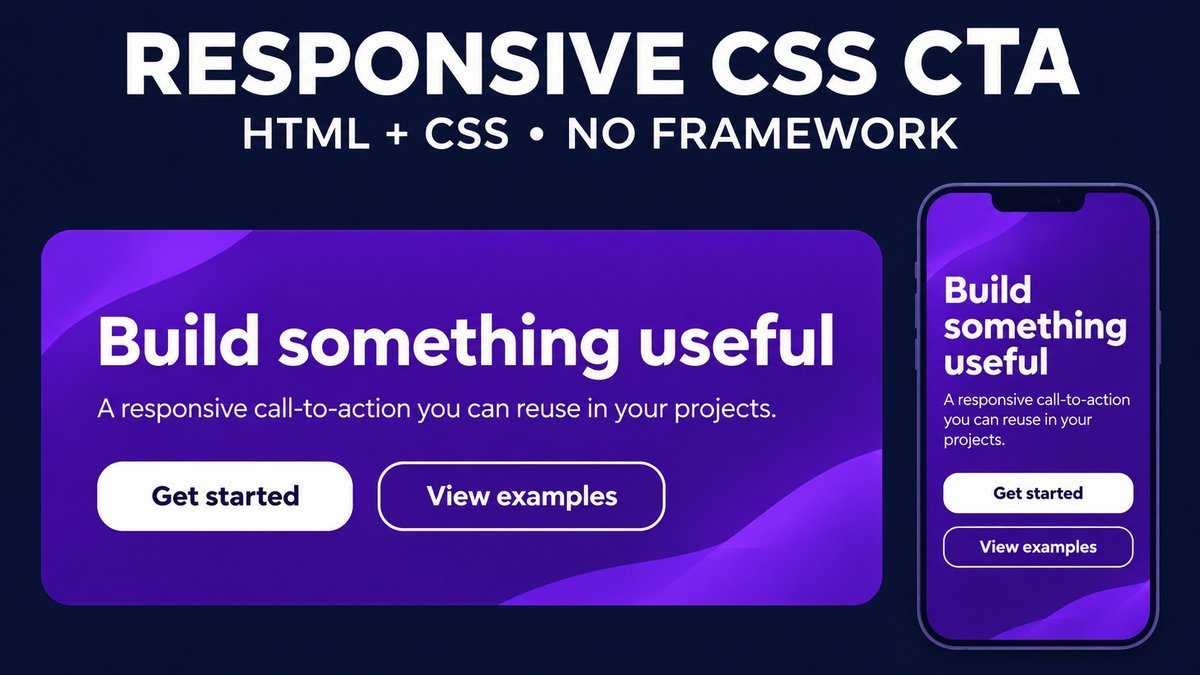
Create a responsive call-to-action section with a clear heading, a short explanation and a link to a useful next step. CSS Grid can place the message beside the action on wide layouts and stack them when the component becomes narrow. No Bootstrap or JavaScript is required.
This tutorial builds a reusable CTA card with primary and secondary links, visible keyboard focus, three demo color themes and a small-screen layout. Both demo links have real local destinations, so you can test the interaction without a signup or payment flow.
Try the responsive call-to-action live demo
Responsive CTA playground
Choose a color theme or preview a stacked layout. Both call-to-action links jump to real example sections below the card. No signup, payment or form submission occurs.
Build steps
Write a specific headline, add a short explanation, choose an actual destination and test the CTA with a keyboard and a narrow screen.
Design notes
Give one action visual priority, keep the label descriptive and let text and links wrap. Replace these local example destinations with your real URLs.
Theme and stacked-preview controls use CSS :has(). If unsupported, the default Ocean card and responsive layout remain usable. No JavaScript or framework is required.
What belongs in a call-to-action section?
A CTA connects a message to a specific next step. Use a heading that explains the value, a brief sentence that supplies context and an action label that tells the visitor what will happen. One prominent action is usually easier to understand than a row of equally emphasized choices.
In this example, See build steps is the primary link and Read design notes is the quieter secondary link. They navigate to sections in the same page. In your project, replace them with destinations that match the visitor’s intent, such as a tutorial, signup page or product information page. A visual CTA alone does not implement any of those services.
1. Write semantic HTML for the message and action
<section class="cta" aria-labelledby="cta-title">
  <div class="cta-copy">
    <h2 id="cta-title">Build your next interface</h2>
    <p>Start with a small, readable component.</p>
  </div>
  <div class="cta-links">
    <a class="cta-primary" href="#build-steps">See build steps</a>
    <a class="cta-secondary" href="#design-notes">Read design notes</a>
  </div>
</section>
Choose a heading level that fits the surrounding page rather than picking it for its default font size. A named section provides context for its content. Keep the actual headline in HTML so it remains readable, selectable and available to assistive technology.
The MDN anchor reference explains that links navigate to URLs, including locations within the same page. Use an anchor when the CTA navigates, and use a native button for an action such as opening a dialog or submitting a form. Do not nest a button inside a link just to get button styling.
2. Use Grid for a flexible two-column layout
.cta {
  display: grid;
  grid-template-columns: minmax(0, 1fr) minmax(170px, auto);
  align-items: center;
  gap: 28px;
  padding: clamp(22px, 4vw, 38px);
  border-radius: 16px;
  background: #16375f;
  color: white;
}
.cta h2 { margin: 0 0 12px; line-height: 1.2; }
.cta p { max-width: 50ch; margin: 0; }
.cta-links { display: flex; flex-direction: column; gap: 10px; }
.cta * { box-sizing: border-box; }
The message column can shrink because it uses minmax with a zero minimum. The action column keeps enough room for its labels. Spacing comes from gap and padding rather than empty Bootstrap columns. There is no fixed height, so longer text can increase the card’s height instead of being clipped.
3. Give the primary link clear visual priority
.cta-links a {
  display: inline-flex;
  align-items: center;
  justify-content: center;
  min-height: 48px;
  padding: 12px 18px;
  border: 2px solid white;
  border-radius: 8px;
  background: white;
  color: #16375f;
  text-align: center;
  text-decoration: none;
  font-weight: 750;
  white-space: normal;
}
.cta-links .cta-secondary { background: transparent; color: white; }
.cta-links a:focus-visible {
  outline: 3px solid #ffe49b;
  outline-offset: 4px;
}
A filled primary link stands out from an outlined secondary link. Keep their labels descriptive even if the surrounding paragraph is not read. Avoid a generic Click here label or a promise the destination cannot fulfill. If only one next step is useful, remove the secondary link.
Keep a visible focus indicator and enough space around the actions so it is not clipped. Link labels should wrap when needed. Recheck contrast whenever you change colors, including hover and focus states; a pleasant palette does not automatically make every state readable.
4. Stack the CTA based on its container width
A card may be placed in a narrow article column even when the browser window is wide. A container query can respond to the space available to the component instead of relying only on the viewport.
.cta-wrapper { container: cta / inline-size; }
@container cta (max-width: 620px) {
  .cta { grid-template-columns: minmax(0, 1fr); }
}
/* Basic viewport fallback */
@media (max-width: 640px) {
  .cta { grid-template-columns: minmax(0, 1fr); }
}
The MDN container-query guide describes applying styles based on a containing element’s size. Set the containment context on a wrapper and query styles on a descendant card. The complete demo uses this relationship with a scoped container name.
The viewport rule provides a simple fallback for small browser windows. In a browser without container-query support, a narrow column inside a wide window may need an additional layout rule. Test the actual embedding location, long headings and browser zoom rather than relying on one device width.
5. Make themes easy to change
The demo uses custom properties for the card’s background and the primary link’s text color. The three palettes keep a dark background behind white text. For a production component, choose your palette directly in CSS and remove the demo controls.
.cta {
  --cta-background: #4e286d;
  --cta-ink: #4e286d;
  background: var(--cta-background);
}
.cta-primary { color: var(--cta-ink); }
The playground’s native radio group changes these values with CSS :has(). A checkbox forces the stacked layout for comparison on a wide screen. These controls are preview tools, not a theme preference saved to your account. Browsers without that selector still show the default Ocean card and its responsive links.
6. Keep motion and high-contrast modes usable
The CTA has no animated entrance, bouncing text or automatic movement. It uses only a short background-color change on mouse hover. The source removes that transition when reduced motion is requested, and it uses system colors in forced-colors mode.
@media (prefers-reduced-motion: reduce) {
  .cta-links a { transition: none; }
}
A CTA should remain understandable without a hover effect. Keyboard users need a visible focus indicator, and touch users need the same destination without a preliminary hover. Do not hide essential wording behind an animation.
Choose an honest destination and message
If the link says Download source, it should reach the promised source. If it says Start a free trial, the destination should explain the trial’s actual terms. Styling cannot create a subscription, process a payment or confirm a submitted request.
There is no universal CTA color or layout that guarantees higher conversion. Assess the message, placement, destination and user outcome in context. If you measure performance, define a meaningful outcome rather than treating every click as a successful signup or purchase.
Download and reuse the example
Extract the ZIP and open index.html. The project contains HTML, style.css and a README. It runs offline with no framework, JavaScript, external fonts or images.
Replace the demo message and links, select a fixed palette and remove the radio and checkbox controls when they are no longer useful. Give repeated instances unique heading and destination IDs, and use different radio-group names if you keep multiple playgrounds on one page.
Common CTA layout problems
- The text is squeezed beside the action: stack earlier using the component width, or reduce the number of actions.
- The button label overflows: allow wrapping and avoid a fixed button height.
- The focus ring disappears: avoid clipping the action container and preserve an explicit focus-visible style.
- The CTA looks clickable but goes nowhere: replace placeholder links with actual destinations.
- Styles change after embedding: scope the component and inspect the final theme styles.
Frequently asked questions
Do I need Bootstrap for a CTA section?
No. HTML, Grid and Flexbox are enough for the example. A framework can be useful in a larger project, but this component has no framework dependency.
Should a CTA be a link or a button?
Use a link for navigation and a button for an action. The demo navigates to local sections, so its calls to action are anchors styled as prominent controls.
Can I use only one action?
Yes. Remove the secondary link if the message has one useful next step. The layout still works with a single primary action.
Does the demo collect signup information?
No. It changes only visual preview settings and navigates to example sections. No form, account creation or data submission is implemented.
Related CSS tutorials
Try a transparent button hover effect or CSS button animations to adapt the action styling further.