

Blog

How to Build a Responsive Sidebar Menu with HTML, CSS, and JavaScript
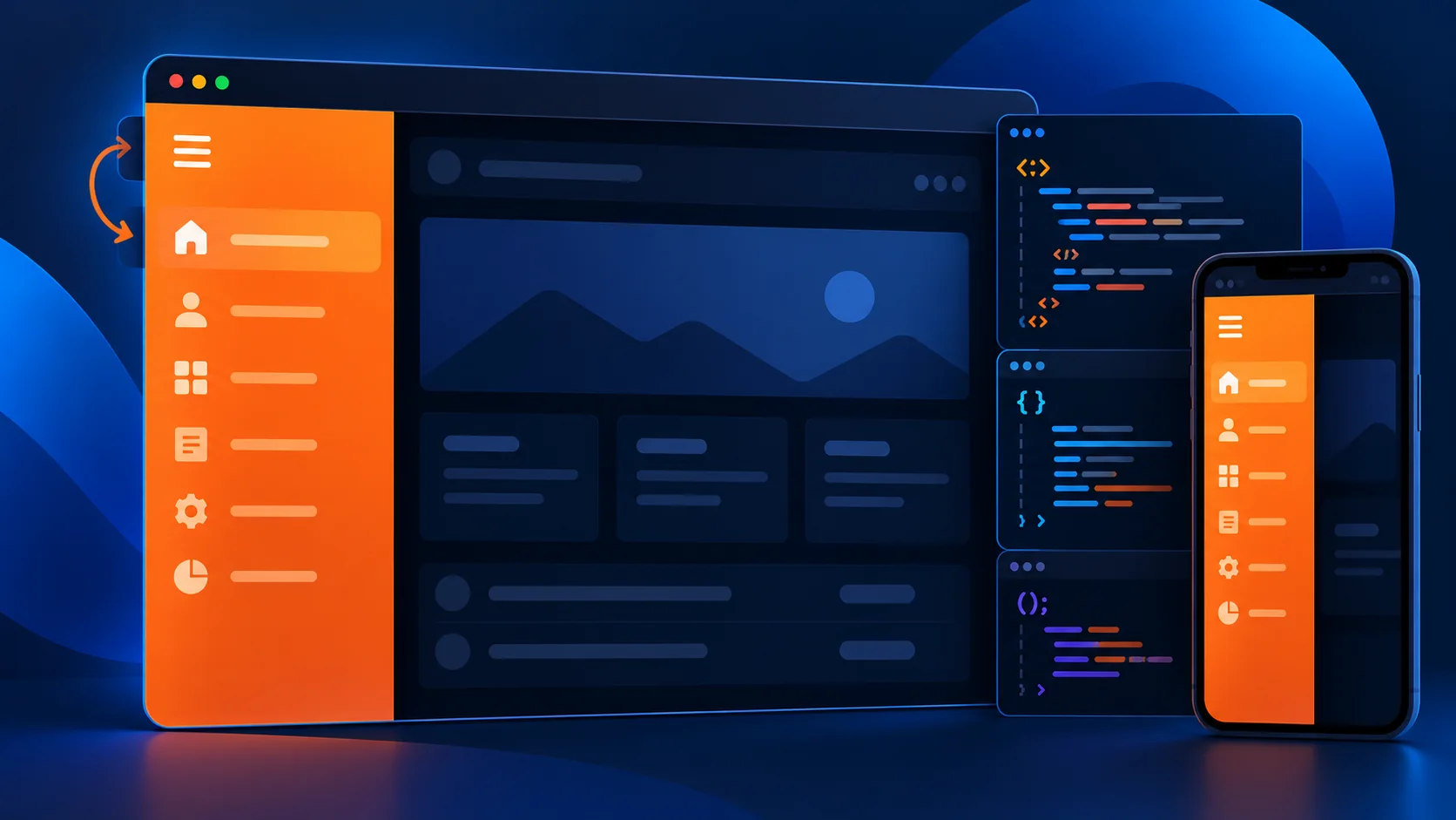
A responsive sidebar menu keeps navigation accessible on small screens without crowding the main layout. In this tutorial, build an off-canvas menu with a hamburger button, a dimmed backdrop, keyboard support, and a layout that adapts to mobile and desktop.
Quick answer: Use a button to control an off-canvas <aside>, toggle an open state with JavaScript, and use CSS transforms to animate the panel. Add an accessible name, update aria-expanded, and let visitors close the menu with Escape.
View Live Demo Download Source ZIP
What you’ll build
This example uses plain HTML, CSS, and JavaScript. The sidebar slides in from the right and closes with its close button, the backdrop, or Escape. The interactive demo is isolated in its own section so its styles do not affect the WordPress theme.
How an off-canvas sidebar works
An off-canvas menu starts outside the visible area with a CSS transform. When the trigger is activated, JavaScript adds an open state, reveals the backdrop, and updates the button’s accessible state. This avoids moving the whole page and works well on narrow screens.
Accessible HTML structure
Use a real button for the menu control and a labelled navigation landmark inside the sidebar. The aria-controls and aria-expanded attributes tell assistive technology which menu the button controls and whether it is open.
Responsive sidebar menu CSS
Use a fixed panel with a viewport-aware width, an off-screen transform, and a transition. The backdrop covers the page while the menu is open. The CSS sample keeps the panel within the viewport and honors reduced-motion preferences.
JavaScript menu interaction
The script toggles the open state, synchronizes aria-expanded, moves focus into the menu when it opens, returns focus to the trigger when it closes, supports Escape, and closes the panel after a navigation link is selected.
Test the menu on mobile and desktop
- Open the live demo and activate the menu button.
- Check that the backdrop appears and the menu is visible.
- Close it with the close button, backdrop, and Escape.
- Resize the browser and verify the panel stays within the viewport.
Frequently asked questions
Does this responsive sidebar need a JavaScript library?
No. It uses browser-native HTML, CSS, and JavaScript, so it does not require jQuery or another dependency.
How do I close the sidebar when a link is clicked?
Listen for clicks on the menu links and call the same close function used by the close button and backdrop.
Can I open the sidebar from the left?
Yes. Change the panel’s starting translate value and anchor it to the left instead of the right.
Download the source files to adapt the example, then replace the sample labels and anchor destinations with links from your project.
INTERACTIVE EXAMPLE
Try the responsive sidebar
Open the navigation and close it with Escape, the close button, or the shaded backdrop.
const menu = document.querySelector("#site-menu");
const trigger = document.querySelector("#menu-toggle");
const closeButton = document.querySelector("#menu-close");
const backdrop = document.querySelector("#menu-backdrop");
let previousFocus;

function setMenuOpen(isOpen) {
  menu.classList.toggle("is-open", isOpen);
  menu.inert = !isOpen;
  menu.setAttribute("aria-hidden", String(!isOpen));
  trigger.setAttribute("aria-expanded", String(isOpen));
  backdrop.hidden = !isOpen;

  if (isOpen) {
    previousFocus = document.activeElement;
    closeButton.focus();
  } else {
    (previousFocus instanceof HTMLElement ? previousFocus : trigger).focus();
  }
}

trigger.addEventListener("click", () => {
  setMenuOpen(trigger.getAttribute("aria-expanded") !== "true");
});
closeButton.addEventListener("click", () => setMenuOpen(false));
backdrop.addEventListener("click", () => setMenuOpen(false));
document.addEventListener("keydown", (event) => {
  if (event.key === "Escape" && trigger.getAttribute("aria-expanded") === "true") {
    setMenuOpen(false);
  }
});<header class="site-header">
<a class="brand" href="#home">Northstar<span>.</span></a>
<button id="menu-toggle" type="button" aria-controls="site-menu"
aria-expanded="false" aria-label="Open navigation menu">
<span></span><span></span><span></span>
</button>
</header>
<div id="menu-backdrop" class="menu-backdrop" hidden></div>
<aside id="site-menu" class="sidebar-menu" aria-label="Site navigation"
aria-hidden="true" inert>
<div class="menu-heading">
<strong>Northstar<span>.</span></strong>
<button id="menu-close" type="button" aria-label="Close navigation menu">×</button>
</div>
<nav aria-label="Main menu">
<a href="#overview">Overview</a>
<a href="#features">Features</a>
<a href="#pricing">Pricing</a>
<a href="#contact">Contact</a>
</nav>
</aside>:root { color-scheme: light; font-family: system-ui, sans-serif; }
.swc-sidebar-demo { --ink: #172033; --accent: #4777e8; --panel: #101a2d; position: relative; min-height: 400px; overflow: hidden; border-radius: 18px; background: linear-gradient(135deg, #eef4ff, #dbe7ff); color: var(--ink); }
.swc-sidebar-demo *, .swc-sidebar-demo *::before, .swc-sidebar-demo *::after { box-sizing: border-box; }
.site-header { display: flex; align-items: center; justify-content: space-between; padding: 24px clamp(20px, 5vw, 48px); }
.brand { color: var(--ink); font-size: 1.25rem; font-weight: 800; text-decoration: none; }
.brand span, .menu-heading span { color: var(--accent); }
#menu-toggle, #menu-close { border: 0; cursor: pointer; font: inherit; }
#menu-toggle { display: grid; gap: 5px; width: 46px; height: 46px; place-content: center; border-radius: 12px; background: var(--panel); }
#menu-toggle span { display: block; width: 19px; height: 2px; border-radius: 2px; background: #fff; }
.demo-content { max-width: 650px; padding: 32px clamp(20px, 5vw, 48px) 58px; }
.demo-content h3 { margin: 0 0 12px; font-size: clamp(1.5rem, 4vw, 2.25rem); }
.demo-content p { color: #536078; line-height: 1.7; }
.menu-backdrop { position: absolute; z-index: 2; inset: 0; border: 0; background: rgb(7 15 30 / 48%); }
.sidebar-menu { position: absolute; z-index: 3; inset: 0 0 0 auto; width: min(340px, 88%); padding: 26px; color: #fff; background: var(--panel); transform: translateX(102%); transition: transform 260ms ease; }
.sidebar-menu.is-open { transform: translateX(0); }
.menu-heading { display: flex; align-items: center; justify-content: space-between; margin-bottom: 36px; font-size: 1.25rem; }
#menu-close { width: 38px; height: 38px; border-radius: 10px; color: #fff; background: rgb(255 255 255 / 12%); font-size: 1.5rem; }
.sidebar-menu nav { display: grid; gap: 8px; }
.sidebar-menu nav a { padding: 13px 14px; border-radius: 10px; color: #e9efff; text-decoration: none; }
.sidebar-menu nav a:hover, .sidebar-menu nav a:focus-visible { outline: none; background: rgb(255 255 255 / 10%); }
@media (max-width: 480px) { .swc-sidebar-demo { min-height: 360px; } .site-header { padding-block: 18px; } }
@media (prefers-reduced-motion: reduce) { .sidebar-menu { transition: none; } }