

Blog

How to Build a Live Chat Box with HTML, CSS, and JavaScript
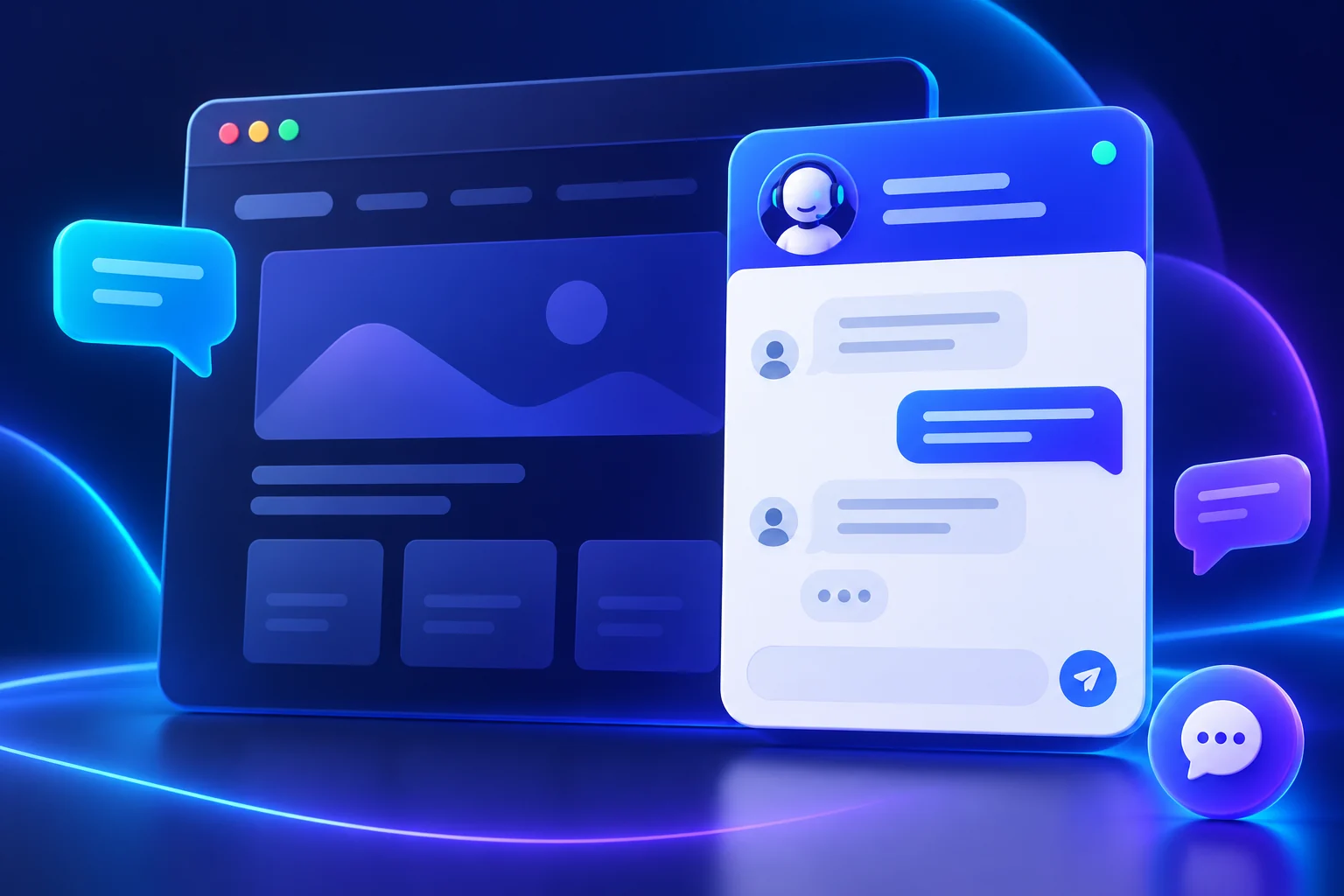
A live chat box gives visitors a quick way to open a support panel, type a message, and read a reply. In this tutorial, you’ll build a responsive chat widget with semantic HTML, scoped CSS, and vanilla JavaScript. The example runs entirely in the browser: it adds a sample reply locally and does not send messages to a real person or server.
Quick answer: Create a launcher button and a hidden chat panel, show or hide the panel with JavaScript, and append message elements when the demo form is submitted. Use buttons, labels, keyboard focus, and a clear privacy notice so the widget works accessibly.
View Live DemoDownload Source ZIP
What this live chat box example does
The floating launcher opens a compact support panel with a message area and input. Submitting a message adds it to the conversation and displays a sample response. The close button hides the panel and returns keyboard focus to the launcher.
This is a user-interface demo, not a customer-support service. It does not transmit or save message text. For a production chat tool, connect the interface to an authenticated backend or a trusted chat provider, add rate limits and abuse controls, and explain how visitor data is handled.
How the chat widget works
The HTML provides labelled controls and an aria-live message region. CSS styles the floating launcher and panel, adapts the panel for narrow screens, and preserves visible keyboard focus. JavaScript toggles the panel and creates message bubbles with textContent, which treats visitor input as text instead of executable HTML.
Build the HTML structure
Place the chat interface in a section with a descriptive accessible name. Use a real button to open or close it, and connect the message field to a visible or screen-reader-only label. The demo markup is included in the source ZIP and in the code sample below.
Style a responsive chat panel
Use fixed positioning for a small site-wide demo, a flexible message list for the conversation, and a constrained panel width so it fits on phones. Avoid removing focus outlines. The CSS sample is scoped to the demo classes so it won’t restyle unrelated site buttons or headings.
Add the JavaScript interaction
Toggle the panel’s hidden state when the launcher and close button are activated. On form submission, trim the input, append a user message and a sample response, then scroll the conversation to the newest message. No network request is made.
Accessibility and production guidance
- Keep the launcher and close control keyboard-operable and clearly labelled.
- Move focus into the message field when opening the panel and return it to the launcher when closing.
- Announce new messages through a polite live region without interrupting the visitor.
- Do not put private information in this demo; messages remain in the current browser page only.
- For real support, connect a secure service and publish an appropriate privacy notice.
Test the live chat box
Open the demo, submit a short sample message, and confirm that both bubbles appear. Close and reopen the panel with the keyboard as well as the mouse, then check the layout at a narrow viewport. Download the ZIP to view the HTML, CSS, and JavaScript as separate files.
Frequently asked questions
Does this chat box send messages to a real support agent?
No. The example adds a local sample reply in the browser only. It does not send, store, or transmit message content.
Can I connect the chat widget to a real backend?
Yes. Replace the local demo response with an API or a trusted live-chat service. Add server-side validation, abuse protection, secure transport, and a privacy notice before collecting visitor messages.
Does the widget work on mobile?
Yes. The panel width is limited to the viewport and the layout adapts on small screens. Test it with your site header, cookie notices, and mobile keyboard to make sure the launcher remains reachable.
INTERACTIVE EXAMPLE
Try the live chat box
Send a sample message to see a local demo reply. Nothing is transmitted.
Hi! This is a browser-only example. What would you like to try?
Demo only · messages stay in this page
<section class="chat-widget" aria-label="Demo customer support chat">
  <div class="chat-panel" id="chat-panel" hidden>
    <header class="chat-header">
      <strong>SanWeb Support</strong>
      <button id="close-chat" type="button" aria-label="Close chat">×</button>
    </header>
    <div class="chat-messages" id="chat-messages" aria-live="polite">
      <p class="message received">Hi! What would you like to try?</p>
    </div>
    <form class="chat-form" id="chat-form">
      <label class="sr-only" for="chat-input">Your message</label>
      <input id="chat-input" name="message" type="text" maxlength="240" required>
      <button type="submit">Send</button>
    </form>
  </div>
  <button class="chat-launcher" id="open-chat" type="button"
    aria-controls="chat-panel" aria-expanded="false">Chat with us</button>
</section>.chat-widget {
position: fixed;
z-index: 20;
right: 22px;
bottom: 22px;
display: grid;
justify-items: end;
gap: 14px;
}
.chat-launcher {
min-height: 54px;
padding: 0 20px;
border: 0;
border-radius: 999px;
background: linear-gradient(135deg, #3658e8, #754bdf);
color: #fff;
font: inherit;
font-weight: 700;
cursor: pointer;
}
.chat-panel {
width: min(360px, calc(100vw - 32px));
overflow: hidden;
border-radius: 20px;
background: #fff;
box-shadow: 0 24px 70px rgb(21 35 81 / 24%);
}
.chat-panel[hidden] { display: none; }
.chat-header { display: flex; align-items: center; gap: 12px; padding: 16px; background: #435ee7; color: #fff; }
.chat-messages { display: flex; min-height: 220px; flex-direction: column; gap: 10px; padding: 16px; background: #f8f9fe; }
.message { max-width: 84%; margin: 0; padding: 10px 12px; border-radius: 14px; }
.sent { align-self: flex-end; background: #e7ebff; }
.chat-form { display: flex; gap: 8px; padding: 12px; }
.chat-form input { min-width: 0; flex: 1; padding: 10px; }
.chat-form button { padding: 0 14px; background: #435ee7; color: #fff; }
@media (max-width: 480px) { .chat-widget { right: 12px; bottom: 12px; } }
@media (prefers-reduced-motion: reduce) { *, *::before, *::after { transition: none !important; } }const panel = document.querySelector("#chat-panel");
const openButton = document.querySelector("#open-chat");
const closeButton = document.querySelector("#close-chat");
const form = document.querySelector("#chat-form");
const input = document.querySelector("#chat-input");
const messages = document.querySelector("#chat-messages");
function setChatOpen(isOpen) {
panel.hidden = !isOpen;
openButton.setAttribute("aria-expanded", String(isOpen));
openButton.hidden = isOpen;
if (isOpen) input.focus();
else openButton.focus();
}
openButton.addEventListener("click", () => setChatOpen(true));
closeButton.addEventListener("click", () => setChatOpen(false));
form.addEventListener("submit", (event) => {
event.preventDefault();
const text = input.value.trim();
if (!text) return;
const sentMessage = document.createElement("p");
sentMessage.className = "message sent";
sentMessage.textContent = text;
messages.append(sentMessage);
input.value = "";
const reply = document.createElement("p");
reply.className = "message received";
reply.textContent = "Thanks for trying the demo. This is a local sample reply.";
messages.append(reply);
messages.scrollTop = messages.scrollHeight;
});