

Blog

Build a Double Slider Sign-In and Sign-Up Form with HTML, CSS, and JavaScript
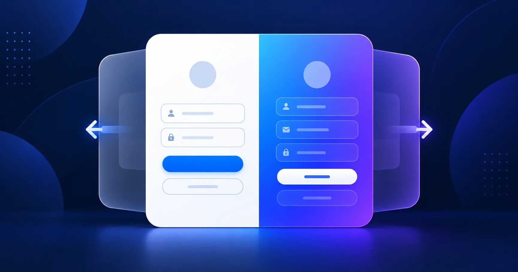
A double slider login form places sign-in and sign-up panels side by side, then slides a colored overlay between them when a visitor switches modes. This tutorial builds a responsive version with semantic HTML, scoped CSS, and a small JavaScript toggle. Use the live demo to try both states, then download the complete source files.
Quick answer: Create two form panels inside one positioned wrapper, add an overlay panel, and toggle a class with JavaScript. CSS transforms animate the panel while the form content changes. This interface is only a front-end example; connect it to a secure authentication service before using real accounts.
View Live DemoDownload Source ZIP
What is a double slider sign-in form?
A double slider form combines a login panel and a registration panel in one card. A colored overlay moves horizontally to reveal the active panel and a short prompt. It keeps both actions in one compact component, which is useful for account pages and UI demonstrations.
How the animation works
The HTML contains separate sign-in and sign-up forms plus an overlay with two switch buttons. The CSS positions both forms in the same card and animates the overlay with transforms. JavaScript only adds or removes the is-sign-up class, so the layout and interaction stay separate.
Build the form structure
Give the card a unique ID and label every input. Use email and password input types, connect labels to their controls, and set autocomplete hints. The complete markup is included in the downloadable project and the HTML sample below.
Style a responsive sliding panel
Use a grid or positioned layers to keep the two form panels aligned. A transform is smoother than animating left or width because browsers can handle transform efficiently. At narrow widths, stack the forms and keep the mode switch visible so the component remains usable on phones.
Add the JavaScript toggle
Listen for the two mode buttons and toggle a class on the card. This avoids inline event handlers and makes it easier to add keyboard support or test the state. The demo also respects reduced-motion preferences.
Accessibility and production notes
- Keep visible labels for all form fields; placeholders are not a replacement for labels.
- Make the mode switch a real button and expose which form is active.
- Preserve a visible keyboard focus outline and adequate color contrast.
- Do not collect or store passwords in this front-end demo. Real sign-in needs server-side validation, secure password handling, HTTPS, CSRF protection, rate limiting, and a trusted authentication flow.
Test the result
Open the live demo, switch repeatedly between sign-in and sign-up, and test the controls with a keyboard. Check the layout at desktop and mobile widths. The download contains separate HTML, CSS, and JavaScript files so you can customize the animation without mixing concerns.
Frequently asked questions
Does this form authenticate users?
No. It demonstrates the visual interface only. The fields do not send or save data. Connect the forms to a secure backend or identity provider to authenticate users.
Can I change the slide direction and colors?
Yes. Change the CSS gradient colors and the transform direction. Keep the active-state class consistent with the JavaScript toggle.
Does the component work on mobile?
Yes. The included responsive styles rearrange the panels on small screens and preserve a visible way to switch modes.
Demo only. It validates sample fields in your browser and does not send or store account details.
<main class="demo-shell">
  <section class="auth-card" aria-label="Sign-in and sign-up form demo">
    <div class="form-side">
      <form class="auth-form" id="sign-in-form" novalidate>
        <h1>Sign in</h1>
        <p>Use the sample fields to explore the form layout.</p>
        <label for="signin-email">Email address</label>
        <input id="signin-email" name="email" type="email" autocomplete="email" required>
        <label for="signin-password">Password</label>
        <input id="signin-password" name="password" type="password" autocomplete="current-password" required minlength="8">
        <button class="primary-button" type="submit">Sign in</button>
        <p class="form-status" id="signin-status" role="status" aria-live="polite"></p>
      </form>
      <form class="auth-form signup-form" id="sign-up-form" novalidate>
        <h2>Create an account</h2>
        <p>This front-end demo does not create real accounts.</p>
        <label for="signup-name">Name</label>
        <input id="signup-name" name="name" type="text" autocomplete="name" required minlength="2">
        <label for="signup-email">Email address</label>
        <input id="signup-email" name="email" type="email" autocomplete="email" required>
        <label for="signup-password">Password</label>
        <input id="signup-password" name="password" type="password" autocomplete="new-password" required minlength="8">
        <button class="primary-button" type="submit">Create account</button>
        <p class="form-status" id="signup-status" role="status" aria-live="polite"></p>
      </form>
    </div>
    <aside class="slider-panel">
      <div class="slider-copy">
        <h2 id="slider-heading">New around here?</h2>
        <p id="slider-description">Switch to the sign-up form with a smooth sliding panel.</p>
        <button class="outline-button" id="show-signup" type="button" aria-controls="sign-up-form" aria-pressed="false">Create account</button>
      </div>
    </aside>
  </section>
  <p class="demo-note">Demo only. It does not send or store account details.</p>
</main>:root {
font-family: system-ui, sans-serif;
color: #14203a;
background: #0c1635;
}
* { box-sizing: border-box; }
body {
min-height: 100vh;
margin: 0;
display: grid;
place-items: center;
padding: 32px 18px;
}
.demo-shell { width: min(100%, 980px); }
.auth-card {
position: relative;
display: grid;
grid-template-columns: 1fr .82fr;
min-height: 490px;
overflow: hidden;
border-radius: 24px;
background: #fff;
box-shadow: 0 28px 80px rgb(3 9 28 / 40%);
}
.form-side { position: relative; padding: 46px clamp(22px, 5vw, 66px); }
.auth-form {
max-width: 380px;
margin: 0 auto;
display: grid;
align-content: center;
gap: 11px;
transition: opacity 260ms ease, transform 420ms ease;
}
.auth-form label { font-size: 13px; font-weight: 700; }
.auth-form input {
width: 100%;
min-height: 46px;
border: 1px solid #d6ddec;
border-radius: 10px;
padding: 10px 13px;
font: inherit;
}
.auth-form input:focus-visible, button:focus-visible {
outline: 3px solid #80cfff;
outline-offset: 3px;
}
.primary-button, .outline-button {
min-height: 44px;
border-radius: 999px;
padding: 10px 20px;
font: inherit;
font-weight: 800;
cursor: pointer;
}
.primary-button { border: 0; background: #2656e8; color: #fff; }
.form-status { min-height: 20px; color: #245238; font-size: 12px; }
.signup-form { position: absolute; inset: 46px clamp(22px, 5vw, 66px); opacity: 0; pointer-events: none; transform: translateX(28px); }
.auth-card.is-signup .auth-form:not(.signup-form) { opacity: 0; pointer-events: none; transform: translateX(-28px); }
.auth-card.is-signup .signup-form { opacity: 1; pointer-events: auto; transform: translateX(0); }
.slider-panel {
display: grid;
place-items: center;
padding: 38px;
color: #fff;
text-align: center;
background: linear-gradient(135deg, #168ce9, #3158e9 54%, #7546df);
transition: transform 420ms ease;
}
.outline-button { border: 1px solid #fff; background: transparent; color: #fff; }
.auth-card.is-signup .slider-panel { transform: translateX(-122%); }
@media (max-width: 700px) {
.auth-card { grid-template-columns: 1fr; min-height: 680px; }
.form-side { min-height: 440px; padding: 38px 24px; }
.signup-form { inset: 38px 24px; }
.slider-panel { min-height: 220px; }
.auth-card.is-signup .slider-panel { transform: translateY(-200%); }
}
@media (prefers-reduced-motion: reduce) {
*, *::before, *::after { transition-duration: .01ms !important; }
}const authCard = document.querySelector(".auth-card");
const toggleButton = document.querySelector("#show-signup");
const sliderHeading = document.querySelector("#slider-heading");
const sliderDescription = document.querySelector("#slider-description");
const signInForm = document.querySelector("#sign-in-form");
const signUpForm = document.querySelector("#sign-up-form");
function setSignupMode(showSignup) {
authCard.classList.toggle("is-signup", showSignup);
toggleButton.setAttribute("aria-pressed", String(showSignup));
toggleButton.textContent = showSignup ? "Sign in instead" : "Create account";
sliderHeading.textContent = showSignup ? "Already have an account?" : "New around here?";
sliderDescription.textContent = showSignup
? "Return to the sign-in form with the sliding panel."
: "Switch to the sign-up form with a smooth sliding panel.";
}
toggleButton.addEventListener("click", () => {
setSignupMode(toggleButton.getAttribute("aria-pressed") !== "true");
});
function handleDemoSubmit(event, statusId, message) {
event.preventDefault();
const form = event.currentTarget;
if (!form.reportValidity()) return;
document.querySelector(statusId).textContent = message;
form.reset();
}
signInForm.addEventListener("submit", (event) => {
handleDemoSubmit(event, "#signin-status", "Demo only: no account was contacted or created.");
});
signUpForm.addEventListener("submit", (event) => {
handleDemoSubmit(event, "#signup-status", "Demo only: no account was created and no details were sent.");
});