
Blog
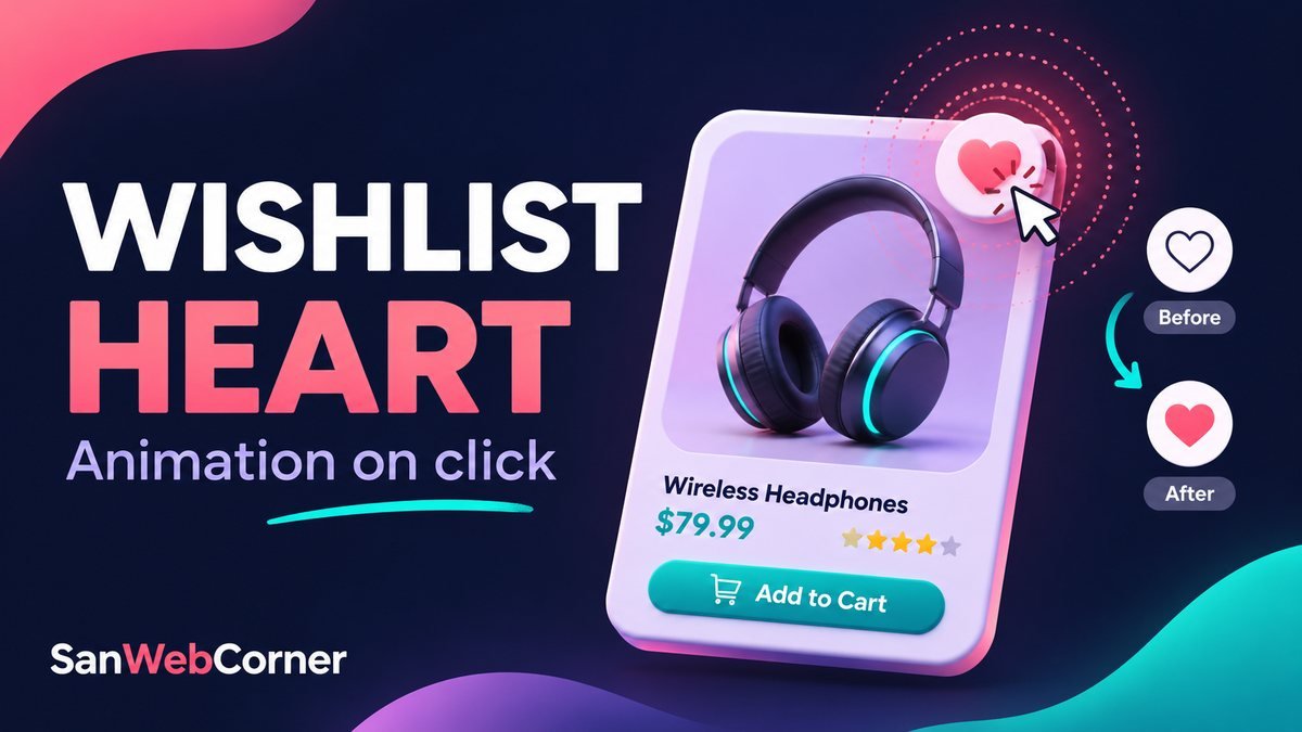

A wishlist heart animation gives visitors quick feedback when they save a product. The heart changes from an outline to a filled shape, a brief pop confirms the click, and a counter keeps the saved total visible.
In this tutorial, we will build a responsive three-product wishlist using HTML, CSS, and a small amount of JavaScript. The demo needs no jQuery, icon font, sprite sheet, or external image. You can open the downloaded project directly in your browser.
Try the wishlist heart animation
Click or tap a heart to add an item, then activate it again to remove the item. Keyboard users can Tab to a heart and press Enter or Space. Clear wishlist removes every selection.
This is a frontend demo: selections reset when the page reloads, and the sample products do not connect to a store or account.
A little love for your favorites
Tap a heart to save an item. Tap it again to remove it.
0 saved
Your wishlist is empty.
Enable JavaScript to try this interactive wishlist.
1. Start with a real toggle button
Use a native button rather than a clickable div. Buttons already support keyboard focus, Enter, and Space. Set type="button" so a heart does not accidentally submit a surrounding form.
An icon-only control needs an accessible name. Give every heart a product-specific label and expose the selected state with aria-pressed. Keep the label stable when the state changes; assistive technology can announce whether the toggle is pressed.
<button type="button" class="swch-toggle"
        aria-label="Save Studio headphones to wishlist"
        aria-pressed="false"
        data-product="Studio headphones">
  <svg viewBox="0 0 24 24" aria-hidden="true" focusable="false">
    <path d="M20.8 4.6a5.5 5.5 0 0 0-7.8 0L12 5.7l-1.1-1.1a5.5 5.5 0 0 0-7.8 7.8L12 21l8.8-8.6a5.5 5.5 0 0 0 0-7.8Z" />
  </svg>
</button>
2. Style the outline and saved states
The SVG starts with a transparent fill and a visible stroke. When aria-pressed becomes true, fill it with the current color. The same attribute controls both the visual appearance and the accessible state, so they stay synchronized.
The complete demo uses 48-pixel heart buttons and a visible focus ring. The product grid wraps as the available space changes.
.swch-toggle svg {
  width: 26px;
  height: 26px;
  fill: transparent;
  stroke: currentColor;
  stroke-width: 1.8;
}
.swch-toggle[aria-pressed="true"] { color: #c7255d; }
.swch-toggle[aria-pressed="true"] svg { fill: currentColor; }
.swch-toggle:focus-visible {
  outline: 3px solid #ffc789;
  outline-offset: 3px;
}
3. Add a short heart pop
Animate the icon’s scale for a gentle pop. A separate circular pseudo-element expands and fades behind it. The product card and button keep their dimensions, so the animation does not push nearby content around.
@keyframes swch-heart-pop {
  0%   { transform: scale(.75); }
  45%  { transform: scale(1.3); }
  75%  { transform: scale(.94); }
  100% { transform: scale(1); }
}
.swch-toggle.swch-pop svg {
  animation: swch-heart-pop .5s ease-out;
}
4. Toggle the state with JavaScript
Read the current pressed state, flip it, and update the wishlist total. Add the animation class only when saving an item. Remove it after the animation ends so the next save can play the effect again.
button.addEventListener('click', () => {
  const saved = button.getAttribute('aria-pressed') !== 'true';
  button.setAttribute('aria-pressed', String(saved));
  button.classList.remove('swch-pop');
  if (saved && !reduce.matches) {
    requestAnimationFrame(() => {
      if (button.getAttribute('aria-pressed') === 'true') {
        button.classList.add('swch-pop');
      }
    });
  }
  update(button.dataset.product +
    (saved ? ' added to' : ' removed from') + ' your wishlist.');
});
button.addEventListener('animationend', () => {
  button.classList.remove('swch-pop');
});
The full source defines reduce with matchMedia() and provides the update() helper. That helper counts buttons with aria-pressed="true", updates the visible badge, and writes a short message into a polite live region.
5. Respect reduced-motion preferences
Saving a product should work even when decorative animation is disabled. The JavaScript checks the visitor’s motion preference before adding the pop class, and CSS removes transitions and animation for reduced motion.
const reduce = window.matchMedia('(prefers-reduced-motion: reduce)');

/* In your stylesheet: */
@media (prefers-reduced-motion: reduce) {
  .swch-toggle svg { transition: none; }
  .swch-toggle.swch-pop svg,
  .swch-toggle.swch-pop::after { animation: none; }
}
6. Clear the wishlist without losing focus
The reset control sets every heart back to false, removes animation classes, and updates the total. It then focuses the first heart. This gives keyboard users a useful next position when the now-empty wishlist disables its Clear button.
Download and run the project
The ZIP includes index.html, style.css, script.js, and a README. Extract the folder and open index.html. Change product names, prices, or colors in those files; keep each button’s label and data-product value consistent with the visible product name.
Common questions
Why does the heart fill without animating?
Reduced motion may be enabled. Otherwise, check that the stylesheet is loaded and the pop class is added on selection. The filled state intentionally remains after the animation finishes.
Will saved items survive a refresh?
This example stores state in the current page only. Add local storage for a browser-specific wishlist, or save product IDs through an authenticated backend for an account-based list.
Can I put the heart inside a product link?
Keep the heart button outside any enclosing link or other button. Give navigation and saving separate interactive controls so clicks and keyboard actions have predictable behavior.
Conclusion
A useful wishlist heart combines a clear selected state, a short animation, and accessible feedback. Native buttons, aria-pressed, and a reduced-motion option make the interaction work for more visitors.
References: W3C button pattern and MDN reduced-motion media feature.