

Blog

Create a Scrolling Background Image Reveal with CSS
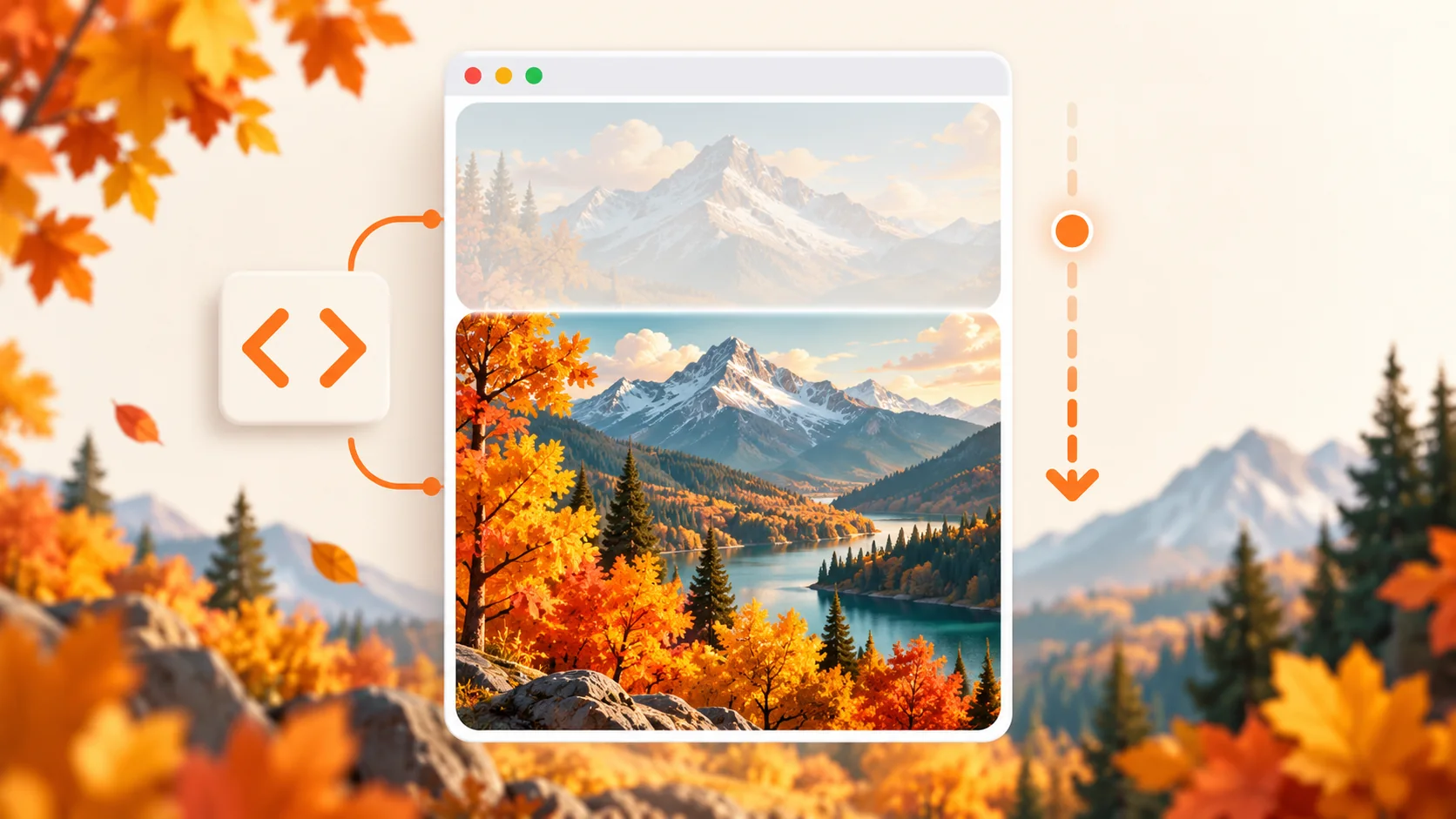
A scrolling background image effect reveals a larger image inside a fixed frame when a visitor hovers over it or focuses it with a keyboard. CSS creates the effect without JavaScript by changing the image position on interaction.
Quick answer: Give the image frame a fixed height, set a tall image with background-size: auto 200%, then change background-position from top to bottom on hover and keyboard focus. The example includes reduced-motion support.
Live demo: scrolling image reveal
Move the pointer over the preview, press Tab to focus it, or tap and hold on a touch screen. The scene is CSS-drawn, so the demo has no external image dependency.
How the effect works
The frame clips its contents with overflow: hidden. Its background is taller than the frame, leaving extra image content above and below the visible area. Changing the vertical background position moves that larger image through the frame.
Use background-size: auto 200% to make the image twice as tall as the frame while keeping its proportions. Set background-position: center top for the starting view and center bottom for the revealed view.
HTML structure
Use a labelled image element so people using assistive technology know what the visual contains. tabindex="0" makes the frame keyboard-focusable, and the CSS focus style makes that state visible.
CSS code
Replace images/autumn-landscape.jpg with a tall image file in your project. A portrait or long screenshot works best because it gives the effect more vertical content to reveal.
Customize the interaction
- Adjust
heightandbackground-sizeto control how much content appears in the frame. - Change the
transitionduration to make the reveal faster or slower. - Use
background-position: center 60%when you want to reveal only part of the lower image. - Use a compressed WebP image to keep the effect lightweight; provide a useful image description when it conveys information.
Accessibility and mobile behavior
The effect works with pointer hover and keyboard focus. Touch devices can activate the focus state by tapping the frame. The reduced-motion media query removes the animated transition for visitors who prefer less motion.
Troubleshooting
The image does not move
Check that the element has a fixed height, the background image is taller than that frame, and the selector matches your HTML. A short landscape image may have too little extra height to make movement noticeable.
The image looks stretched
Use background-size: auto 200% to preserve the source image proportions. Use cover only when you prefer the image to fill the frame and are comfortable with some cropping.
The animation does not run on a phone
Phones do not have a persistent hover state. Tap the focusable image frame to reveal the lower section, or add a visible button if the effect needs an explicit show/hide control.
Frequently asked questions
Can I make a scrolling background image effect without JavaScript?
Yes. CSS backgrounds, hover and focus selectors, overflow clipping, and transitions are enough for this decorative reveal.
Which image works best?
Use a tall image with useful details throughout its height, such as a mobile screenshot, long illustration, or portrait photograph. Optimize it as WebP and avoid an image so large that it slows down the page.
Can I use this effect on touch screens?
Yes. Make the frame keyboard-focusable and style :focus as well as :hover. Touch browsers can then activate the same state with a tap.
Download the source
The ZIP includes a complete HTML/CSS demo and a short README. Extract it and open index.html in a modern browser. The example uses CSS-drawn artwork and needs no build step or JavaScript.
Autumn in the mountains
Move your pointer over the image or focus it with the keyboard to reveal the scene.
<section class="reveal-card" aria-labelledby="reveal-title">
  <div class="reveal-frame" tabindex="0" role="img"
       aria-label="Illustrated autumn landscape revealed from top to bottom">
    <div class="landscape" aria-hidden="true"></div>
    <span class="frame-hint" aria-hidden="true">Hover or focus to explore</span>
  </div>
  <div class="card-copy">
    <div>
      <p class="eyebrow">Interactive preview</p>
      <h2 id="reveal-title">Autumn in the mountains</h2>
    </div>
    <span class="effect-badge">CSS only</span>
  </div>
</section>.reveal-card { overflow: hidden; padding: 14px; border: 1px solid #dce4f3; border-radius: 24px; background: #fff; box-shadow: 0 20px 55px rgb(33 53 94 / 10%); }
.reveal-frame { position: relative; display: block; overflow: hidden; min-height: 380px; border-radius: 16px; background: #d9e6f5; cursor: pointer; outline: none; }
.reveal-frame:focus-visible { outline: 4px solid #426de0; outline-offset: 3px; }
.landscape { position: absolute; inset: 0; height: 190%; background-color: #f8be83; background-image: radial-gradient(ellipse at 74% 11%, #fff4b4 0 6%, transparent 6.5%), linear-gradient(165deg, transparent 0 27%, #526e84 27.2% 42%, transparent 42.2%), linear-gradient(205deg, transparent 0 30%, #647f8b 30.2% 45%, transparent 45.2%), linear-gradient(155deg, transparent 0 47%, #d87950 47.2% 62%, transparent 62.2%), linear-gradient(210deg, transparent 0 48%, #e5985a 48.2% 66%, transparent 66.2%), linear-gradient(180deg, #f8be83 0 20%, #e99b71 38%, #809a87 58%, #536c67 100%); transition: transform 1.15s cubic-bezier(.2,.72,.24,1); }
.reveal-frame:hover .landscape, .reveal-frame:focus .landscape, .reveal-frame:active .landscape { transform: translateY(-47%); }
.frame-hint { position: absolute; right: 16px; bottom: 16px; padding: 9px 13px; border-radius: 999px; color: #fff; background: rgb(24 34 57 / 78%); font-size: .85rem; }
.card-copy { display: flex; align-items: center; justify-content: space-between; gap: 16px; padding: 20px 8px 8px; }
.card-copy .eyebrow { margin: 0 0 5px; color: #5a70a6; font-size: .75rem; font-weight: 800; letter-spacing: .13em; text-transform: uppercase; }
.card-copy h2 { margin: 0; font-size: clamp(1.2rem, 3vw, 1.6rem); }
.effect-badge { flex: none; padding: 8px 12px; border-radius: 999px; color: #294caa; background: #edf2ff; font-size: .8rem; font-weight: 750; }
@media (max-width: 560px) { .reveal-card { padding: 9px; } .reveal-frame { min-height: 300px; } .card-copy { align-items: flex-start; } }
@media (prefers-reduced-motion: reduce) { .landscape { transition: none; } }