

Blog

How to Build a Horizontal Image Carousel with HTML, CSS, and JavaScript
A horizontal image carousel lets readers browse a row of cards without using the full height of a page. In this tutorial, you’ll build a responsive carousel with semantic HTML, CSS scroll snapping, and vanilla JavaScript. It includes previous and next buttons, keyboard support, and a status message for screen-reader users.
Quick answer: Place the cards in a horizontally scrollable list, use CSS scroll-snap-type to align cards after scrolling, and call JavaScript scrollBy() from the navigation buttons. The content remains available if JavaScript is disabled.
What you’ll build
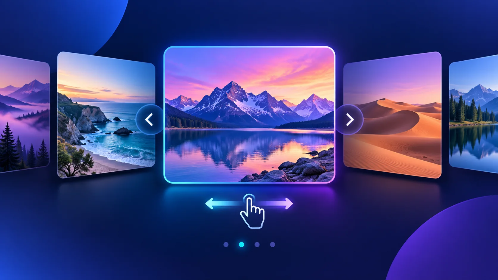
The live example shows five landscape cards in a horizontally scrollable row. Visitors can use the buttons, drag the scrollbar, swipe on a touch screen, or scroll with a keyboard. The row adapts to narrow screens and does not autoplay.
How the carousel works
HTML provides the labeled section, card list, and real buttons. CSS creates the horizontal track and snapping behavior. JavaScript measures one card plus its gap, then moves the track by that distance when a button is activated. No library or build step is required.
Step 1: Create the HTML structure
Use a list for related cards and give each image meaningful alternative text. Real buttons are keyboard operable by default. The complete markup is shown in the HTML code block below; use your own image URLs and descriptive alt text in a project.
Step 2: Add responsive CSS scroll snapping
overflow-x: auto enables native horizontal scrolling. CSS Grid places cards in a row, and scroll-snap-type with scroll-snap-align makes each card settle into place. At smaller widths, each card occupies more of the screen for easier browsing.
Step 3: Add the JavaScript controls
The script scrolls by one card width plus the track gap. It also updates an aria-live status so assistive technology can announce the current card. The browser continues to provide native swipe, touchpad, and keyboard scrolling.
Try the live demo
Choose Previous or Next, drag the horizontal scrollbar, or focus the image row and use the arrow keys. On a phone, swipe through the cards. The demo respects reduced-motion preferences and keeps movement under the visitor’s control.
Customize the carousel
- Card width: Change the track’s
grid-auto-columnsvalue. - Spacing: Adjust the track’s
gap. - Snap strength: Try
scroll-snap-type: x proximityfor a looser snap. - Images: Use appropriately sized WebP or AVIF images with width and height attributes.
- Appearance: Update card, button, focus, and text colors to match your site.
Accessibility and performance tips
Avoid autoplay, show a clear keyboard focus indicator, label the carousel and buttons, and write useful image alternatives. Native scrolling keeps the basic content usable without JavaScript. For real galleries, compress images and consider lazy loading cards that start outside the viewport.
Troubleshooting
- The buttons do not move the row: Check that the JavaScript selectors match the HTML and that the script runs after the markup.
- The last card is clipped: Review the track padding, card width, and parent container overflow.
- Cards do not snap: Add
scroll-snap-typeto the scrollable track andscroll-snap-alignto each card. - The whole page scrolls sideways: Confirm that only the card track is wider than its viewport.
Conclusion
HTML and CSS provide a responsive horizontal carousel, while a small JavaScript enhancement adds arrow controls and status announcements. Use the live demo and downloadable source as a starting point, then adapt the cards and styles to your project.
Reviewed and updated: October 5, 2026.
HTML + CSS + VANILLA JAVASCRIPT
Explore the collection
Coastal escape
Ocean views and open horizons
Mountain lake
Quiet water below the peaks
Golden dunes
Warm light across the desert
Forest trail
Follow the path into the trees
City lights
Color after the sun goes down
Showing card 1 of 5
<section class="swc-carousel-demo" id="swc-carousel-demo" aria-label="Interactive horizontal image carousel demo">
  <div class="swc-carousel-demo__heading">
    <div>
      <p class="swc-carousel-demo__eyebrow">HTML + CSS + VANILLA JAVASCRIPT</p>
      <h2>Explore the collection</h2>
    </div>
    <div class="swc-carousel-demo__controls">
      <button class="swc-carousel-demo__button" type="button" data-direction="prev" aria-label="Scroll to previous cards">←</button>
      <button class="swc-carousel-demo__button" type="button" data-direction="next" aria-label="Scroll to next cards">→</button>
    </div>
  </div>
  <ul class="swc-carousel-demo__track" tabindex="0" aria-label="Image cards">
    <li class="swc-carousel-demo__card"><div class="swc-carousel-demo__art swc-art--coast" role="img" aria-label="Turquoise coastline"><span>01</span></div><h3>Coastal escape</h3><p>Ocean views and open horizons</p></li>
    <li class="swc-carousel-demo__card"><div class="swc-carousel-demo__art swc-art--mountain" role="img" aria-label="Mountain lake at sunset"><span>02</span></div><h3>Mountain lake</h3><p>Quiet water below the peaks</p></li>
    <li class="swc-carousel-demo__card"><div class="swc-carousel-demo__art swc-art--desert" role="img" aria-label="Golden desert dunes"><span>03</span></div><h3>Golden dunes</h3><p>Warm light across the desert</p></li>
    <li class="swc-carousel-demo__card"><div class="swc-carousel-demo__art swc-art--forest" role="img" aria-label="Forest trail"><span>04</span></div><h3>Forest trail</h3><p>Follow the path into the trees</p></li>
    <li class="swc-carousel-demo__card"><div class="swc-carousel-demo__art swc-art--city" role="img" aria-label="City skyline at dusk"><span>05</span></div><h3>City lights</h3><p>Color after the sun goes down</p></li>
  </ul>
  <p class="swc-carousel-demo__status" aria-live="polite">Showing card 1 of 5</p>
</section>.swc-carousel-demo {
--ink: #17233d;
--muted: #5b6880;
--blue: #315fc6;
max-width: 1080px;
margin: 32px auto;
padding: clamp(18px, 4vw, 34px);
overflow: hidden;
border: 1px solid #dbe4f3;
border-radius: 24px;
background: #fff;
color: var(--ink);
font-family: system-ui, -apple-system, "Segoe UI", sans-serif;
box-shadow: 0 18px 50px rgb(34 56 102 / 10%);
}
.swc-carousel-demo * { box-sizing: border-box; }
.swc-carousel-demo__heading { display: flex; justify-content: space-between; align-items: center; gap: 16px; margin-bottom: 20px; }
.swc-carousel-demo__eyebrow { margin: 0 0 8px; color: var(--blue); font-size: .72rem; font-weight: 800; letter-spacing: .12em; }
.swc-carousel-demo__heading h2 { margin: 0; color: var(--ink); font-size: clamp(1.3rem, 3vw, 2rem); }
.swc-carousel-demo__controls { display: flex; gap: 10px; }
.swc-carousel-demo__button { width: 44px; height: 44px; border: 0; border-radius: 50%; background: var(--blue); color: #fff; font-size: 1.5rem; cursor: pointer; }
.swc-carousel-demo__button:hover { background: #234ca5; }
.swc-carousel-demo__button:focus-visible,
.swc-carousel-demo__track:focus-visible { outline: 3px solid #f4a340; outline-offset: 3px; }
.swc-carousel-demo__track { display: grid; grid-auto-columns: minmax(240px, 31%); grid-auto-flow: column; gap: 18px; margin: 0; padding: 4px 4px 18px; overflow-x: auto; overscroll-behavior-inline: contain; scroll-snap-type: x mandatory; scroll-padding-inline: 4px; scrollbar-color: #9bb1df #edf1f8; scrollbar-width: thin; }
.swc-carousel-demo__card { min-width: 0; overflow: hidden; scroll-snap-align: start; border: 1px solid #e0e7f2; border-radius: 17px; background: #fff; box-shadow: 0 7px 20px rgb(30 48 85 / 8%); }
.swc-carousel-demo__art { display: flex; align-items: flex-end; aspect-ratio: 1.52; padding: 14px; background: linear-gradient(135deg, #1593a8, #a3e0df 50%, #f0c490); color: #fff; font-size: 1.2rem; font-weight: 800; }
.swc-carousel-demo__art span { padding: 6px 10px; border-radius: 999px; background: rgb(15 28 58 / 55%); }
.swc-art--mountain { background: linear-gradient(150deg, #f9a8a9 0 38%, #7072ad 39% 58%, #294b78 59%); }
.swc-art--desert { background: linear-gradient(155deg, #9dc9eb 0 38%, #f0ad68 39% 64%, #bb6848 65%); }
.swc-art--forest { background: linear-gradient(155deg, #b8e0d0 0 35%, #5e9a79 36% 58%, #245f59 59%); }
.swc-art--city { background: linear-gradient(155deg, #262d68 0 42%, #5361a7 43% 68%, #161d4b 69%); }
.swc-carousel-demo__card h3 { margin: 16px 16px 4px; color: var(--ink); font-size: 1.04rem; }
.swc-carousel-demo__card p { margin: 0 16px 17px; color: var(--muted); font-size: .9rem; }
.swc-carousel-demo__status { margin: 14px 2px 0; color: var(--muted); font-size: .9rem; }
@media (max-width: 640px) {
.swc-carousel-demo__track { grid-auto-columns: minmax(78%, 1fr); gap: 14px; }
.swc-carousel-demo__heading { align-items: flex-start; }
}
@media (prefers-reduced-motion: reduce) {
.swc-carousel-demo * { scroll-behavior: auto !important; }
}
.gallery__controls { display: flex; gap: 10px; }
.gallery__button { display: grid; width: 44px; height: 44px; place-items: center; border: 0; border-radius: 50%; background: #315fc6; color: #fff; font-size: 1.5rem; cursor: pointer; }
.gallery__button:focus-visible, .gallery__track:focus-visible { outline: 3px solid #f4a340; outline-offset: 3px; }
.gallery__track { display: grid; grid-auto-columns: minmax(240px, 31%); grid-auto-flow: column; gap: 18px; margin: 0; padding: 4px 4px 18px; overflow-x: auto; overscroll-behavior-inline: contain; scroll-snap-type: x mandatory; scrollbar-color: #9bb1df #edf1f8; scrollbar-width: thin; }
.gallery__card { min-width: 0; overflow: hidden; scroll-snap-align: start; border: 1px solid #e0e7f2; border-radius: 17px; background: #fff; box-shadow: 0 7px 20px rgb(30 48 85 / 8%); }
.gallery__art { display: block; width: 100%; aspect-ratio: 1.52; background: linear-gradient(145deg, #78dce6 0 35%, #1a8b9d 36% 60%, #f3d6a2 61%); }
.gallery__card h2 { margin: 17px 17px 4px; color: #17233d; font-size: 1.05rem; }
.gallery__card p { margin: 0 17px 18px; color: #647188; font-size: .92rem; }
@media (max-width: 640px) { .gallery__track { grid-auto-columns: minmax(78%, 1fr); gap: 14px; } }
@media (prefers-reduced-motion: reduce) { *, *::before, *::after { scroll-behavior: auto !important; } }(() => {
const demo = document.querySelector("#swc-carousel-demo");
if (!demo) return;
const track = demo.querySelector(".swc-carousel-demo__track");
const status = demo.querySelector(".swc-carousel-demo__status");
const cards = [...demo.querySelectorAll(".swc-carousel-demo__card")];
const buttons = demo.querySelectorAll("[data-direction]");
if (!track || !status || cards.length === 0) return;
const getStep = () => {
const gap = Number.parseFloat(getComputedStyle(track).columnGap) || 0;
return cards[0].getBoundingClientRect().width + gap;
};
buttons.forEach((button) => {
button.addEventListener("click", () => {
const direction = button.dataset.direction === "next" ? 1 : -1;
const reduceMotion = matchMedia("(prefers-reduced-motion: reduce)").matches;
track.scrollBy({
left: direction * getStep(),
behavior: reduceMotion ? "auto" : "smooth"
});
});
});
let updatePending = false;
track.addEventListener("scroll", () => {
if (updatePending) return;
updatePending = true;
requestAnimationFrame(() => {
const index = Math.min(cards.length - 1, Math.max(0, Math.round(track.scrollLeft / getStep())));
status.textContent = `Showing card ${index + 1} of ${cards.length}`;
updatePending = false;
});
}, { passive: true });
})();