

Blog
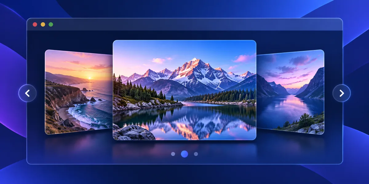

How to Build a Responsive CSS Image Slider with HTML and CSS
Learn how to create a responsive image slider with HTML and CSS. This tutorial uses native radio buttons, CSS transitions, and responsive images, so visitors can move between slides without JavaScript or a third-party library.
Quick answer: Put each slide and its radio control inside a slider wrapper. Use CSS selectors for the checked radio to move the track, then add labels as previous/next controls. This keeps the carousel lightweight and lets keyboard users change slides.
View Live Demo Download Source ZIP
What this CSS image slider includes
The example below is a small, self-contained carousel with three slides, captions, previous/next controls, and pagination. It uses CSS for slide changes and HTML controls, with no JavaScript dependency. Replace the sample images with your own optimized assets and update their alternative text.
How a CSS-only image slider works
Each radio input represents a slide. When a visitor selects one, CSS moves the track to the matching position. The controls are real form inputs, so they can be reached and selected with a keyboard. CSS transitions make the movement smooth, while a reduced-motion rule removes that movement for visitors who prefer less animation.
Build the HTML structure
Create one labelled radio input per slide and keep the slides together in a track. Use descriptive alt text for meaningful images; if an image is decorative and the caption already provides the same information, use empty alt text. Give every radio group a unique name if you place more than one slider on a page.
Style the slider for responsive screens
Make the slider container fluid and let the image use object-fit: cover with a predictable aspect ratio. The layout below uses a maximum width on large screens and shrinks to the available space on mobile. Adjust the aspect ratio if your photos are portrait or square, and compress images to improve page loading.
Customize the carousel
- Change the slide images, captions, and alternative text to fit your project.
- Update the accent color and border radius in the CSS variables.
- Keep the number of slides modest; a carousel should not hide important page content.
- Use properly sized WebP or AVIF images to reduce transfer size.
Accessibility and performance notes
Keep visible labels and clear focus styles for the radio controls. Do not rely on automatic movement: visitors should control when a slide changes. Avoid autoplay for this small demo, and respect reduced-motion settings. Use descriptive image alt text and test the finished slider at narrow screen widths and with keyboard navigation.
Frequently asked questions
Can I build an image slider with CSS only?
Yes. Native radio inputs can hold the selected slide state, while CSS updates the visible track. JavaScript is optional for additional features such as autoplay, swipe gestures, or dynamically loaded slides.
Will this CSS image slider work on mobile?
It is designed to fit narrow screens, and the controls remain available without hover. Replace the sample images with appropriately sized files and check the layout on your own theme and devices.
When should I use JavaScript instead?
Choose JavaScript when the carousel needs autoplay, touch dragging, dynamic content, synchronized controls, or a large accessible carousel API. For a few manually selected slides, CSS can be a simpler option.
Download the complete source
Use the live demo to try the controls, or download the ZIP to inspect and adapt the standalone HTML and CSS files. Update the image URLs and text before using the example in a production project.
Try the CSS image slider
Choose a numbered control below to switch slides. The carousel works without JavaScript.



Tip: use the numbered controls to switch slides. Reduced-motion preferences are respected.
<section class="slider" aria-label="Featured places">
  <input type="radio" name="slide" id="slide-1" checked>
  <input type="radio" name="slide" id="slide-2">
  <input type="radio" name="slide" id="slide-3">
  <div class="slider__window">
    <div class="slider__track">
      <figure class="slider__item">
        <img src="https://images.unsplash.com/photo-1500530855697-b586d89ba3ee?auto=format&fit=crop&w=1400&q=82" alt="Mountain landscape beneath an open sky">
        <figcaption>Explore the outdoors</figcaption>
      </figure>
      <figure class="slider__item">
        <img src="https://images.unsplash.com/photo-1470770841072-f978cf4d019e?auto=format&fit=crop&w=1400&q=82" alt="Mountain scenery reflected in a lake">
        <figcaption>Find a quiet moment</figcaption>
      </figure>
      <figure class="slider__item">
        <img src="https://images.unsplash.com/photo-1518837695005-2083093ee35b?auto=format&fit=crop&w=1400&q=82" alt="Ocean waves on a bright shoreline">
        <figcaption>Follow the coastline</figcaption>
      </figure>
    </div>
  </div>
  <nav class="slider__dots" aria-label="Choose a slide">
    <label for="slide-1">1</label>
    <label for="slide-2">2</label>
    <label for="slide-3">3</label>
  </nav>
</section>.slider { --accent: #315cc9; max-width: 820px; margin: 2rem auto; font-family: system-ui, sans-serif; }
.slider input[type="radio"] { position: absolute; width: 1px; height: 1px; overflow: hidden; clip-path: inset(50%); }
.slider__window { overflow: hidden; border-radius: 14px; }
.slider__track { display: flex; width: 300%; transition: transform .55s ease; }
.slider__item { position: relative; flex: 0 0 33.3333%; margin: 0; aspect-ratio: 16 / 8; }
.slider__item img { display: block; width: 100%; height: 100%; object-fit: cover; }
.slider__item figcaption { position: absolute; inset: auto 0 0; padding: 2.5rem 1.25rem 1rem; color: #fff; background: linear-gradient(transparent, #0a1220d9); font-size: 1.25rem; }
#slide-1:checked ~ .slider__window .slider__track { transform: translateX(0); }
#slide-2:checked ~ .slider__window .slider__track { transform: translateX(-33.3333%); }
#slide-3:checked ~ .slider__window .slider__track { transform: translateX(-66.6667%); }
.slider__dots { display: flex; justify-content: center; gap: .6rem; margin-top: 1rem; }
.slider__dots label { display: grid; place-items: center; width: 2.2rem; height: 2.2rem; border: 1px solid #b9c7e3; border-radius: 50%; cursor: pointer; }
#slide-1:checked ~ .slider__dots label[for="slide-1"], #slide-2:checked ~ .slider__dots label[for="slide-2"], #slide-3:checked ~ .slider__dots label[for="slide-3"] { color: #fff; background: var(--accent); }
.slider input:focus-visible ~ .slider__dots label { outline: 2px solid #17233b; outline-offset: 3px; }
@media (max-width: 520px) { .slider__item { aspect-ratio: 4 / 3; } }
@media (prefers-reduced-motion: reduce) { .slider__track { transition: none; } }