

Blog

How to Create an Animated Image Border with CSS
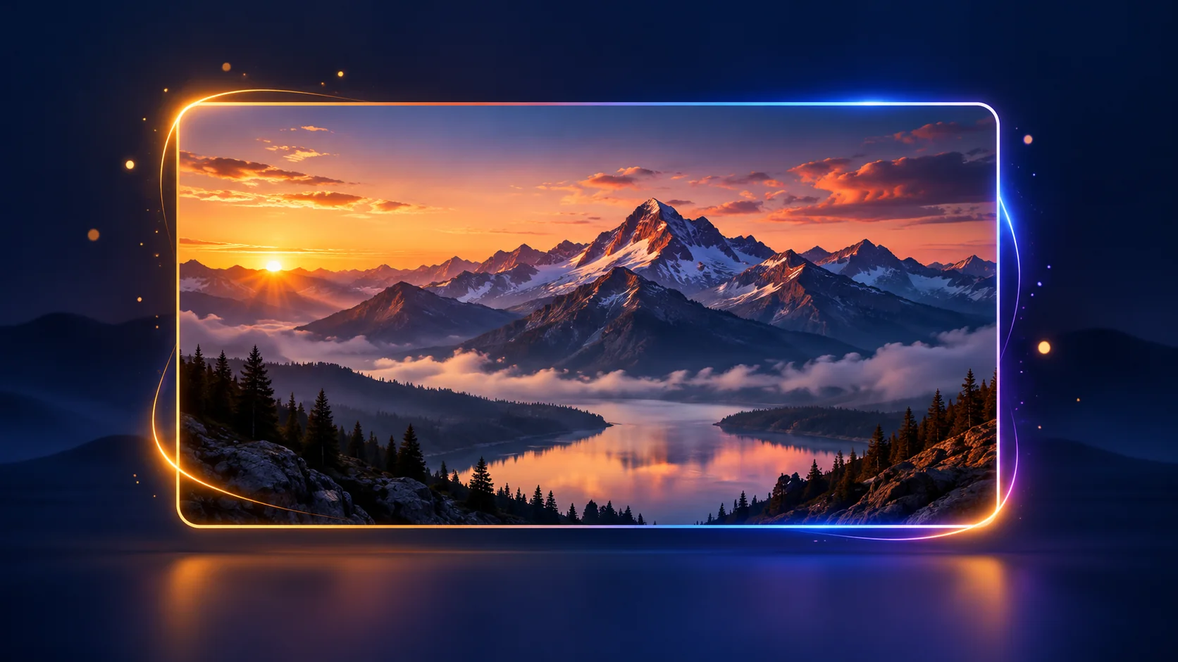
Animated image borders add a polished frame to a photo without another image asset. In this tutorial, build a responsive card with a gradient border that draws into view on hover or keyboard focus using HTML and CSS.
Quick answer: Put the image and a decorative border layer inside a positioned card. Use a CSS gradient for the border and animate its clip-path from hidden to visible. The demo works without JavaScript.
Try the Live Demo Download the Source ZIP
What you’ll build
The card uses a landscape image, a dark overlay for readable caption text, and a four-color border. The border appears on hover or when a visitor tabs to the card. On touch screens, tap the card to focus it.
How the animated border works
The border is a separate, absolutely positioned element. A linear gradient supplies its colors, while clip-path controls what is visible. The default polygon collapses to a point; hover and focus-visible rules expand it around the image. A short image-scale transition adds depth.
This keeps the markup small and lets CSS handle the effect. The border layer is decorative for assistive technology, and the image has meaningful alternative text.
Use the demo
Hover over the image to reveal the frame. To check keyboard access, press Tab until the card receives focus. The same border animation appears without a mouse. The example honors the operating system’s reduced-motion preference.
Customize the effect
- Change the colors: Edit the color stops in
linear-gradient(). - Adjust the inset: Change the border layer’s
insetvalue. - Change the timing: Update the
clip-pathtransition duration and easing. - Use your own photo: Replace the image and write descriptive alt text.
- Change the caption: Replace the sample label with text that fits your design.
Accessibility and reduced motion
The card can receive keyboard focus, and :focus-visible shows the same border as hover. Keep a visible focus indicator. The CSS also reduces transition duration when a visitor has enabled reduced motion in system settings.
Browser support
The demo uses modern CSS features including clip-path, aspect-ratio, and :focus-visible. Current major browsers support these features. For older browsers, keep the image and a static border as a useful fallback.
Frequently asked questions
Does this animated image border need JavaScript?
No. HTML provides the card structure and CSS handles the gradient, hover, keyboard-focus, and motion effects.
Can the effect work on a phone?
Yes. The card scales to its available width, and touch users can tap it to focus the link. The image and caption remain useful even if the animation does not run.
How do I make the border appear all the time?
Set the border layer’s clip-path to the expanded polygon by default, or move the expanded polygon from the hover and focus-visible rule into the base selector.
Download the source
Download the complete HTML and CSS files, then replace the sample image and caption with your own content.
Try the Animated Image Border
Hover over the card or use the Tab key to reveal its gradient frame.
 Explore the outdoors
This interactive example uses HTML and CSS only—no JavaScript is required.
<a class="image-card" href="#details" aria-label="Explore the mountain road">
  <img
    src="https://images.unsplash.com/photo-1500530855697-b586d89ba3ee?auto=format&fit=crop&w=1400&q=82"
    alt="Mountain road winding through a red-rock valley">
  <span class="image-card__shade" aria-hidden="true"></span>
  <span class="image-card__border" aria-hidden="true"></span>
  <span class="image-card__caption">Explore the outdoors</span>
</a>.image-card {
position: relative;
display: block;
width: min(100%, 620px);
margin: 0 auto;
overflow: hidden;
aspect-ratio: 16 / 10;
border-radius: 1rem;
color: #fff;
isolation: isolate;
box-shadow: 0 22px 55px rgb(20 37 75 / 18%);
}
.image-card img {
display: block;
width: 100%;
height: 100%;
object-fit: cover;
transition: transform .5s ease;
}
.image-card__shade {
position: absolute;
inset: 35% 0 0;
z-index: 1;
background: linear-gradient(transparent, rgb(7 16 35 / 78%));
}
.image-card__border {
position: absolute;
inset: 1rem;
z-index: 2;
border: 2px solid transparent;
border-radius: .6rem;
background: linear-gradient(135deg, #ffad43, #fff 35%, #5d8bff 70%, #d36cff) border-box;
-webkit-mask: linear-gradient(#fff 0 0) padding-box, linear-gradient(#fff 0 0);
-webkit-mask-composite: xor;
mask-composite: exclude;
clip-path: polygon(0 0, 0 0, 0 0, 0 0, 100% 0, 100% 0, 100% 0, 100% 0, 100% 100%, 100% 100%, 100% 100%, 100% 100%, 0 100%, 0 100%, 0 100%, 0 100%);
transition: clip-path .8s cubic-bezier(.2, .75, .25, 1);
}
.image-card:hover .image-card__border,
.image-card:focus-visible .image-card__border {
clip-path: polygon(0 0, 25% 0, 50% 0, 75% 0, 100% 0, 100% 25%, 100% 50%, 100% 75%, 100% 100%, 75% 100%, 50% 100%, 25% 100%, 0 100%, 0 75%, 0 50%, 0 25%);
}
.image-card:hover img,
.image-card:focus-visible img {
transform: scale(1.035);
}
.image-card:focus-visible {
outline: 3px solid #315cc9;
outline-offset: 5px;
}
.image-card__caption {
position: absolute;
z-index: 3;
left: 2rem;
bottom: 2rem;
font-size: clamp(1.25rem, 3vw, 1.8rem);
font-weight: 750;
text-align: left;
}
@media (prefers-reduced-motion: reduce) {
*, *::before, *::after {
scroll-behavior: auto !important;
transition-duration: .01ms !important;
}
}