
Blog
Simple Parallax Effect Using CSS

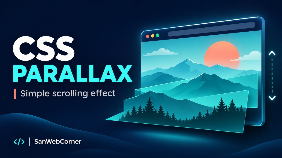
A simple parallax effect makes a background appear to move more slowly than the content in front of it. You can create that sense of depth with HTML and CSS, without a scroll listener or an animation library.
In this tutorial, we will build a self-contained mountain scene inside a scrollable panel. The downloadable project runs by opening index.html in a browser: there are no dependencies, remote images, or build commands.
What creates the parallax effect?
Our demo uses two planes. The text cards stay in the foreground, while a decorative background moves farther away along the Z axis. A small CSS perspective value makes the planes move at different apparent speeds as you scroll.
This differs from the classic fixed-background approach. With background-attachment: fixed, the image stays attached to the viewport while the page moves over it. That is useful for full-page sections; a perspective container gives this embedded demo its own scrolling area.
1. Add a scroll container and two layers
The viewport is keyboard focusable, so visitors can scroll it without a mouse. Its accessible name explains the panel’s purpose. The background is decorative, so hide it from assistive technology; keep meaningful text in real HTML.
<div class="viewport" tabindex="0" role="region"
     aria-label="Scrollable parallax demo">
  <div class="scene">
    <div class="background" aria-hidden="true"></div>
    <div class="foreground">
      <h2>A little perspective</h2>
      <p>Scroll to explore the scene.</p>
    </div>
  </div>
</div>
2. Give the panel perspective
A fixed panel height and taller scene create the scroll distance. Set perspective on the scrolling parent and preserve the children’s three-dimensional positions on the scene. Avoid adding opacity, filters, or clipping to the scene itself: those changes can flatten the layers.
.viewport {
  height: 460px;
  overflow-x: hidden;
  overflow-y: auto;
  perspective: 1px;
  perspective-origin: center top;
}
.scene {
  position: relative;
  height: 1260px;
  transform-style: preserve-3d;
}
3. Move the background back
A negative Z translation places the background farther away. With a perspective of 1px and a depth of -1px, scaling the background by 2 compensates for its smaller apparent size. Matching the transform origin to the perspective origin keeps the top of the artwork aligned.
.background {
  position: absolute;
  inset: 0;
  transform: translateZ(-1px) scale(2);
  transform-origin: center top;
  background: linear-gradient(#102b53, #4d96aa, #112e46);
}
.foreground {
  position: relative;
  transform: translateZ(0);
  padding: 70px 24px;
}
Live CSS parallax demo
Scroll inside the panel below. Compare how quickly the cards and background move. The responsive cards fit smaller screens, too.
Live demo — scroll inside this panel
Focus the panel and use Page Down, your mouse wheel, or a touch swipe. With reduced motion enabled, the scene scrolls without the depth effect.
4. Respect reduced motion and smaller screens
Parallax is optional decoration. Remove the perspective and background transform when the visitor requests reduced motion. The cards also use smaller padding below 601px. All three cards remain available in both modes.
@media (prefers-reduced-motion: reduce), (max-width: 600px) {
  .viewport { perspective: none; }
  .scene { transform-style: flat; }
  .background { transform: none; }
}
Using a fixed background on a full page
For a simpler full-width section, use a background image and fix its attachment to the viewport. Size the section with min-height so longer text can still fit. Use a dark overlay behind light text and provide a normal scrolling fallback for smaller screens and reduced motion.
.hero {
  min-height: 65vh;
  padding: 4rem 1.5rem;
  color: white;
  background-image: linear-gradient(#08172c88, #08172c88),
                    url("mountains.jpg");
  background-position: center;
  background-size: cover;
  background-attachment: fixed;
}
@media (prefers-reduced-motion: reduce), (max-width: 600px) {
  .hero { background-attachment: scroll; }
}
Common questions
Why is nothing moving?
The scroll container needs content taller than its own height. Check that perspective is on the scrolling element, preserve-3d is on the scene, and the background has a negative Z translation. A reduced-motion preference intentionally disables depth in this example.
Do I need JavaScript?
No. The browser handles the scrolling and transforms. Use JavaScript only if you need extra controls or behavior beyond this CSS example.
Can I use my own image?
Yes. Replace the gradient and decorative mountain elements with an optimized local background image. Keep the text separate, provide sufficient contrast, and include the image in your project folder.
Download and customize
The ZIP contains the complete HTML demo, a separate stylesheet, and a README. Extract it, open index.html, and edit the colors, card text, or scene height. Keep the reduced-motion rules when adapting it for your own site.
Conclusion
CSS perspective creates a convincing parallax effect with a small amount of code. Use it on decorative layers, keep foreground content readable, and offer a comfortable scrolling experience when motion is reduced.
References: MDN: perspective, MDN: background-attachment, and MDN: prefers-reduced-motion.