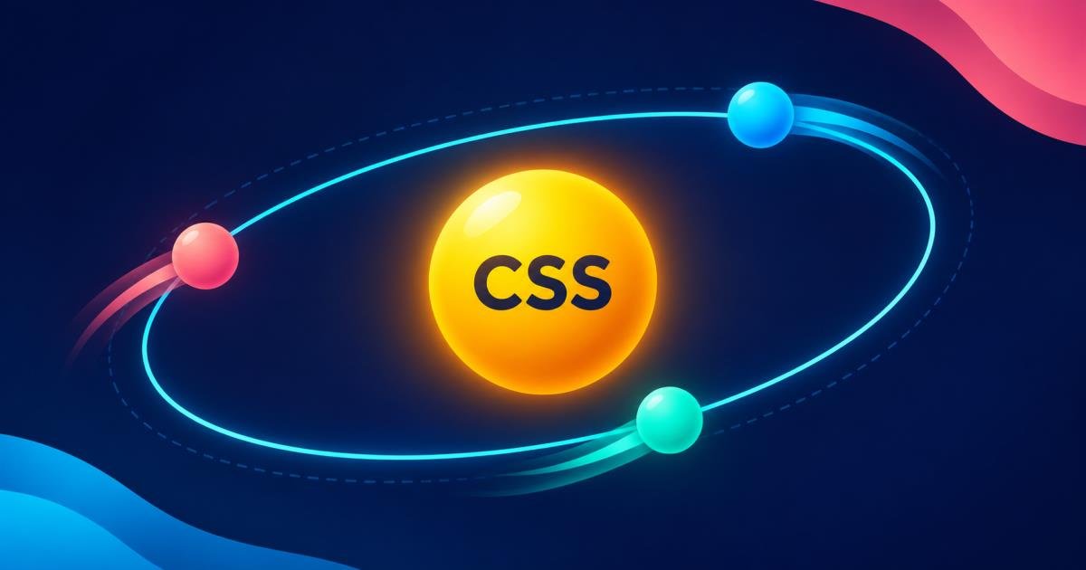
CSS object rotation is a simple way to add motion to a page. This tutorial builds a responsive orbit animation with three satellites, pause and reverse controls, and a speed slider.Privacy: The live demo runs in your browser and sends or saves nothing.Try the live demo · Download the source ZIP
How a CSS orbit works
CSS keyframes change an element’s transform over time. Rotating an orbit wrapper keeps the center still while its children travel around it. Use a linear timing function for a steady pace and an infinite iteration count to repeat.
HTML structure
<div class="scene">
  <div class="center">CSS</div>
  <div class="orbit">
    <span class="satellite">01</span>
    <span class="satellite satellite-two">02</span>
    <span class="satellite satellite-three">03</span>
  </div>
</div>
Rotate the orbit with CSS
Position the orbit around the center, then animate a full turn. The duration sets how long one orbit takes.
.orbit {
  position: absolute;
  width: min(64vw, 390px);
  height: min(64vw, 250px);
  border: 1px solid #82caff66;
  border-radius: 50%;
  animation: orbit 18s linear infinite;
}
@keyframes orbit {
  to { transform: rotate(360deg); }
}
Add useful motion controls
Keep the animation in CSS and use JavaScript only to toggle a paused class, reverse the animation direction, and change a CSS custom property for the duration. Give buttons clear labels, expose their state with aria-pressed, and announce changes through a polite status region.
orbit.classList.toggle('paused');
orbit.classList.toggle('reverse');
document.documentElement.style.setProperty('--orbit-speed', '12s');
Respect reduced motion
Decorative animation can distract some visitors. Honor the operating system preference and keep a visible pause button available:
@media (prefers-reduced-motion: reduce) {
  .orbit { animation-duration: 60s; }
}
Try the interactive demo
Pause or reverse the orbit and adjust its speed. The demo is responsive, keyboard friendly, and has no external dependencies.
Try the live demo · Download the source ZIP
Conclusion
A dedicated rotating wrapper keeps CSS orbit animations simple. Add accessible pause, direction, and speed controls, and reduce motion when visitors request it. Download the standalone project to explore the complete example.