

Blog

How to Create Responsive Pricing Cards with HTML, CSS, and JavaScript
A responsive pricing table presents plans, sample prices, and included features in a layout that adapts to desktop and mobile screens. This example uses semantic HTML for the cards, CSS Grid for the responsive layout, and vanilla JavaScript to switch between monthly and yearly-equivalent sample prices. The plan buttons only update a message in the demo. They do not process payments or collect visitor information. Connect them to your own checkout or enquiry flow before using this component for a real service. View Live DemoDownload Source ZIPWhat you will build
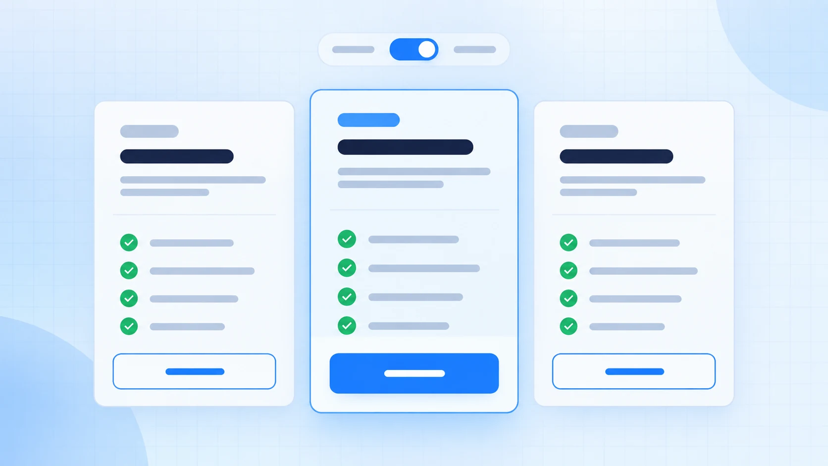
The example has three pricing plans, a highlighted middle card, a billing-period switch, feature lists, and plan-selection buttons. The cards use CSS Grid on wide screens and stack on phones. The prices are placeholders so you can replace them with your own plans, currency, and billing rules.Before you start
You need a text editor and a current browser. The download containsindex.html, styles.css, and script.js. Open index.html to view the standalone example. No package manager, external library, or build step is required.
1. Add the pricing card HTML
Each plan is anarticle with a name, short description, price, feature list, and button. The data-monthly and data-yearly attributes store the example amounts. The billing buttons expose their selection with aria-pressed, and a status region announces plan selections.
Keep the plan details accurate and concise. If a feature has a limit, state it clearly so visitors can compare plans without guessing.
2. Build a responsive layout with CSS
CSS Grid places the cards in three columns on wide screens, two columns on medium screens, and one column on narrow screens. The featured plan uses a border and background to stand out without relying on color alone. Focus styles remain visible for keyboard users, and reduced-motion preferences are respected.3. Add the billing toggle with JavaScript
The script changes the displayed sample amount, updates the selected billing button, and changes itsaria-pressed value. Choosing a plan updates a local status message. This example intentionally has no checkout endpoint, payment processing, or form submission.
Try the live demo
Use the Monthly and Yearly buttons to switch the sample prices, then choose a plan to see the status message. Yearly amounts are monthly equivalents for illustration; replace them with amounts and labels that match your actual offer.Customize the pricing cards
- Edit plan names and descriptions in the HTML.
- Replace feature lists with accurate inclusions and limits.
- Update each price element’s
data-monthlyanddata-yearlyvalues. - Change the currency symbol and billing note to match your pricing model.
- Connect each plan button to a real checkout or contact page. Validate orders on your server and use a trusted payment provider.
Accessibility and responsive behavior
Keep a clear heading hierarchy, use real buttons for actions, and leave thearia-pressed state in sync with the selected billing period. The live status gives feedback after a plan is selected. Check the cards at narrow widths, maintain readable contrast, and keep a visible focus outline when adapting the colors.
Troubleshooting
The price does not change
Confirm the price element has bothdata-monthly and data-yearly attributes, and that script.js loads after the markup.
The selected billing period is unclear to screen readers
Keep thearia-pressed update in the JavaScript and do not remove the billing control’s accessible label.
The cards look cramped on a phone
Keep the single-column breakpoint and avoid long feature text. Adjust the card padding only after checking the narrow layout.The plan button does not open checkout
The example only displays a local confirmation. Add a link or submit handler for your actual checkout flow; no payment service is included in the download.Frequently asked questions
Does this pricing table process payments?
No. It is a front-end example. The buttons display a local status message only. Connect a trusted payment provider and server-side order handling to accept payments.Can I change the currency and plans?
Yes. Change the visible currency symbol, sample prices, plan names, descriptions, and feature lists to match your offer.Do the cards work without JavaScript?
The cards and monthly sample prices remain visible, but the billing switch and plan-selection feedback require JavaScript.Is the pricing layout mobile-friendly?
Yes. The cards use three columns on wide screens, two at medium widths, and one column on narrow screens.Download the complete example
The ZIP includes the full HTML, CSS, JavaScript, and setup notes. The example is a starting point; review prices, features, legal terms, and checkout behavior before using it in production. View Live DemoDownload Source ZIPConclusion
This pricing card component combines semantic plan markup, a responsive CSS Grid layout, and a small JavaScript billing toggle. Replace the sample content with accurate plan details and connect each action to the service your project uses.Choose a plan
Pick the option that fits your project.
Choose a billing period. Yearly prices are shown as monthly equivalents.
For personal projects
Starter
The essentials for a small site.
$9 / month
- One website
- Core components
- Email support
Popular choice
For growing projects
Pro
More room for a growing site.
$19 / month
- Five websites
- All components
- Priority email support
For teams
Business
Shared tools for a small team.
$39 / month
- Unlimited websites
- Team access
- Priority support
Sample prices only. This demo does not process payments or collect information.
HTML: pricing cards
<section class="pricing-grid" aria-label="Plans">
  <article class="price-card">
    <h2>Starter</h2>
    <p class="price">
      <span data-monthly="9" data-yearly="7">$9</span> / month
    </p>
    <ul>
      <li>One website</li>
      <li>Core components</li>
      <li>Email support</li>
    </ul>
    <button type="button" data-plan="Starter">Select Starter</button>
  </article>

  <article class="price-card is-featured">
    <h2>Pro</h2>
    <p class="price">
      <span data-monthly="19" data-yearly="15">$19</span> / month
    </p>
    <ul>
      <li>Five websites</li>
      <li>All components</li>
      <li>Priority email support</li>
    </ul>
    <button type="button" data-plan="Pro">Select Pro</button>
  </article>
</section>
CSS: responsive layout
.pricing-grid {
  display: grid;
  grid-template-columns: repeat(3, minmax(0, 1fr));
  gap: 1rem;
}

.price-card {
  display: flex;
  flex-direction: column;
  padding: 1.5rem;
  border: 1px solid #dce4f0;
  border-radius: 1rem;
  background: #fff;
}

.price-card.is-featured {
  border: 2px solid #2457d6;
  background: #f1f6ff;
}

.price {
  font-size: 2rem;
  font-weight: 800;
}

.price-card button {
  margin-top: auto;
  padding: 0.75rem 1rem;
  border: 0;
  border-radius: 0.6rem;
  background: #2457d6;
  color: #fff;
  font: inherit;
  cursor: pointer;
}

@media (max-width: 820px) {
  .pricing-grid {
    grid-template-columns: repeat(2, minmax(0, 1fr));
  }
}

@media (max-width: 560px) {
  .pricing-grid {
    grid-template-columns: 1fr;
  }
}
JavaScript: billing toggle
const demo = document.querySelector("#swc-price-demo");
if (demo) {
  const periodButtons = demo.querySelectorAll("[data-period]");
  const prices = demo.querySelectorAll(".swc-price[data-monthly][data-yearly]");
  periodButtons.forEach((button) => {
    button.addEventListener("click", () => {
      const period = button.dataset.period;
      periodButtons.forEach((item) => {
        const selected = item === button;
        item.classList.toggle("is-active", selected);
        item.setAttribute("aria-pressed", String(selected));
      });
      prices.forEach((price) => {
        price.textContent = "$" + price.dataset[period];
      });
    });
  });
}