

Blog
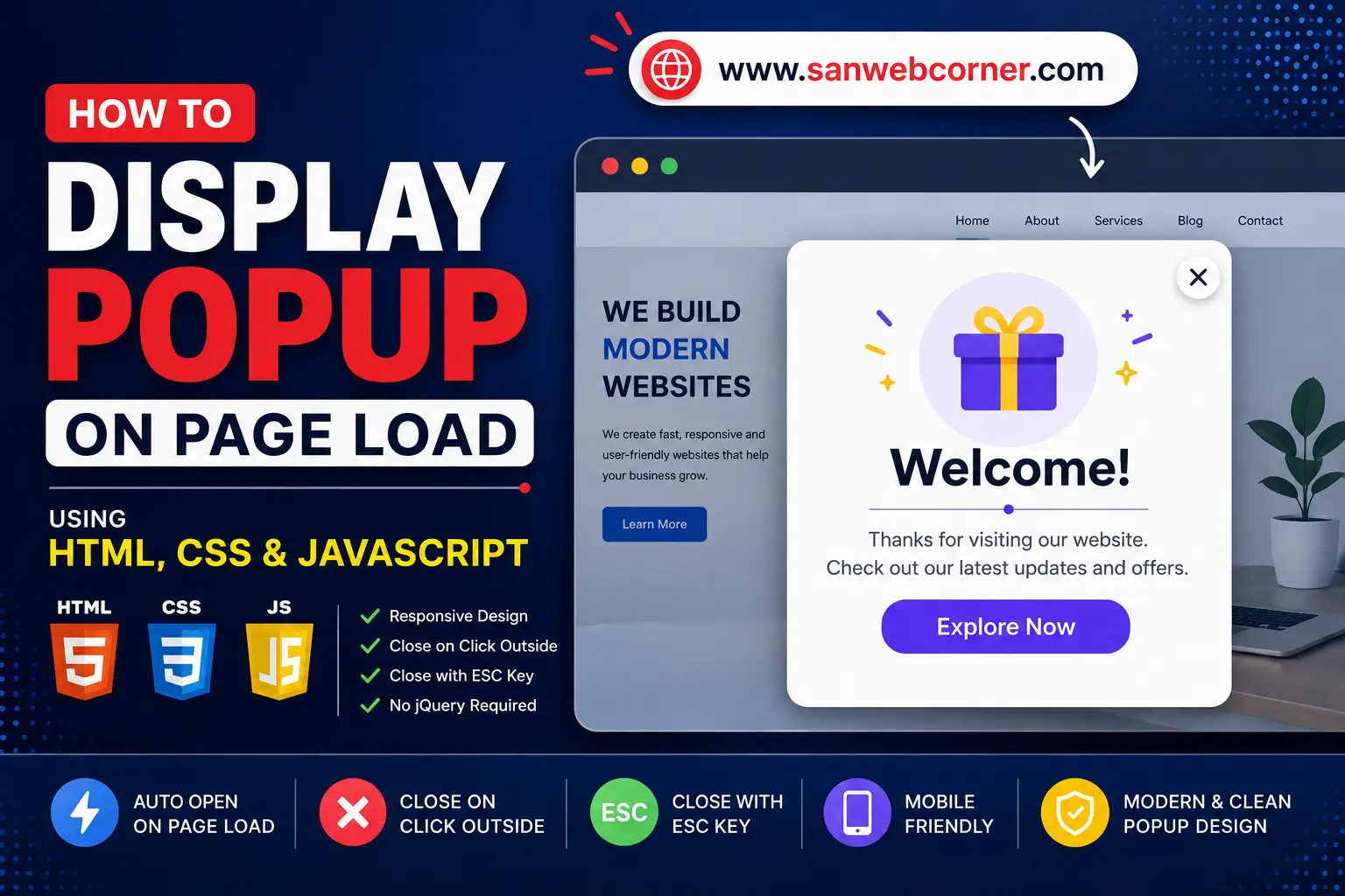

Display a Modern Popup on Page Load Using HTML, CSS and JavaScript
Updated for 2026 • HTML • CSS • JavaScript
Introduction
A page-load popup can be used to display an important announcement, welcome message, newsletter form, promotional offer, event notice, or other useful information when a visitor opens a webpage. In this updated version, we will build a modern, responsive popup using HTML, CSS and vanilla JavaScript without relying on jQuery.
What we are building
- A centered responsive modal popup.
- A dark background overlay behind the popup.
- A close button in the top-right corner.
- Closing the popup by clicking the overlay.
- Closing the popup with the Escape key.
- A smooth fade and scale animation.
- Responsive styling for mobile and desktop screens.
Popup on Page Load
Try the modern HTML dialog popup. No jQuery required.
Welcome to our website
This area represents your normal webpage content. Click the button below to test the popup.
Click "Run Demo" to preview the popup.
HTML Code
<!-- Demo Popup -->
<div class="swc-demo-wrapper">
  <button class="swc-demo-button" type="button" id="swcOpenPopup">
    Open Popup Demo
  </button>

  <div class="swc-modal" id="swcPopup" aria-hidden="true">
    <div class="swc-modal-overlay" data-swc-close></div>

    <div class="swc-modal-card" role="dialog"
         aria-modal="true"
         aria-labelledby="swcPopupTitle">

      <button class="swc-modal-close"
              type="button"
              aria-label="Close popup"
              data-swc-close>
        ×
      </button>

      <div class="swc-modal-content">
        <span class="swc-modal-badge">Welcome</span>
        <h2 id="swcPopupTitle">Welcome to SanWebCorner</h2>
        <p>
          This is a modern page-load popup built with HTML, CSS and JavaScript.
          You can replace this content with an announcement, offer, form or image.
        </p>

        <a href="#"
           class="swc-modal-action"
           data-swc-close>
          Continue
        </a>
      </div>
    </div>
  </div>
</div>
CSS Code
.swc-demo-wrapper {
  text-align: center;
  padding: 30px 20px;
}

.swc-demo-button,
.swc-modal-action {
  display: inline-flex;
  align-items: center;
  justify-content: center;
  border: 0;
  border-radius: 10px;
  padding: 13px 22px;
  background: #111827;
  color: #fff;
  text-decoration: none;
  cursor: pointer;
  font-size: 15px;
  font-weight: 600;
}

.swc-modal {
  position: fixed;
  inset: 0;
  z-index: 99999;
  display: none;
  align-items: center;
  justify-content: center;
  padding: 20px;
}

.swc-modal.is-visible {
  display: flex;
}

.swc-modal-overlay {
  position: absolute;
  inset: 0;
  background: rgba(15, 23, 42, 0.72);
  backdrop-filter: blur(4px);
}

.swc-modal-card {
  position: relative;
  z-index: 2;
  width: min(520px, 100%);
  border-radius: 18px;
  background: #fff;
  box-shadow: 0 25px 70px rgba(0, 0, 0, 0.25);
  transform: translateY(15px) scale(.96);
  opacity: 0;
  transition: opacity .25s ease, transform .25s ease;
}

.swc-modal.is-visible .swc-modal-card {
  transform: translateY(0) scale(1);
  opacity: 1;
}

.swc-modal-content {
  padding: 42px 32px 32px;
  text-align: center;
}

.swc-modal-badge {
  display: inline-block;
  margin-bottom: 12px;
  padding: 6px 10px;
  border-radius: 999px;
  background: #eef2ff;
  color: #4338ca;
  font-size: 12px;
  font-weight: 700;
}

.swc-modal-content h2 {
  margin: 0 0 12px;
  font-size: 30px;
  line-height: 1.2;
}

.swc-modal-content p {
  margin: 0 0 24px;
  color: #4b5563;
  line-height: 1.7;
}

.swc-modal-close {
  position: absolute;
  top: 12px;
  right: 12px;
  z-index: 3;
  width: 38px;
  height: 38px;
  border: 0;
  border-radius: 50%;
  background: #f3f4f6;
  color: #111827;
  font-size: 25px;
  line-height: 1;
  cursor: pointer;
}

body.swc-popup-open {
  overflow: hidden;
}

@media (max-width: 600px) {
  .swc-modal-content {
    padding: 38px 22px 25px;
  }

  .swc-modal-content h2 {
    font-size: 24px;
  }
}
JavaScript Code
document.addEventListener("DOMContentLoaded", function () {
  const popup = document.getElementById("swcPopup");
  const openButton = document.getElementById("swcOpenPopup");
  const closeButtons = popup.querySelectorAll("[data-swc-close]");

  function openPopup() {
    popup.classList.add("is-visible");
    popup.setAttribute("aria-hidden", "false");
    document.body.classList.add("swc-popup-open");
  }

  function closePopup() {
    popup.classList.remove("is-visible");
    popup.setAttribute("aria-hidden", "true");
    document.body.classList.remove("swc-popup-open");
  }

  openButton.addEventListener("click", openPopup);

  closeButtons.forEach(function (button) {
    button.addEventListener("click", closePopup);
  });

  document.addEventListener("keydown", function (event) {
    if (event.key === "Escape" && popup.classList.contains("is-visible")) {
      closePopup();
    }
  });

  // Automatically show the popup when the page loads.
  setTimeout(openPopup, 700);
});
How It Works
The popup is initially hidden. When the page finishes loading, JavaScript waits 700 milliseconds and adds the is-visible class. CSS then displays the modal and animates the popup into view.
The same closePopup() function handles the close button, overlay click and Escape key. This keeps the interaction simple and avoids the jQuery dependency used by the original article.
Customize the Popup
- Replace the heading and paragraph with your own message.
- Add an image inside .swc-modal-content if you need a visual announcement.
- Replace the Continue link with a newsletter form, contact form or call-to-action.
- Change the popup width, border radius, spacing and animation in the CSS.
- Change the 700 value in setTimeout(openPopup, 700) to control the page-load delay.
Using It in WordPress
For a WordPress post, the HTML can be placed in a Custom HTML block. The CSS can be placed in your site’s Additional CSS area or in your child theme stylesheet. JavaScript should be loaded through a proper WordPress script method or a code-snippet/plugin solution rather than pasting executable JavaScript into a normal paragraph block.
Important WordPress Note
If you are using Elementor, you can also create the live demo with an HTML widget. Keep the class names prefixed with swc- so the demo is less likely to conflict with your WordPress theme or plugins.
Why This Version Is Better Than the Original
- Uses modern vanilla JavaScript instead of the old jQuery 1.11 dependency.
- Works responsively on mobile and desktop.
- Uses a fixed overlay rather than calculating document dimensions.
- Supports the Escape key.
- Includes basic modal accessibility attributes.
- Uses CSS transitions for a smoother modern animation.
- Keeps the demo self-contained so it can live directly inside the article.
Conclusion
This updated page-load popup is a good replacement for the original 2015 implementation. The main idea remains the same, but the implementation is cleaner, responsive and easier to reuse in modern websites. You can extend the same component for announcements, newsletter forms, promotional offers, login forms and other WordPress popup use cases.