

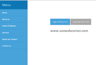
Today we are going to see how to create responsive sidebar menu. This method easy to understand and very useful to you. Lets go to see how to create, Below see the code and see the demo video easy to understand. Download the code used your website.
Html:
<div class=”nav-right visible-xs”>
<div class=”button” id=”btn”>
<div class=”bar top”></div>
<div class=”bar middle”></div>
<div class=”bar bottom”></div>
</div>
</div>
<!– nav-right –>
<main>
<nav>
<div class=”nav-right hidden-xs”>
<div class=”button” id=”btn”>
<div class=”bar top”></div>
<div class=”bar middle”></div>
<div class=”bar bottom”></div>
</div>
</div>
<!– nav-right –>
</nav>
<a href=”#” class=”ua” target=”_blank”>
<i class=”fa fa-user”></i>
</a>
</main>
<div class=”sidebar”>
<ul class=”sidebar-list”>
<li class=”sidebar-item”><a href=”#” class=”sidebar-anchor”>about</a></li>
<li class=”sidebar-item”><a href=”#” class=”sidebar-anchor”>contact</a></li>
<li class=”sidebar-item”><a href=”#” class=”sidebar-anchor”>blog</a></li>
<li class=”sidebar-item”><a href=”#” class=”sidebar-anchor”>service</a></li>
</ul>
</div>
Css:
@import url(https://fonts.googleapis.com/css?family=Arimo:400,400italic,700,700italic);
body,
html {
height: 100%;
padding: 0;
margin: 0;
font-family: ‘Arimo’, sans-serif;
}
main {
z-index: 2;
position: relative;
height: 100%;
background-color: #2D3142;
-webkit-transition: transform .7s ease-in-out;
-moz-transition: transform .7s ease-in-out;
-ms-transition: transform .7s ease-in-out;
-o-transition: transform .7s ease-in-out;
transition: transform .7s ease-in-out;
}
.sidebar {
height: 100%;
width: 400px;
position: fixed;
top: 0;
z-index: 1;
right: 0;
background-color: #EF8354;
}
.bar {
display: block;
height: 5px;
width: 50px;
background-color: #EF8354;
margin: 10px auto;
}
.button {
cursor: pointer;
display: inline-block;
width: auto;
margin: 0 auto;
-webkit-transition: all .7s ease;
-moz-transition: all .7s ease;
-ms-transition: all .7s ease;
-o-transition: all .7s ease;
transition: all .7s ease;
}
.nav-right {
position: fixed;
right: 40px;
top: 20px;
}
.nav-right.visible-xs {
z-index: 3;
}
.hidden-xs {
display: none;
}
.middle {
margin: 0 auto;
}
.bar {
-webkit-transition: all .7s ease;
-moz-transition: all .7s ease;
-ms-transition: all .7s ease;
-o-transition: all .7s ease;
transition: all .7s ease;
}
.nav-right.visible-xs .active .bar {
background-color: #FFF;
-webkit-transition: all .7s ease;
-moz-transition: all .7s ease;
-ms-transition: all .7s ease;
-o-transition: all .7s ease;
transition: all .7s ease;
}
.button.active .top {
-webkit-transform: translateY(15px) rotateZ(45deg);
-moz-transform: translateY(15px) rotateZ(45deg);
-ms-transform: translateY(15px) rotateZ(45deg);
-o-transform: translateY(15px) rotateZ(45deg);
transform: translateY(15px) rotateZ(45deg);
}
.button.active .bottom {
-webkit-transform: translateY(-15px) rotateZ(-45deg);
-moz-transform: translateY(-15px) rotateZ(-45deg);
-ms-transform: translateY(-15px) rotateZ(-45deg);
-o-transform: translateY(-15px) rotateZ(-45deg);
transform: translateY(-15px) rotateZ(-45deg);
}
.button.active .middle {
width: 0;
}
.move-to-left {
-webkit-transform: translateX(-400px);
-moz-transform: translateX(-400px);
-ms-transform: translateX(-400px);
-o-transform: translateX(-400px);
transform: translateX(-400px);
}
nav {
padding-top: 30px;
}
.sidebar-list {
padding: 0;
margin: 0;
list-style: none;
position: relative;
margin-top: 150px;
text-align: center;
}
.sidebar-item {
margin: 30px 0;
opacity: 0;
-webkit-transform: translateY(-20px);
-moz-transform: translateY(-20px);
-ms-transform: translateY(-20px);
-o-transform: translateY(-20px);
transform: translateY(-20px);
}
.sidebar-item:first-child {
-webkit-transition: all .7s .2s ease-in-out;
-moz-transition: all .7s .2s ease-in-out;
-ms-transition: all .7s .2s ease-in-out;
-o-transition: all .7s .2s ease-in-out;
transition: all .7s .2s ease-in-out;
}
.sidebar-item:nth-child(2) {
-webkit-transition: all .7s .4s ease-in-out;
-moz-transition: all .7s .4s ease-in-out;
-ms-transition: all .7s .4s ease-in-out;
-o-transition: all .7s .4s ease-in-out;
transition: all .7s .4s ease-in-out;
}
.sidebar-item:nth-child(3) {
-webkit-transition: all .7s .6s ease-in-out;
-moz-transition: all .7s .6s ease-in-out;
-ms-transition: all .7s .6s ease-in-out;
-o-transition: all .7s .6s ease-in-out;
transition: all .7s .6s ease-in-out;
}
.sidebar-item:last-child {
-webkit-transition: all .7s .8s ease-in-out;
-moz-transition: all .7s .8s ease-in-out;
-ms-transition: all .7s .8s ease-in-out;
-o-transition: all .7s .8s ease-in-out;
transition: all .7s .6s ease-in-out;
}
.sidebar-item.active {
opacity: 1;
-webkit-transform: translateY(0px);
-moz-transform: translateY(0px);
-ms-transform: translateY(0px);
-o-transform: translateY(0px);
transform: translateY(0px);
}
.sidebar-anchor {
color: #FFF;
text-decoration: none;
font-size: 1.8em;
text-transform: uppercase;
position: relative;
padding-bottom: 7px;
}
.sidebar-anchor:before {
content: “”;
width: 0;
height: 2px;
position: absolute;
bottom: 0;
left: 0;
background-color: #FFF;
-webkit-transition: all .7s ease-in-out;
-moz-transition: all .7s ease-in-out;
-ms-transition: all .7s ease-in-out;
-o-transition: all .7s ease-in-out;
transition: all .7s ease-in-out;
}
.sidebar-anchor:hover:before {
width: 100%;
}
.ua {
position: absolute;
bottom: 20px;
left: 30px;
}
.fa {
font-size: 1.4em;
color: #EF8354;
-webkit-transition: all 1s ease;
-moz-transition: all 1s ease;
-ms-transition: all 1s ease;
-o-transition: all 1s ease;
transition: all 1s ease;
}
.ua:hover .fa {
color: #FFF;
-webkit-transform: scale(1.3);
-moz-transform: scale(1.3);
-ms-transform: scale(1.3);
-o-transform: scale(1.3);
transform: scale(1.3);
-webkit-transition: all 1s ease;
-moz-transition: all 1s ease;
-ms-transition: all 1s ease;
-o-transition: all 1s ease;
transition: all 1s ease;
}
@media (min-width: 480px) {
.nav-list {
display: block;
}
}
@media (min-width: 768px) {
.nav-right {
position: absolute;
}
.hidden-xs {
display: block;
}
.visible-xs {
display: none;
}
}
Javascript:
$(document).ready(function() {
function toggleSidebar() {
$(“.button”).toggleClass(“active”);
$(“main”).toggleClass(“move-to-left”);
$(“.sidebar-item”).toggleClass(“active”);
}