

Now, see this method animation flipping images or box using css code. Now see the image front and back flipping. Touch to the box fliping back. This is very useful for animated website.
This way easy to understand see the demo video and download the code.
Below see the code using the method,
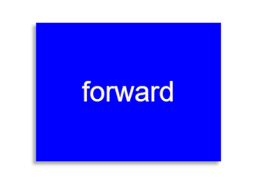
Code for flipping animation in html:
<div class=”flip-container” ontouchstart=”this.classList.toggle(‘hover’);”>
<div class=”flipper”>
<div class=”front”>
forward
</div>
<div class=”back”>
Backward
</div>
</div>
</div>
Code for flipping animation in Css:
.flip-container {
perspective: 1000;
}
.flip-container:hover .flipper, .flip-container.hover .flipper {
transform: rotateY(180deg);
}
.flip-container, .front, .back {
width: 320px;
height: 240px;
margin: 1em auto;
}
.flipper {
transition: 0.6s;
transform-style: preserve-3d;
position: relative;
}
.front, .back {
backface-visibility: hidden;
position: absolute;
top: 0;
left: 0;
color: cornSilk;
text-align: center;
font: 3em/240px ‘Helvetica Neue’, Helvetica, sans-serif;
box-shadow: -5px 5px 5px #aaa;
}
.front {
z-index: 2;
/* for firefox 31 */
transform: rotateY(0deg);
background: blue;
}
.back {
transform: rotateY(180deg);
background: crimson;
}