

Blog
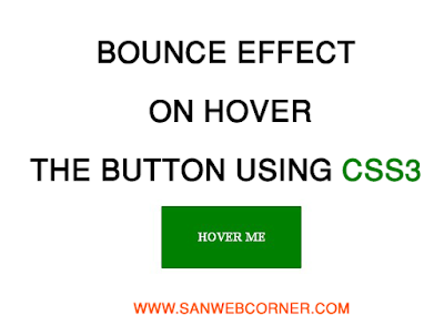
Bounce Effect on hover the button using css and Html

@keyframes bounce {
0%, 100%, 20%, 50%, 80% {
-webkit-transform: translateY(0);
-ms-transform: translateY(0);
transform: translateY(0)
}
40% {
-webkit-transform: translateY(-30px);
-ms-transform: translateY(-30px);
transform: translateY(-30px)
}
60% {
-webkit-transform: translateY(-15px);
-ms-transform: translateY(-15px);
transform: translateY(-15px)
}
}
span {
position: absolute;
top: 50%;
left: 50%;
height: 80px;
width: 180px;
background-color: green;
border-radius: 1%;
line-height: 80px;
text-align: center;
text-transform: uppercase;
-webkit-animation-duration: 1s;
animation-duration: 1s;
-webkit-animation-fill-mode: both;
animation-fill-mode: both;
-webkit-animation-timing-function: ease-in-out;
animation-timing-function: ease-in-out;
animation-iteration-count: infinite;
-webkit-animation-iteration-count: infinite;
color: white;
font-weight:bold;
}
span:hover {
cursor: pointer;
animation-name: bounce;
-moz-animation-name: bounce;
}
Here is the demo link. Check out the demo link to live preview of this example bounce effect. And also the option to download the code you can download and execute file.
I hope this example is very useful

<html lang=”en” >
<head>
<meta charset=”UTF-8″>
<title>Bounce Effect on Hover the button</title>
<style>
@keyframes bounce {
0%, 100%, 20%, 50%, 80% {
-webkit-transform: translateY(0);
-ms-transform: translateY(0);
transform: translateY(0)
}
40% {
-webkit-transform: translateY(-30px);
-ms-transform: translateY(-30px);
transform: translateY(-30px)
}
60% {
-webkit-transform: translateY(-15px);
-ms-transform: translateY(-15px);
transform: translateY(-15px)
}
}
span {
position: absolute;
top: 50%;
left: 50%;
height: 80px;
width: 180px;
background-color: green;
border-radius: 1%;
line-height: 80px;
text-align: center;
text-transform: uppercase;
-webkit-animation-duration: 1s;
animation-duration: 1s;
-webkit-animation-fill-mode: both;
animation-fill-mode: both;
-webkit-animation-timing-function: ease-in-out;
animation-timing-function: ease-in-out;
animation-iteration-count: infinite;
-webkit-animation-iteration-count: infinite;
color: white;
font-weight:bold;
}
span:hover {
cursor: pointer;
animation-name: bounce;
-moz-animation-name: bounce;
}
</style>
</head>
<body>
<div class=”wrapper”>
<span class=”bounce_button”>Hover Me</span>
</div>
<h2><a href=”http://sanwebcorner.com”>www.sanwebcorner.com</a></h2>
</body>
</html>